How to Choose Living Room Art: A Practical Guide to Scale, Color, and Style
The right piece is rarely the one that simply matches the sofa. It is the one that gives your living room a little more of what it is missing—calm, connection, contrast, or an anchor—and then earns its exact place on the wall.
How to choose living room art without starting with a style label
Most living-room art guides correctly mention mood, color, scale, and placement. The trouble is that those ideas often arrive as a pile of good advice rather than a choice order. Start one step earlier: ask what the room still needs. Does it need to settle down after a patterned rug and busy shelves? Does it need one visual anchor above a low sofa? Or does it simply need a personal note so it stops feeling like a room you are borrowing? Current guides also connect art choice with mood, orientation, and an in-room tape preview; the useful move is to turn those ingredients into a sequence.
That first answer is allowed to be plain. A calm room may want one quiet work with an open composition. A mostly neutral room may want a single point of energy. A room with meaningful objects already in it may want an image that continues the story rather than competes for attention. You are not picking a personality type for your house; you are choosing what the wall should contribute when you walk in.
A useful test: complete this sentence before you search. “I want this wall to make the room feel more [your word].” If your answer is settled, connected, warm, collected, lighter, or more awake, you have a decision filter. If the answer is “I do not know,” look at what is visually loudest already—the sofa, rug, books, wood tone, windows, or empty wall—and decide whether the art should support it or give it a counterweight.
Give the wall one job
Use the room as the brief. The same abstract piece can feel calm in one room and stranded in another because it is answering a different visual problem.
| If the room feels… | Let the art do… | Look for… |
|---|---|---|
| Busy or visually noisy | Settle and simplify | Open space, quieter values, fewer competing details |
| Careful but a little flat | Create one anchor | A more distinct value, shape, or color note with enough visual weight |
| Collected but disconnected | Bridge existing elements | A piece that can hold two room tones or echo a repeated texture |
| Neutral and unfinished | Add a personal point of view | A subject, mark, or palette you would still want to look at after the room is tidy |
Choose a color role—not a color match
“Match the sofa” is a reasonable emergency instruction, but it is not the only way for art to belong. Treat the room's colors as ingredients and choose one relationship. An echo repeats a settled note already in the room. A bridge carries two existing notes together—perhaps the warm clay in the rug and the green-gray in a chair. A contrast gives a quiet room one controlled push. The widely used 60-30-10 color palette framework can be a helpful lens for noticing dominant, secondary, and accent colors, but it is a framework, not an interior-design summons.
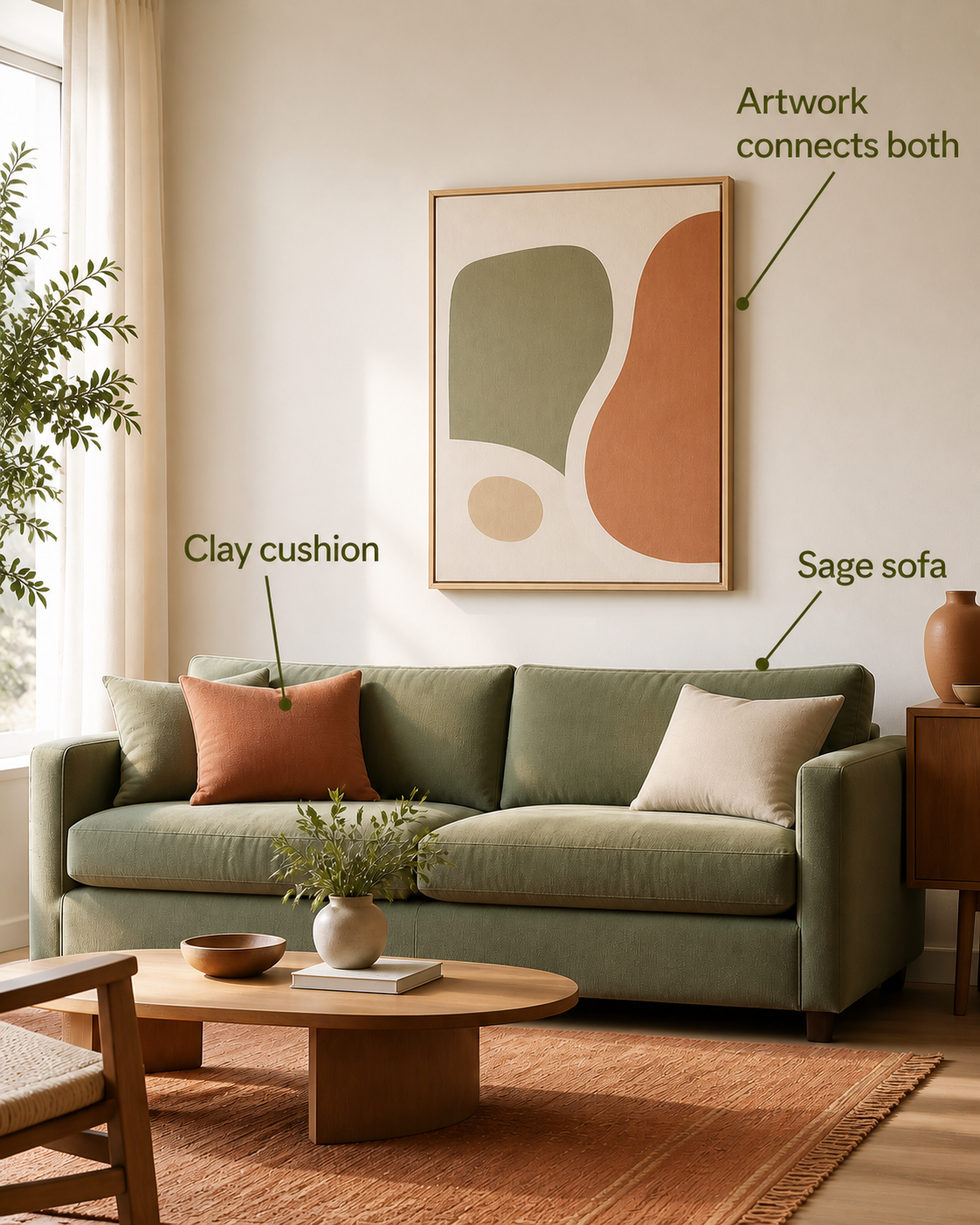
The question is not “Can I find the exact blue from my cushions?” It is “What should the art make easier to see?” Look at the room scene below: the artwork does not copy the sofa or the cushion. It borrows one note from each, so the eye reads the two parts as related. That is a bridge. In a room that already has several warm notes, a restrained echo may make everything feel considered; in a pale room that feels polite but forgettable, contained contrast can give the eye somewhere to land. Guides that recommend considering deliberate color contrast are useful here because contrast is a choice of role, not a failure to coordinate.
Use style as a filter, not as the first decision
The scene is not a paint-by-numbers rule; it simply makes the bridge decision visible before style gets involved. Now style becomes useful because it has a job to do. If you chose “settle,” you might filter for quieter abstraction, a muted landscape, or photography with space around the subject. If you chose “anchor,” you might look for a bolder graphic shape, a strong horizon, or a darker frame. If you chose “bridge,” look for a work that can carry more than one room note without becoming a color chart.
This is also where personal attachment matters. A room can absorb a favorite city, a remembered landscape, a figure, a found architectural detail, or an abstract work you genuinely want to revisit. Personal subject matter is not the opposite of a coherent room; it usually becomes more coherent once you have decided whether the art should settle, bridge, or anchor what is already there.
Be a little suspicious of a style label that makes every choice for you. “Modern,” “organic,” or “minimal” can help you eliminate obvious mismatches, but they cannot tell you whether a particular piece has the right visual weight for your actual wall. The room gets the last word. It is a surprisingly good editor, even when it has terrible opinions about throw pillows.
Let the wall and furniture suggest a format before you measure
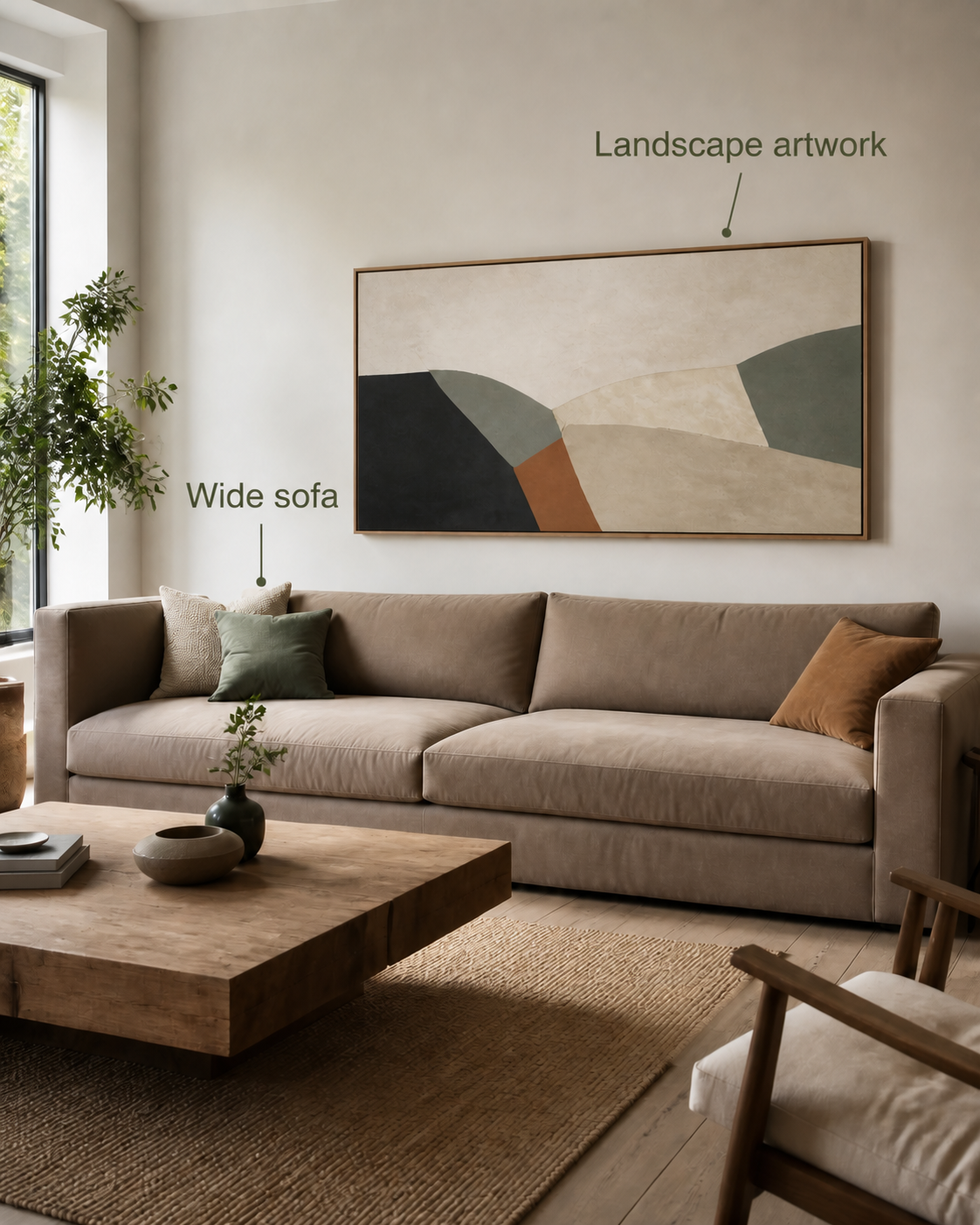
Once the color role and visual language feel right, choose an artwork direction. A wide sofa or long horizontal wall often gives a landscape format a natural conversation partner—the room scene below lets you see that horizontal conversation before the tape measure appears. A narrow vertical zone beside a tall feature may give a portrait format more room to breathe. A compact balanced wall can make a square feel composed. These are starting hypotheses, not commandments; they help you decide what to test before numbers enter the room.
This is the hand-off point. Use the wall-art size guide for a living room to calculate proportional width above a sofa or on an open wall. Once a candidate has earned its place, use the hanging-height guide to decide where it should sit vertically. Separating direction, width, and height keeps you from solving the same problem three times with a tape measure.
Run a real-wall test before you buy or drill
A screen can help you compare candidates. It cannot tell you how much air a frame needs around it, or whether the colors disappear in your afternoon light. Make the next decision reversible.
- Write the one-line brief.For example: “I need one landscape piece that bridges the warm rug and green chair without making the room louder.”
- Choose one candidate direction.Pick landscape, portrait, square, one large work, or a small group—not every option at once.
- Tape the approximate outer edge.Use painter's tape or kraft paper at the wall. You are testing a footprint, not impersonating a final frame.
- Step back, sit down, and take one phone photo.Check from the doorway and from the seat you use most. A phone photo is useful because it reduces the temptation to keep adjusting while you hold the tape.
- Name the problem before changing the candidate.If it is too small, go to the size guide. If it sits too high, go to the hanging guide. If it is the wrong mood, return to the color role or visual job instead of buying a bigger version of the same mismatch.
Questions that make the choice easier
Does living-room art need to match the sofa?
No. It can echo a sofa color, bridge the sofa to another room element, or deliberately contrast a quiet sofa. What matters is that you can name the relationship and that it supports the room's visual job.
Should I choose one large piece or a gallery wall?
Start with the visual job. One large piece is often useful when the wall needs a clear anchor. A gallery wall can work when the room benefits from a more collected, narrative rhythm. Then use the size guide to test the total footprint, not just the individual frames.
What if I love a piece online but cannot imagine it in my room?
Do not force yourself to decide from the product image. Write the four-part brief, tape the approximate footprint, and check whether the color role and format direction still make sense in your light and from your normal viewpoints.
Which should I decide first: art size or art style?
Decide the room's visual job and color role first, then the format direction. Exact size comes next because it tests a candidate you already have a reason to choose.