Tactile Texture in Art: The Surface and the Picture of It
Paint can have ridges while picturing a soft flower. A smooth sculpture can still have tactile texture. Three real works help separate the object’s surface from the materials it represents.
What does tactile texture mean in art?
Tactile texture is the actual physical quality of an artwork’s surface: rough, smooth, ridged, grainy or otherwise textured. It is also called actual texture. Implied or visual texture is the appearance of a material created by marks, color and light—for example, painted silk that looks soft even though the artwork is paint on canvas.
The Getty’s introduction to the elements of art distinguishes physical surface quality from texture conveyed visually. The distinction concerns what the texture belongs to. A painting can have both a physically uneven paint layer and a convincing depiction of smooth glass. Being a two-dimensional picture does not make its surface texture disappear.
We find it more useful to name those two things separately than to call an entire work “textured.” What material are we looking at in the picture, and what surface does the artwork itself have? The examples below make that question concrete. Their photographs let us inspect appearances; the collection records supply the documented materials.
Roses: paint marks are not petals
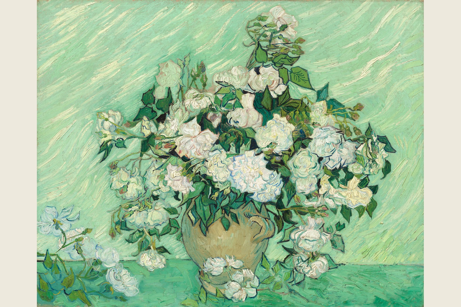
In Vincent van Gogh’s Roses, look first at the pale flower heads, then at the long, slanting marks in the green background. The flowers suggest layered petals; the background makes the movement of paint across the image particularly easy to notice.
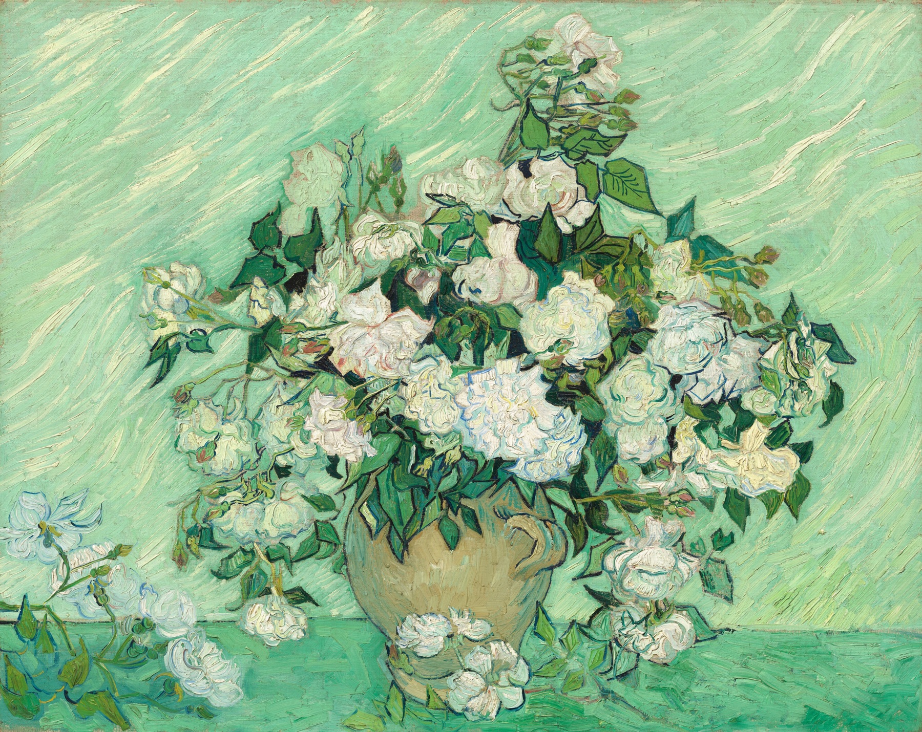
The National Gallery of Art’s record describes thickly applied paint. That is a fact about this oil painting’s physical surface. Petal softness, by contrast, is something represented in the image. We would describe this work as thick paint forming a picture of flowers, rather than say that the painted surface has the same texture as a rose.
That distinction also keeps the photograph in its proper role. Visible brush marks are helpful looking cues, but this screen does not let us measure their height or feel the original surface.
Soap Bubbles: several pictured materials, one painted object
Now look at Chardin’s Soap Bubbles. Compare the bubble’s faint curved boundary and small reflections with the boy’s gathered sleeve and the broad stone ledge beneath his hands.

The bubble reads as thin and transparent; the sleeve appears pliable; the ledge seems solid. These are our visual readings of materials within the picture. The Met identifies the actual work as oil on canvas. There is no soap bubble, cloth sleeve or stone slab to touch on the painting’s face.
We would choose this example when the question is how different materials can be suggested by a painted image. We would not describe its entire paint surface as physically smooth just because the bubble looks smooth. The depicted subject and the object’s actual surface are separate observations.
Hand of God: roughness and smoothness on the same object
Rodin’s Hand of God provides a different comparison. Look at the irregular base and the mass behind the small figures, then at the more smoothly formed hand and bodies.
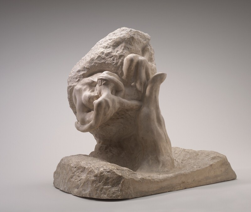
The National Gallery records this version in plaster and describes rough and smooth areas. Here those differences belong to the sculpture’s surface, rather than only to materials pictured in paint. Smoothness counts as tactile texture too; the term is broader than conspicuous bumps.
This photograph records one view and one lighting arrangement. It helps locate the surface differences, while the object record identifies what we are seeing. It does not establish permission to handle the sculpture.
A completed reference choice
Imagine preparing a short museum-looking note whose purpose is to explain contrasting textures on one physical object. This is a hypothetical editorial task, not a museum commission. We would choose Hand of God: its rough base and smoother forms make that particular distinction easier to locate. Chardin’s differing materials are chiefly the things depicted; Roses would be more useful for discussing visible paint marks.
Change the question to “How can paint suggest transparent, soft and hard materials?” and we would choose Soap Bubbles instead. The first choice is not a ranking of the artworks. It follows the thing the note needs to explain.
A useful description can therefore be quite specific: “rough and smooth passages on a plaster sculpture,” or “a painted bubble that looks transparent.” Both tell someone else where to look and what kind of observation you are making.
When the image becomes a print
If you want a reproduction, add one more distinction: the surface of the particular copy. A photograph of thick paint printed on paper can retain the appearance of brush marks without recreating their relief. The paper or canvas used for that copy still has its own physical texture.
There are exceptions to flat image reproduction. Factum Foundation documents elevated printing that builds a textured surface through successive ink layers. That specialized process does not follow automatically from the words “print,” “canvas” or “giclée.”
If physically raised marks are essential to your choice, we would hold the decision until the exact item’s process and surface are clear. Our art print versus poster guide covers the separate question of what a seller’s label and material description actually establish. Here, the useful starting point is knowing whether you like the pictured texture, the object’s physical surface, or both.
FAQ
Is tactile texture the same as actual texture?
In this art-element distinction, yes: both describe the object’s physical surface quality. Implied texture describes the appearance of materials represented in the image.
Can a painting have both tactile and implied texture?
Yes. Physically thick paint can depict petals, cloth or glass. The texture of the paint and the suggested texture of the subject need not match.
Does tactile texture always mean a rough or raised surface?
No. Smoothness is also a physical surface quality. Compare the rougher and smoother passages in the plaster sculpture above; texture is not a synonym for impasto.
Can I tell a print’s physical texture from an online picture?
An image can show useful clues, but it does not by itself establish the relief of the item being sold. Check that particular copy’s process and surface description. Specialized raised reproductions exist; a canvas or giclée label alone does not identify one.
Sources and image notes
Getty supplies the basic texture distinction; the linked National Gallery of Art and Met records identify the works and their materials. Factum Foundation documents the raised-printing exception. Looking descriptions and the changed-question reference choice are our editorial interpretations. Community discussions about painted texture and reproductions helped identify the questions; they do not establish physical facts about these works. Images are real museum reproductions, with public-domain records linked in their captions. Cover: Vincent van Gogh, Roses, 1890. Public domain. Complete museum painting fitted within a neutral matte.