Warm Colors in Art: Read the Whole Picture Before You Choose
Red, orange and yellow are the usual starting point. Three artworks show why a warm field, a mixed pastel palette and one small orange light can offer very different things to look at.
What are warm colors in art?
Warm colors usually mean the red, orange and yellow side of the color wheel. In a picture, related ochres, reddish browns and peach tones can also contribute to a warm appearance. The term describes a color relationship; it does not measure the artwork's physical temperature or promise a particular feeling.
There is also a relative meaning. One red can look more orange, another more violet; a gray can seem warmer beside a blue-gray. GOLDEN's discussion of color temperature explains why warm and cool depend on the comparison, including differences within a color family. That is useful when looking at finished art, even if you never mix a pigment.
We begin with the whole picture before using a warm-color label to shortlist an artwork. How much of the image carries the warmth, how bright or muted is it, and what happens around it? A small orange flame can be more conspicuous than a much larger brown field. Neither makes the two pictures interchangeable.
Monet: a warm sky in a mixed picture
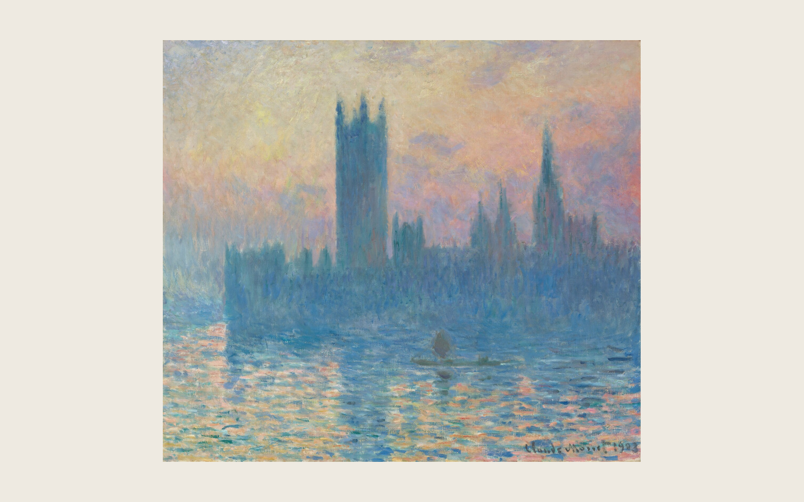
In Claude Monet's The Houses of Parliament, Sunset, look at the peach, pink and pale yellow above the buildings. Then follow the blue towers down toward the broken reflections. The warm passages share the picture with cooler ones.
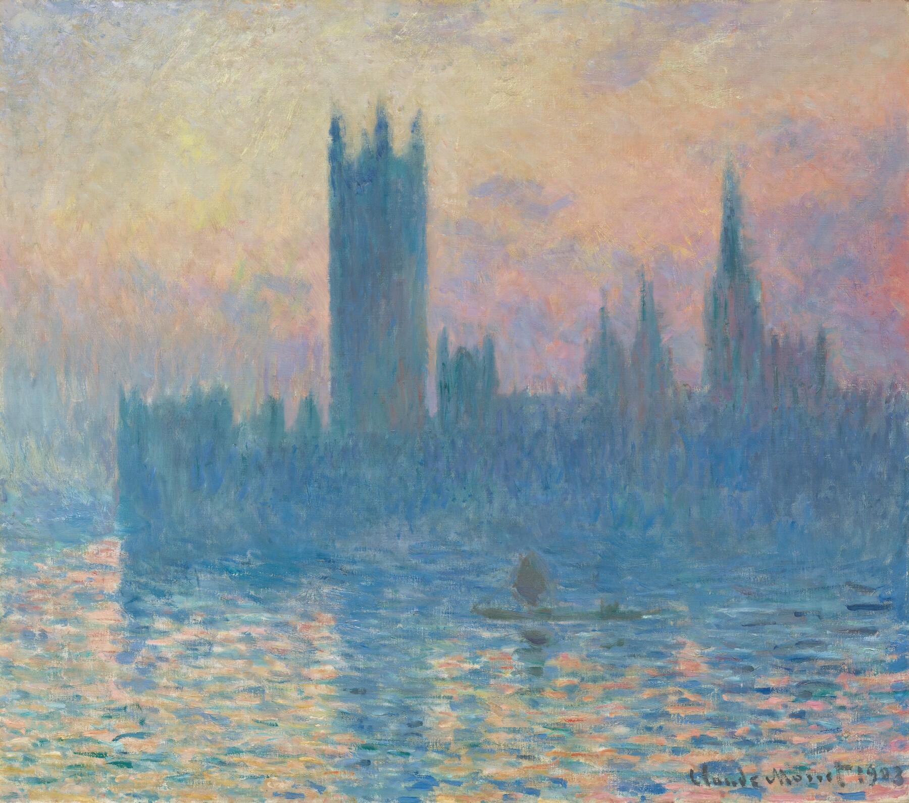
We read this as a pastel warm-and-cool mixture, rather than a uniformly warm image. The sky takes up a large area, but the blue architecture remains part of what you see. If you like warm light without wanting every major passage to belong to the same family, that mixture may be exactly the attraction.
The National Gallery of Art identifies this as Monet's 1903 oil painting. The color description here is our reading of its museum reproduction. It is not a measurement of the original under every light, or a guarantee that an unrelated printed copy will match your screen.
Turner: a small warm accent can carry the contrast
Turner's Keelmen Heaving in Coals by Moonlight gives you a different place to look. Find the concentrated orange fire toward the right, then compare it with the broader pale moonlight, gray-blue passages and dark boats.
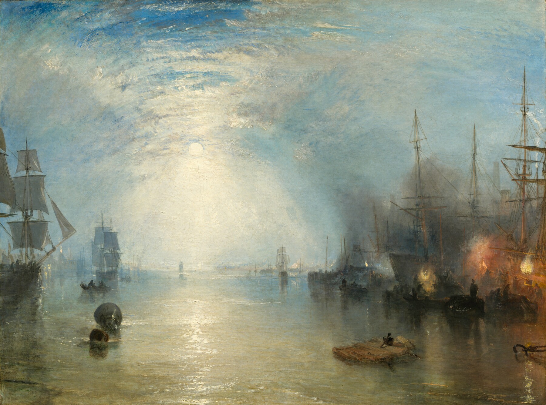
The National Gallery's account discusses the contrast of firelight and moonlight. In the image above, the orange is localized and strong. There are warmer pale and yellowish passages elsewhere, too; calling everything outside the flame “cool” would flatten the picture.
We would choose this example for someone who likes a concentrated warm light within a wider, varied field. Its appeal does not depend on orange occupying most of the canvas. Color area and visual prominence are different observations: the first tells you how much space a passage occupies, while the second concerns how forcefully it catches your eye.
House of Embers: muted warmth with deep shadow
Now compare our House of Embers. Ochre and brown spread around a broad dark central form. Pale, partly recognizable figures sit within that field. The warmth is less dependent on one luminous orange point.
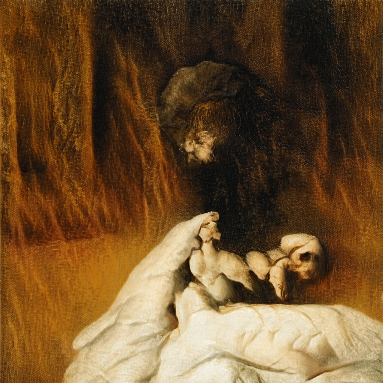
We read the image as broad, muted warmth with dark figural ambiguity. That last part matters. A warm palette can accompany shadow, uncertain forms or an uneasy image. Red, yellow and brown do not require an artwork to feel cheerful or welcoming to every viewer.
This is a straight-on image of the WhispArt work, included because its color structure provides a useful third comparison. We are describing what is visible in the image. The illustration does not establish the finish, texture or framing of a physical copy.
A completed shortlist choice
Imagine that these are three images you are considering, and that you specifically enjoy muted ochre and brown over much of the picture. You also like partly recognizable figures and deep shadow. This is a hypothetical preference exercise, not a report of a customer's purchase; availability, size and price are outside this image comparison.
We would shortlist House of Embers for that preference. The large warm field and ambiguous forms answer both parts. Monet offers warm pastel light, but the blue skyline and more recognizable setting make it a different choice. Turner's strongest orange is concentrated rather than spread broadly across the image.
Now change the preference: you want peach-and-pink light alongside blue architecture and reflections. Choose Monet as the visual reference instead. Or, if you want a small bright fire that stands out against moonlit surroundings, choose Turner. The decision changes because the wanted visual property changes, not because one artwork has earned a higher warm-color score.
To repeat the comparison with your own shortlist, start at a size where you can see the complete image. Name the warm passage and its extent, then look closer at the surrounding colors and subject. Finish with a sentence specific enough to discriminate between two candidates: “I like the broad ochre field and shadowed figures,” for example, rather than only “I want warm art.” If the candidates still seem equivalent, the label has not yet narrowed the choice.
Keep color preference and the physical copy separate
A useful shortlist can include different kinds of warmth. You do not need to make every color in an image agree, or choose the most saturated red to prove that you like warm palettes. A muted field, a pale sky and a bright accent give different answers to the same broad search.
If you are choosing a reproduction, this image preference is one decision. The actual paper, ink, dimensions and finish are another. Our art print versus poster guide explains why a seller's label alone cannot establish those properties. If an exact color match is essential, hold that decision until the particular copy's appearance is adequately evidenced.
For a broader shortlist beyond color, our guide to choosing artwork without a fixed style develops the taste question. Here the finished choice is narrower: identify the kind of warmth you actually enjoy, then select the image that visibly supplies it.
FAQ
Are warm colors just red, orange and yellow?
Those are the usual color-wheel families. In finished images, related ochres, browns and peach tones may also read as warm. Their neighbors and relative color bias matter, so look at the actual passage rather than treating every named shade as an absolute category.
Can a painting have both warm and cool colors?
Yes. Monet's warm sky and blue architecture above coexist in one image. Calling a picture warm does not require all of its major colors to be warm.
Are warm colors always bright?
No. Muted ochre and brown can provide warmth without vivid orange or red. Brightness, saturation and relative warmth describe different aspects of a color passage.
Does warm-colored art always feel cozy or happy?
No. The subject, dark passages, forms and your own response also matter. House of Embers combines ochre and brown with shadow and ambiguous figures; a warm-family description does not dictate an emotion.
Does a small orange accent make the whole picture warm?
It can make warmth conspicuous without dominating the picture's area. In Turner's harbor, compare the localized fire with the rest of the image before describing the whole palette.
Sources and image notes
GOLDEN supports the relative color-temperature distinction. The linked National Gallery records identify Monet's and Turner's works; their captions provide the open-access image records. Color-area descriptions, preferences and the completed shortlist are our editorial interpretations of the displayed images. Public artist discussions helped identify confusing terms; they are not a survey of American buyers or testimony from a gallery operator. House of Embers is our own work, used as a relevant visual example. Cover: Claude Monet, The Houses of Parliament, Sunset, 1903. Public domain / Open Access. Complete museum painting fitted within a neutral matte.