How to Choose Artwork for Your Home When You Don’t Know Your Style
You have a place of your own, a folder full of saved images, and no idea which picture you would actually want on the wall. You do not need to name your style before you can choose.
To choose artwork for your home, find an image you enjoy returning to, check whether its physical format works in your space, and confirm the complete cost and seller’s terms. If the first part feels impossible, begin with what you notice in pictures—not with a decorating label. A small, specific preference gives you something to compare. It does not have to explain your whole personality.
This guide is for the first-choice stage: choosing the image when everything from a landscape to a strange still life seems possible. You can keep the furniture, posters and gifts you already like. A first “grown-up” purchase does not require retiring everything that came before it.
“Buy what you love” is difficult when you do not know what that is
In one discussion about choosing artwork, the poster wanted to make a home their own after a breakup. The pictures they already owned had been gifts; choosing for themselves was the unfamiliar part. Replies offered different routes: travel memories, favorite subjects, making work, collecting gradually and noticing recurring colors. That is one conversation, not a survey of how everyone should decorate.
You may recognize the uncertainty without sharing that situation. When every search produces hundreds of attractive options, “follow your instinct” can sound like being told to use a tool you do not have yet.
Give yourself a smaller question: what, exactly, makes me stop at this image? A person alone in a landscape? The rhythm of repeated shapes? A scene that almost makes sense? “It is blue” is useful information, but it may not be the reason you want to keep looking.
Describe the repeat, not the style
Open a few images you have saved voluntarily: art, film stills, your own photographs or book covers. Leave out pictures saved only because you wanted their sofa, shelving or wall color. For each remaining image, finish two short sentences: “I come back for…” and “I could lose…”.
This builds on a familiar starting point. Jose Art Gallery’s guide suggests examining everyday visual preferences and a moodboard for recurring themes. The important next step is to use what you find to reject an attractive but less relevant candidate—not simply keep collecting more references.
Here is a fictional example. A recent graduate has saved a film still with one small person on a quiet street, a photograph they took at an almost-empty station, and a book cover with a single lit window. Their notes read:
- Come back for: a little human story inside a lot of open space. The image feels as though something happened just before the moment shown.
- Could lose: the exact city, the matching blue cushion in a styled photograph, and the name of the supposed interior style.
That reader’s starting preference is “quiet scenes with a small story.” It is narrower than “modern art” and more useful than “something that matches.” It is also temporary: a direction for this purchase, not a permanent identity.
If your references share nothing obvious, you are allowed to have several tastes. Choose one image you enjoy and describe its appeal, or leave the purchase for later. Do not manufacture a theme just to finish the exercise.
Three similar palettes, three different reasons to choose
For our fictional reader, consider the three examples below. All use muted blue and ochre. Ignore how neatly those colors might match a room and look at what each image offers.
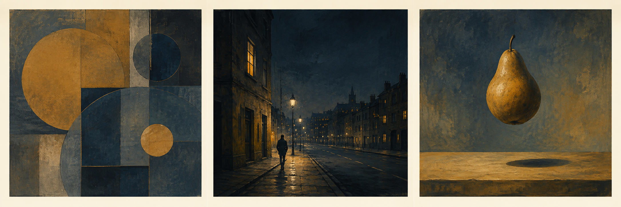
On a small screen, open the comparison at full size and zoom in to see the small walker and lit windows in the middle image.
The middle image is the best shortlist choice for the stated preference. Its small walker, lit windows and receding street supply the implied story that connected the reader’s earlier references. The color helps, but the choice would still have a reason if the room’s cushions changed.
The left image offers shape, repetition and surface. It might coordinate beautifully, but our fictional reader has not identified those as the things they keep returning to. The floating pear on the right offers a different kind of curiosity: an impossible event rather than an ordinary moment with an unfinished story.
Change the preference and the answer changes. If your saved images repeatedly feature curves, blocks of color and satisfying arrangements—with little interest in characters or places—the left image is the stronger candidate. If you enjoy wondering how an image’s world could exist, the pear may hold your attention longer. These are editorial interpretations of the examples, not measurements of anyone’s taste.
The outcome is a usable search description: “quiet city scene art with a small figure.” That is browsing language derived from this example, not a claim that this exact phrase has measured search demand. Start looking at artists or collections with those visible qualities; keep their names and work titles so you can return to a specific image instead of starting the search again.
Let the first attraction become a reason you can revisit
In our studio, a first impression matters, but it is not the whole selection. Our founder describes leaving an image in view and coming back later, rather than keeping it simply because the generation process was complicated. The interest is in how a picture can feel different with time and context—not a trick in which you must identify a new object on every visit.
That is a subjective studio practice, not a test of how long a buyer will enjoy art. For your shortlist, borrow the smaller question: after the first attraction, what still interests me? You can return on another day without imposing a required waiting period. These two museum paintings make possible answers visible; the following readings are ours, made for this guide.
If the first attraction is green and blue, look at their movement

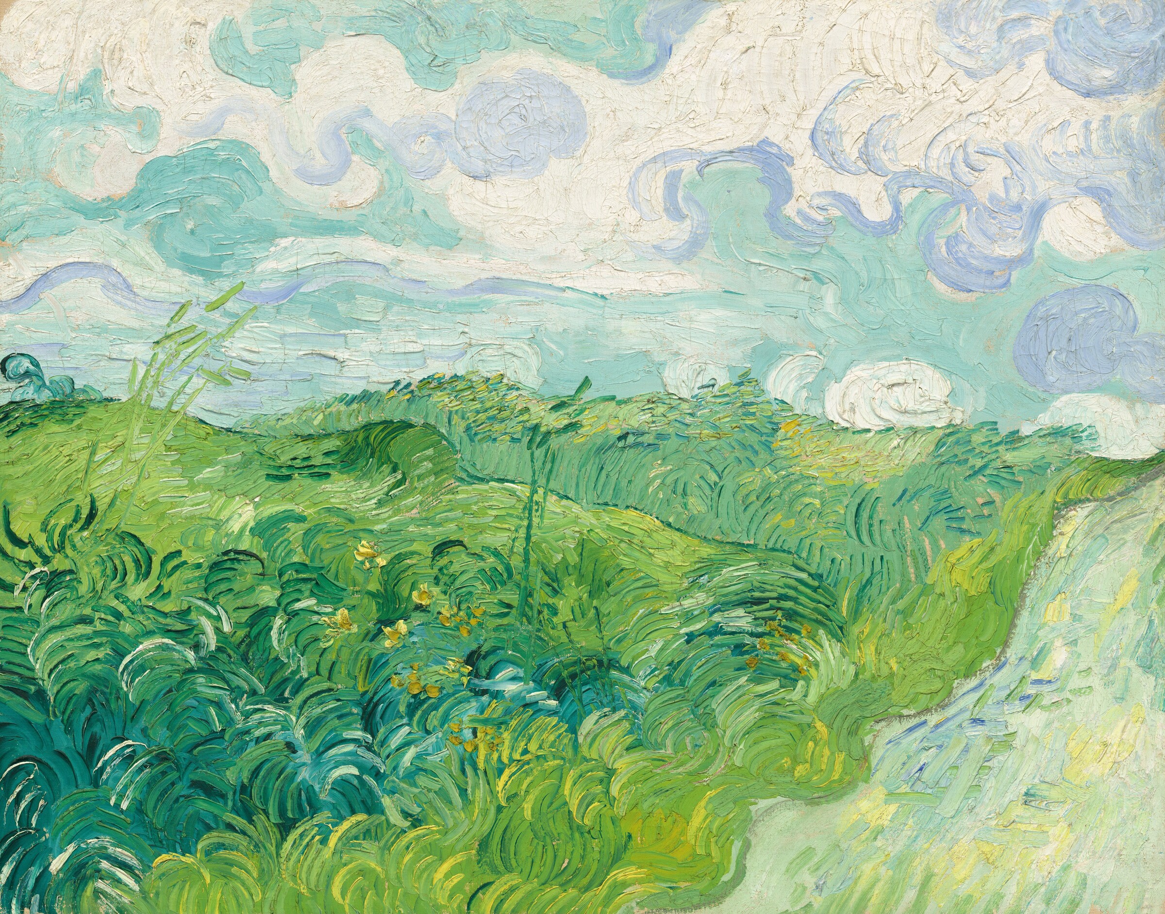
In Vincent van Gogh’s Green Wheat Fields, Auvers, I would move from “I like the colors” to the recurring curves. The foreground strokes bunch into rolling bands; broad cloud curls echo them above the horizon. The pale road at the right offers a different route into the distance. “I come back for the movement shared by field and sky” gives a reader who enjoys those marks a specific reason to revisit this image.
If the first attraction is yellow flowers, follow the path as well
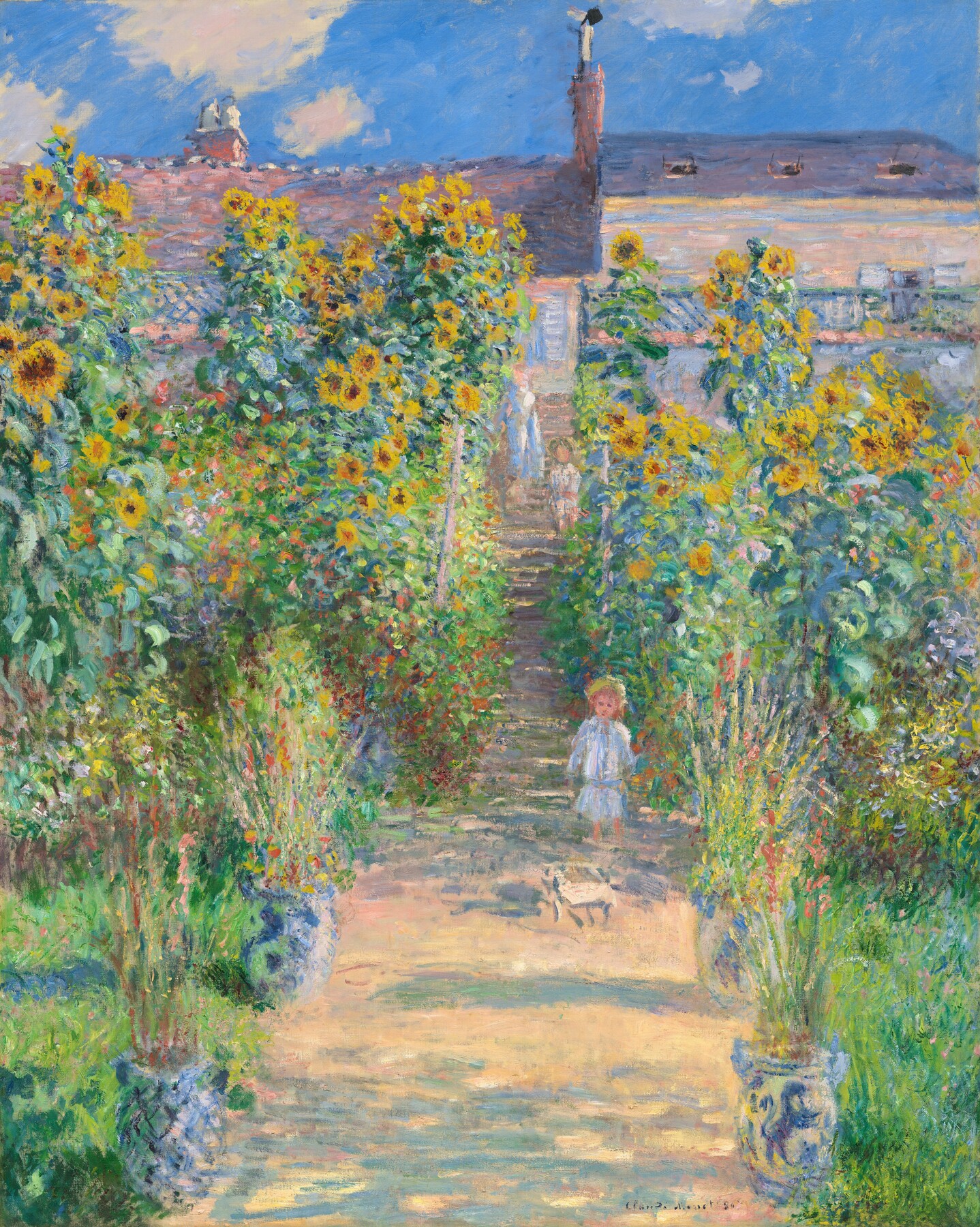
In Claude Monet’s The Artist’s Garden at Vétheuil, the sunflowers are an immediate attraction. I would then follow the narrowing central path between their tall, irregular banks. Blue-green shadows cross its warm surface, while the planters repeat beside it. The appeal could become “a bright garden with a path I enjoy following,” rather than yellow alone.
Neither reason is obligatory, and these paintings are examples for looking, not purchase offers. Back with our fictional city-scene candidate, the reader can check whether the walker, windows and receding street still supply the quiet story they wanted. If that story continues to appeal, keep the shortlist choice; if another feature now matters more, revise the reason and compare again. You can also simply enjoy a picture without analyzing it in detail.
When two people want different things from one picture
For a shared wall, each person should be able to point to something they actively want in the image. Start by separating two questions: do we like this picture, and can the actual object work here? In one public discussion, the poster clarified that both people liked the artwork; the disagreement was about whether it went with the room. A different frame or position is worth considering in that situation. It cannot supply a liking for the subject that one person does not have.
Here is a hypothetical shared choice. One person wants a small human story to look into. The other wants broad sky and water, without a large foreground group. Both enjoy boats. Those are specific preferences we can compare with two actual paintings.
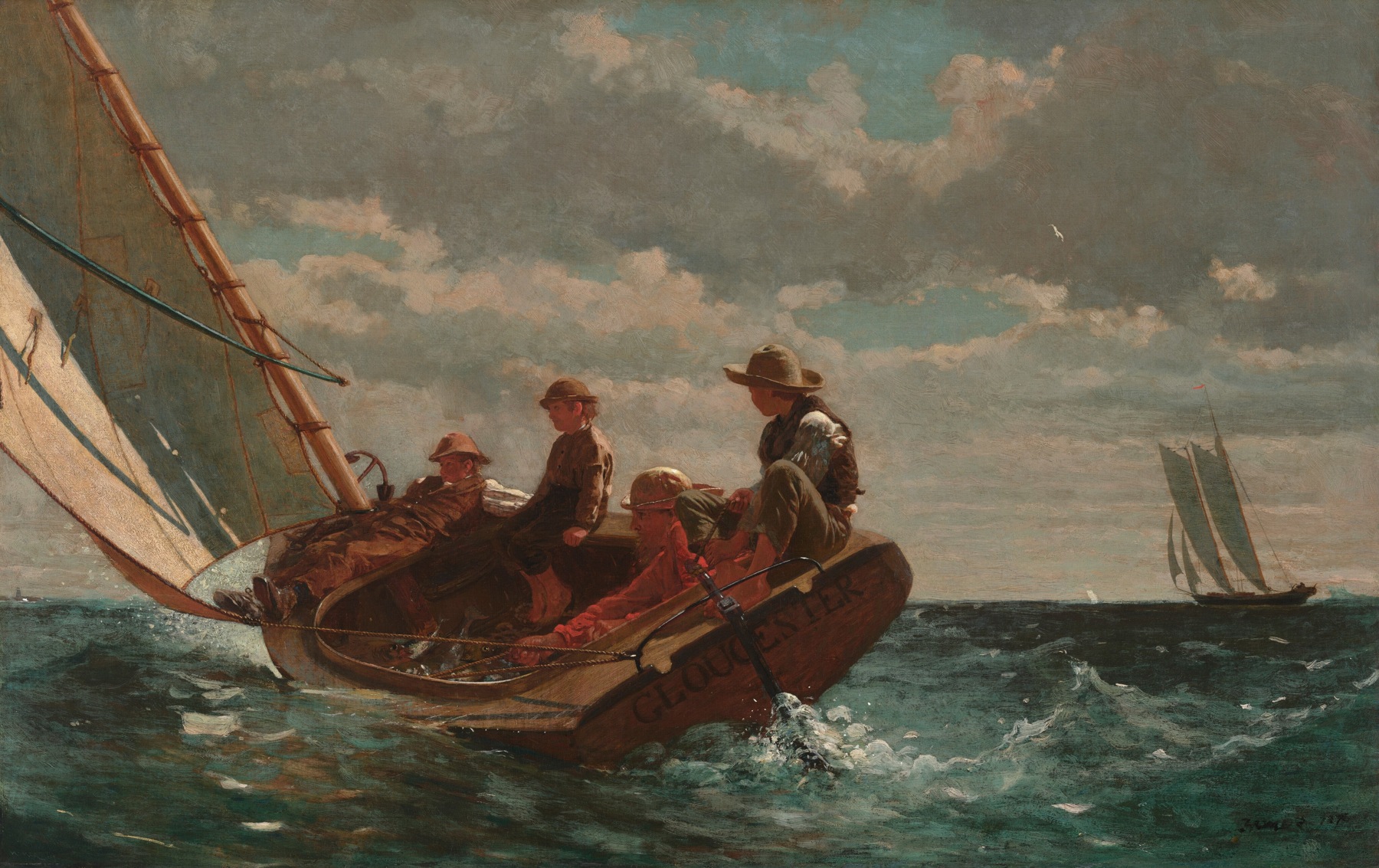
In Homer’s picture, the four people sit close to us in a boat leaning across choppy water. The diagonal sail and the figures’ poses make the immediate activity a substantial part of the image. Our first person has plenty to return to; the second has a foreground group they specifically wanted to avoid.

Lane’s schooner sits low beneath a much wider field of sky. There are people on its lumber-filled deck, but they are small within the view. On a phone, open the full painting and zoom in to inspect them. The small activity can reward a closer look while leaving the open sky prominent.
For these stated preferences, we would keep Lane’s image on the shared shortlist. One person can point to the working boat; the other can point to the expanse around it. Each has a positive reason to want this particular picture. The choice gives up Homer’s much more prominent people and immediate movement. These works also differ in color, light and sea state, so this is an editorial comparison, not a test isolating one compositional variable.
If the first person needs faces and gestures to be as readable as Homer’s, neither candidate yet meets both briefs. Keep looking with that clearer description or leave the shared wall undecided. A personal wall can hold a separately chosen work if both agree on that arrangement. There is no need to buy a third picture that leaves both indifferent. Once an image earns a shared yes, continue with the room, finished-size and buying checks below.
Make sure you like the picture, not just the photograph around it
Before making a favorite final, view the artwork’s straight-on image as well as its room photograph. If removing the beautiful apartment removes most of the attraction, put the work back in the “maybe” group. You may have been shopping for the atmosphere of that photograph.
This is not a rule against choosing by color. Dream Green DIY’s personal examples show both sentimental selection and a palette-led route; the article discloses gifted products. Color can be the thing you genuinely enjoy. The distinction is between liking the image’s color relationships and buying it only because a retailer has already styled it successfully.
Now bring the actual room back into the decision. Check the intended position, outer framed dimensions and available space. For the visual relationship with furniture, use our living-room art guide. A picture you love may need a different position or format; that does not make your preference wrong.
A favorite is a shortlist decision—not yet a purchase
Set an all-in spending limit that leaves everyday needs covered. Include the frame, tax, delivery and any mounting work you need. Confirm whether you are buying an original, a print or another specified physical object; inspect its dimensions, materials and the seller’s return or custom-order terms. Our online wall-art buying guide covers those object-level checks.
Suppose our fictional reader has chosen the middle image, but the listing gives only the paper dimensions and leaves framing and delivery costs unclear. The image choice is complete. The order is not. They ask for the outer framed dimensions and the complete price, then check the proposed position and any rental restrictions before paying.
If the total exceeds their limit, they can ask about another available format, save for the work or wait. Buying the left-hand image merely because it is cheaper and similarly colored would discard the reason they made the shortlist. A different image can be a good choice, but it deserves its own reason.
If two candidates still appeal equally after a second look, you do not need to buy both to escape the decision. Choose the one with acceptable practical terms and a commitment you are comfortable making, or pause. A set is worth buying when you enjoy the relationship between its images—not because it lets you stop choosing.
No exercise can promise that your taste will never change. What it can give you is a decision you understand now: “I like this particular thing about this image; I know where the object can go; I know what I am agreeing to buy.” That is enough for a first piece. It does not have to be your last word on art.
Questions about choosing your first artwork
Do I need an interior style before I buy art?
No. Start with a particular image and a reason you enjoy it. A style name can help you browse, but it does not make the choice for you. Several different tastes can belong in one home.
What if I admire a work but do not want it on my wall?
That is a useful distinction. You can value an unsettling, demanding or dramatic work without wanting to live beside it. Choose the kind of viewing experience you want at home, rather than treating your shortlist as a judgment of the work’s artistic worth.
Does looking again prove I will not get tired of it?
No. Returning can help you explain what appeals now; it cannot predict permanent taste. There is no required number of visits. If the reason no longer feels convincing, change the shortlist or wait.
Can color be my main reason for choosing?
Yes. Enjoying colors, marks or a pattern is enough. Check the image itself as well as the styled room, then confirm the actual object and complete cost. You do not need to invent a personal story to justify a visual preference.
How do we choose art when our tastes differ?
Name one visible quality each of you actively wants, then compare actual images. In our example, Lane’s small working figures and broad sky satisfy two different preferences. If one person needs much larger figures, that choice fails; continue looking or wait. Check room fit separately when both like the image.
Sources and image note
- AskWomenOver30: How do you pick artwork for your home? — one person’s question and visible community replies, not a representative study.
- Jose Art Gallery: How to Choose Art for Your Home — reference gathering and identifying recurring visual preferences.
- Dream Green DIY: How to Pick Art for Your Home — the author’s size, sentiment and palette examples, with a gifted-product disclosure.
The graduate, reference descriptions and candidate decision are a hypothetical editorial demonstration, not a taste experiment. The three-way comparison uses generated teaching examples; different preferences can reasonably lead to different choices.
Cover: Vincent van Gogh, Green Wheat Fields, Auvers, 1890. National Gallery of Art, Collection of Mr. and Mrs. Paul Mellon, 2013.122.1. Public-domain image; the website cover may show a detail. The full painting appears in the body. Monet’s The Artist’s Garden at Vétheuil, 1881, is from the National Gallery of Art, Ailsa Mellon Bruce Collection, 1970.17.45; its image is also public domain.
The studio account comes from our founder’s written interviews about selection and returning to images. It describes our practice and hopes for an open-ended viewing experience, not a study of buyers. The readings of the two museum paintings are current editorial observations, not past studio selections or physical-print tests.
The shared-wall comparison is a hypothetical editorial choice between the two named National Gallery paintings, whose records are linked in the captions. It does not describe customers or a taste experiment. The works differ in several respects; the recommendation applies only to the stated preferences.