Contrast in Black-and-White Art: What the Tonal Differences Do
A picture can contain very dark and very pale areas while some of its subjects almost disappear into one another. The useful distinction is between the whole tonal range and the differences at a particular boundary.
A broad range does not separate every shape
The overall tonal range concerns the lightest and darkest areas in the picture. It does not tell you how many intermediate tones occur between them, or where they occur. A picture built mostly from dark and pale shapes can have a broad range; so can one containing many intermediate values.
Local contrast concerns neighboring areas. A dark shutter against a pale wall can be easy to distinguish, while another dark shutter against a similarly dark recess can be harder to separate. The whole image has not changed; the particular comparison has.
The transition concerns how the change happens. An abrupt boundary can give a shape a crisp edge. A gradual change can describe a turning surface without a hard dividing line. A sharp edge and a large value difference are related possibilities, rather than interchangeable terms.
I would start with the local comparison when describing a work. “The hands separate from the coats” identifies something we can inspect. “It has high contrast” leaves open which parts are doing the work.
Vallotton: pale details within connected dark shapes
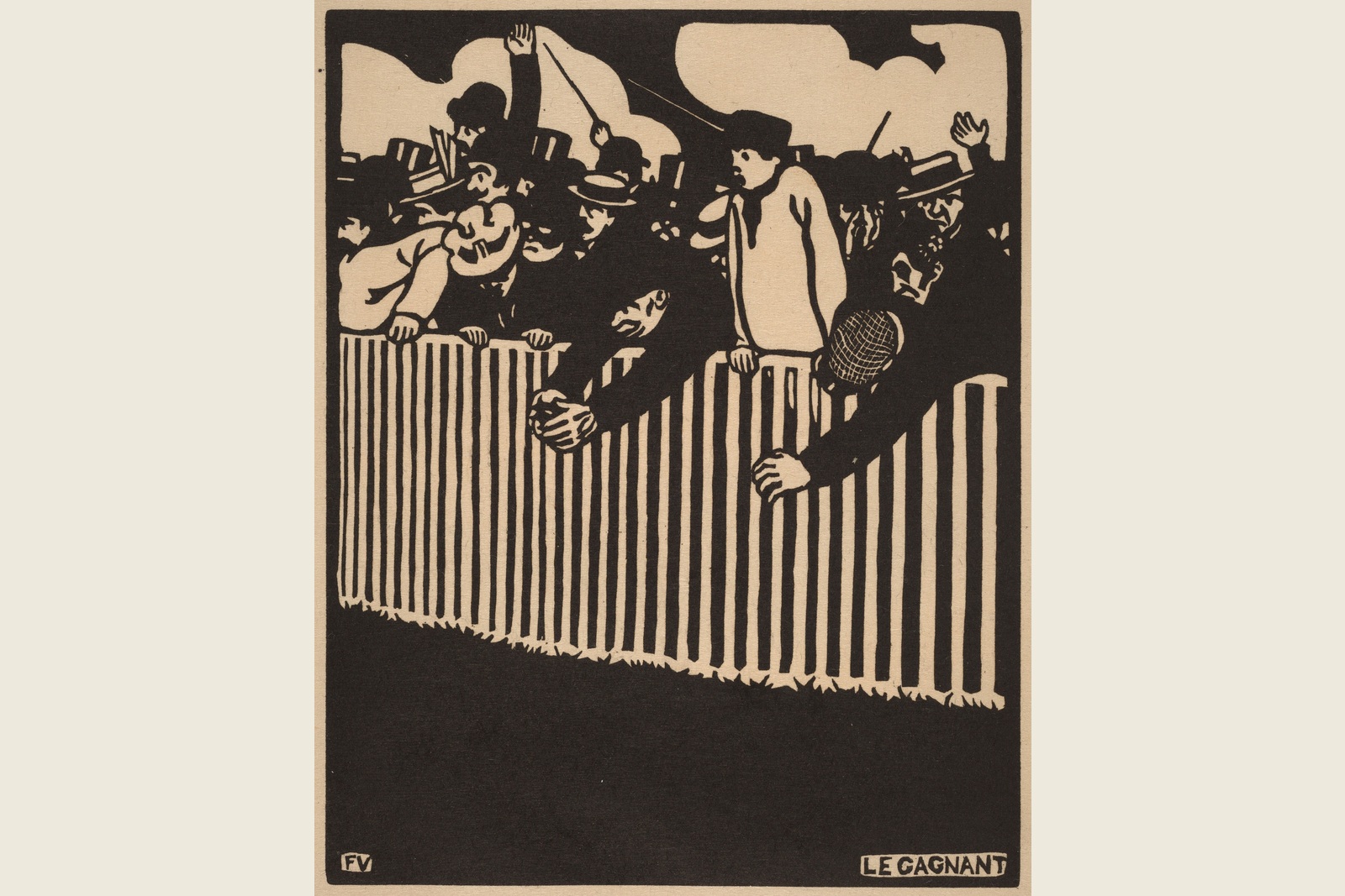
Look at the complete reproduction of Félix Vallotton’s Le Gagnant (The Winner). The National Gallery of Art record identifies it as an 1898 woodcut in black on japan paper. Pale hands, faces, hat details and the railing interrupt large dark areas.
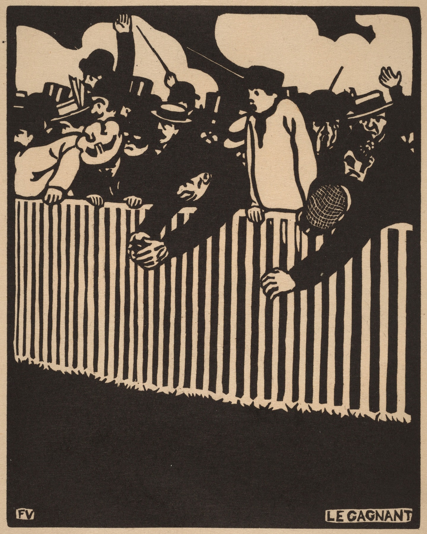
Now compare the dark clothing in the foreground. In several places, one dark coat meets another without a light strip separating every body. The graphic dark mass remains forceful, but the individual garments are not equally isolated. That is the difference between a strong dark–pale relationship across the work and strong local separation at every boundary.
My completed description would be: “Pale hands, faces and railing bars punctuate broad, connected dark forms; some neighboring coats merge.” It accounts for both the striking difference and the quieter boundaries. It does not assume that every viewer notices the same detail first or establish the artist’s intention.
Marville: many local changes within a detailed street
Charles Marville’s [Rue de Constantine] offers a different comparison. The Metropolitan Museum of Art record dates the albumen silver print from a glass negative to 1866. Its reproduction is warm toned, not a digitally neutralized black-and-white image; we retain that appearance.
Look from the dark nearby building to the paler façades farther along the street. Then compare an individual shutter with its surrounding wall, and the small surface changes within the pavement.
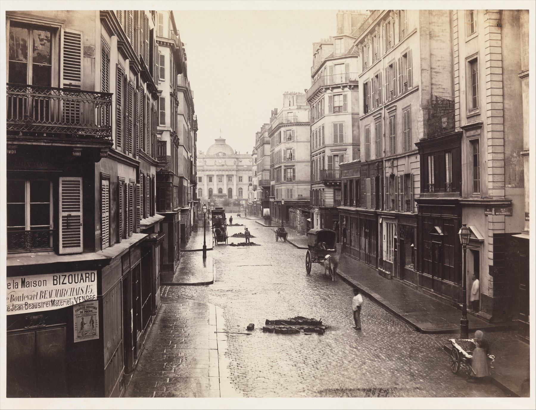
There are dark and pale areas, but much of the description happens through intermediate tones. A shutter may make a marked local step against a wall. Elsewhere, smaller differences carry masonry and surface detail. Calling the photograph simply “low contrast” would overlook those local steps; calling it “high contrast” would overlook the many quieter transitions.
Our completed description is: “A dark near façade and pale distant surfaces span a broad tonal extent, while shutters and changing wall and pavement tones create many smaller local differences.” We are describing the visible reproduction, not claiming that its numerical range equals Vallotton’s or that a physical print will match a particular screen.
Use the comparison to choose a visual reference
Imagine choosing a monochrome reference for an art-viewing conversation. The brief is bold pale shapes against broad dark masses, with some forms allowed to merge. This is a hypothetical editorial choice, not a reported gallery commission.
I would choose Vallotton for that brief. The hands and railing provide specific dark–pale boundaries to discuss, and the connected coats meet the allowance for merging. Marville is more useful for a conversation about the many intermediate differences within a detailed surface.
Change the brief to “help me describe subtle changes within buildings and pavement,” and I would choose Marville. Change it instead to “every figure must be individually separated,” and I would reject Vallotton as evidence for that requirement: its strong overall contrast does not supply that separation everywhere.
These are choices of references, rather than a ranking of the works or an offer to purchase the historical originals. If you are choosing a reproduction, assess the actual offered image and its full crop. The examples explain what to look for; they do not establish the seller’s printing result.
More contrast is not a complete improvement brief
A public black-and-white photo critique includes competing judgments about shadow detail, tonal adjustments and mood. It is a self-selected discussion, not a representative preference survey. Its useful question is specific: what should remain visible, and what may merge?
For Vallotton, separating every coat would change the connected dark shapes we have just described. For Marville, losing smaller wall-tone differences would remove part of the visible surface description. Neither can be evaluated by a general request to make the image “punchier.”
The wider placement of dark and pale forms also belongs to composition. Continue with our guide to composition in art for that whole-picture relationship. Here the question remains narrower: how different are these neighboring areas, and what does their boundary let us see?
Questions about black-and-white contrast
Does black-and-white art have to use only pure black and white?
No. It can include many intermediate tones. Historic monochrome photographs may also have a warm or cool tone. Describe what the actual work or reproduction contains rather than assuming a neutral two-tone image.
Can a high-contrast picture contain low-contrast areas?
Yes. Very dark and pale areas can coexist with neighboring shapes of similar value. Vallotton’s pale details and merging dark coats make that distinction inspectable.
Is a sharp edge the same as strong contrast?
No. Edge sharpness describes how abruptly a boundary changes; value contrast describes how different the neighboring lightness values are. Specify both when they matter.
Is more contrast always better for wall art?
No universal amount follows from these examples. Choose according to what you want to remain visible: graphic dark–pale shapes, intermediate surface tones, or individually separated subjects. Then inspect the actual reproduction offered.