Composition in Art: How the Parts Hold a Picture Together
A face, a dark shape, a diagonal, a repeated color: each can be compelling on its own. Composition is what makes those parts belong to the same picture.
The elements are the parts; composition is their relationship
Line, shape, color, value—the relative lightness or darkness of a tone—and space give us words for what is visible. Composition asks what those things do in combination. A red shape may be prominent because it is large, because the surrounding area is blue, because it sits alone, or because several smaller red shapes repeat it elsewhere.
Tate’s definition emphasizes arrangement and relationships. The Getty’s design-principles guide supplies useful terms such as balance, emphasis, movement, and repetition. These terms help describe a picture; they do not supply a single layout that every picture must follow.
When I compare compositions, I start by naming a relationship I can point to: “the dark figure occupies much more of the foreground than the pale figure,” or “the repeated red forms connect opposite sides.” That tells me more than calling a work balanced without saying what is being balanced.
Five useful cues, without turning them into rules
- Emphasis: which areas seem prominent, and through what contrast or placement?
- Balance: how do areas of different size, darkness, detail, or color relate across the image? Balance does not require equal objects on both sides.
- Direction: what do diagonals, curves, gestures, or repeated edges connect?
- Rhythm: which forms recur, and how do their differences prevent the repetition from becoming uniform?
- Space and boundaries: how do gaps, overlaps, the horizon, and the picture’s edges separate or connect the forms?
The rule of thirds divides a rectangle into three rows and three columns; it can be a useful way to compare placement. Symmetry can organize corresponding forms around an axis. A triangle or an S-shaped arrangement can also provide a useful description. None is a certificate of quality. If a grid explains one placement but ignores the relationships that make the rest of the picture work, it is an incomplete reading.
The public composition-practice discussion and composition-analysis discussion show why this distinction matters: contributors ask for ways to understand and compare arrangements, while replies range from grids to references and contrasts. These are self-selected art-making conversations, not evidence of what gallery buyers prefer. Here we will use the question they raise—how to explain an arrangement—and answer it through looking.
1. A prominent portrait can still have unequal sides
Look at Leonardo da Vinci’s Ginevra de’ Benci [obverse]. The light face is prominent against the dark juniper. The torso turns while the face comes toward us. On the right, a more distant landscape gives a different kind of space from the dense foliage on the left.
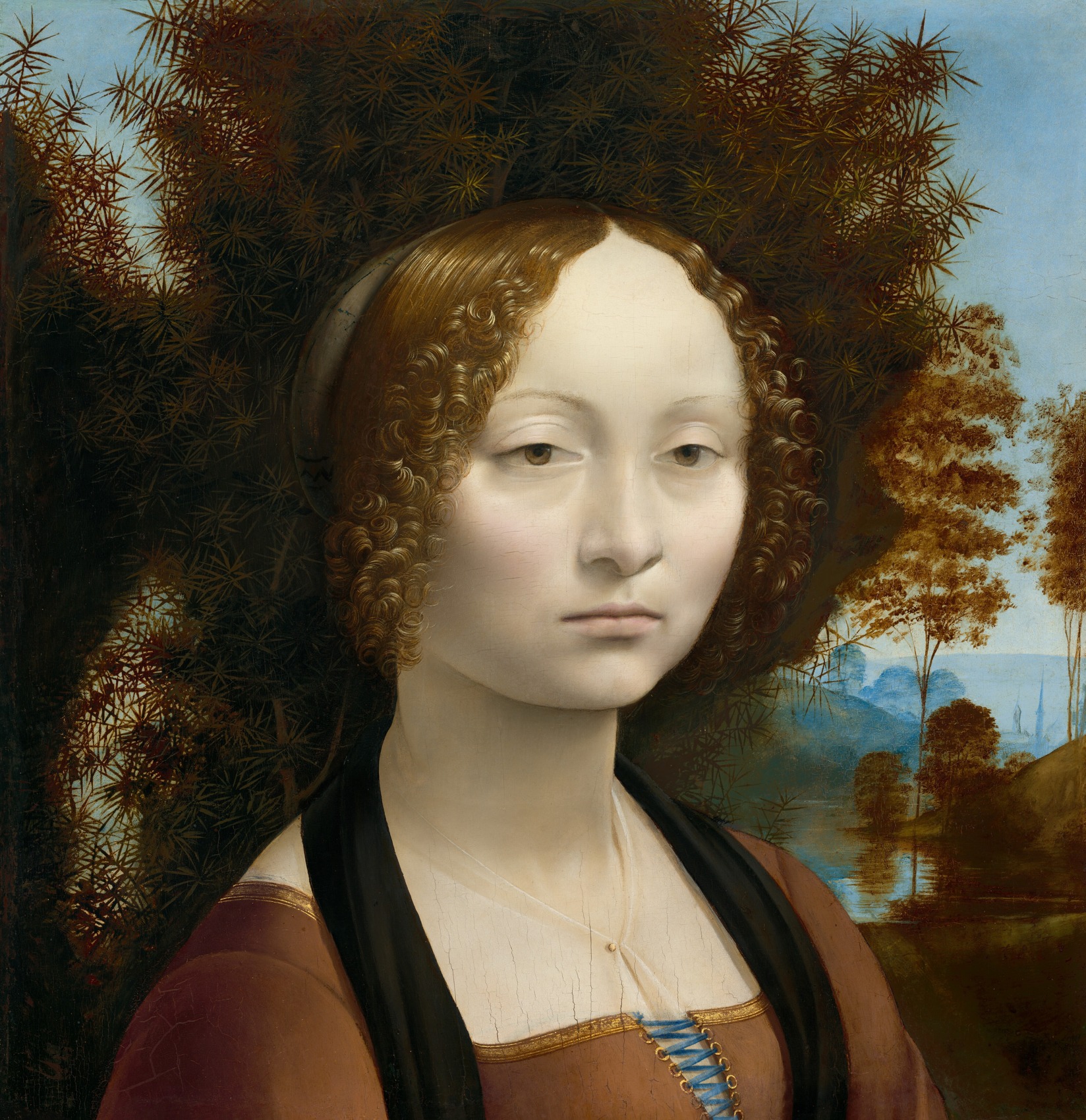
This is a useful counterexample to “never put the subject near the center.” The figure holds a prominent position, but the whole image is not a mirror arrangement. The turn of the body, uneven background, and relationship between the pale face and darker foliage matter together.
My reading would be: a dominant portrait held against a dark background, with unequal surroundings keeping the picture from becoming a simple left-right repeat. That describes visible relationships. It does not establish where every viewer looks first or explain Leonardo’s intention.
2. Unequal figures can be connected across the picture
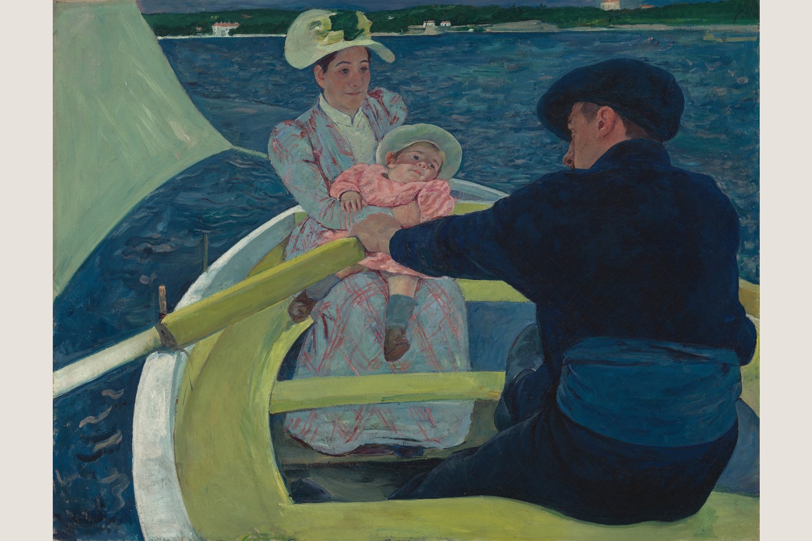
Mary Cassatt’s The Boating Party places a large, dark rower in the foreground on the right, with the mother and child farther back toward the left. The boat’s pale edges and yellow-green supports cut across the water and the figures. A curved sail occupies the left; the distant shore sits near the top.
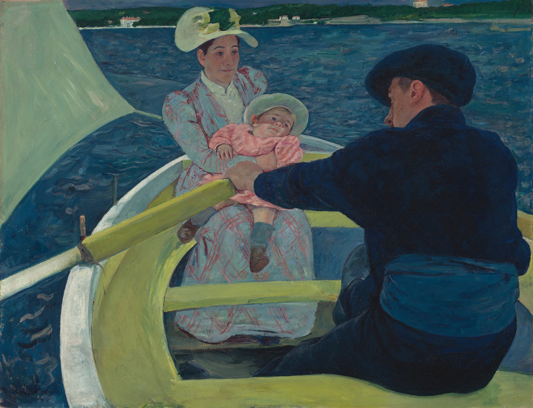
One way to read the arrangement is to start with the rower’s dark back, follow his extended arm across the boat, and compare it with the mother’s arms holding the child. Another is to begin with the light hats and faces, then notice how much larger the rower appears. The diagonal supports give these separated areas a visible connection.
I find the unequal scale especially useful here: the large foreground body makes the mother and child seem farther away, while the arm and boat structure keep the group connected. Calling it simply an “off-center composition” would miss much of that work.
This is also why the full reproduction matters. A crop around the mother and child would preserve two recognizable figures but remove the relationship we are trying to describe. The crop would be a different arrangement, even though the subjects remained the same.
3. Repetition can connect several areas of interest
In Whispart’s A Garden of Teeth, large red organic forms appear at the left, lower center, right, and bottom edge. Black branching shapes cross the blue field. A smaller face-like form sits left of center, among several larger forms.
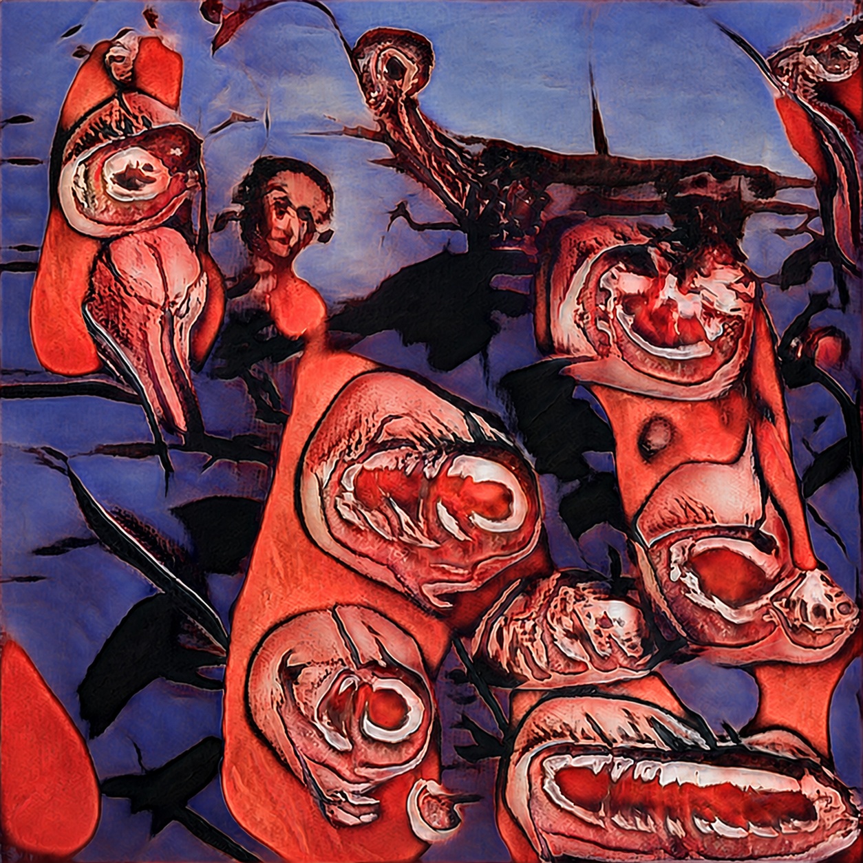
The repeated reds give us a way to compare separated parts of the picture. Their outlines and inner shapes vary, so the repetition is not a row of identical motifs. The dark branches provide additional connections across the blue intervals.
I would describe this as distributed interest connected by recurring red forms and branching dark shapes. A viewer might pause at the smaller face-like area, but it is not necessary to make that area the only focal point for the arrangement to be readable. Several areas can remain active at once.
This is an original artwork image used for a composition reading. It does not demonstrate the texture, printing, framing, or appearance of a physical product. The interpretation concerns what is visible in the reproduced image.
One studio choice: branches, openings, or a concentrated center?
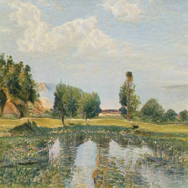
A composition preference is easier to discuss when the alternative is still visible. In the selection case documented in our studio’s looking notes, we kept seed 2723 and did not select the alternative, seed 2998. These are digital GAN outputs from one review set. They are not photographs of prints or a record of a customer’s choice.
The selected image leaves more pale intervals through its branching dark forms. Look between the separate trunks and the limbs extending towards the top and sides. In our reading, those openings keep the dark shapes connected without gathering all their weight into one central block.
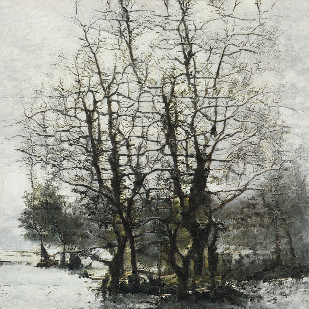
The alternative also has pale space, especially around the trees. The difference is where that space falls: the overlapping dark forms collect more tightly near the center, with a lighter field outside them. I find that central concentration more enclosed than the branching intervals in the selected image.
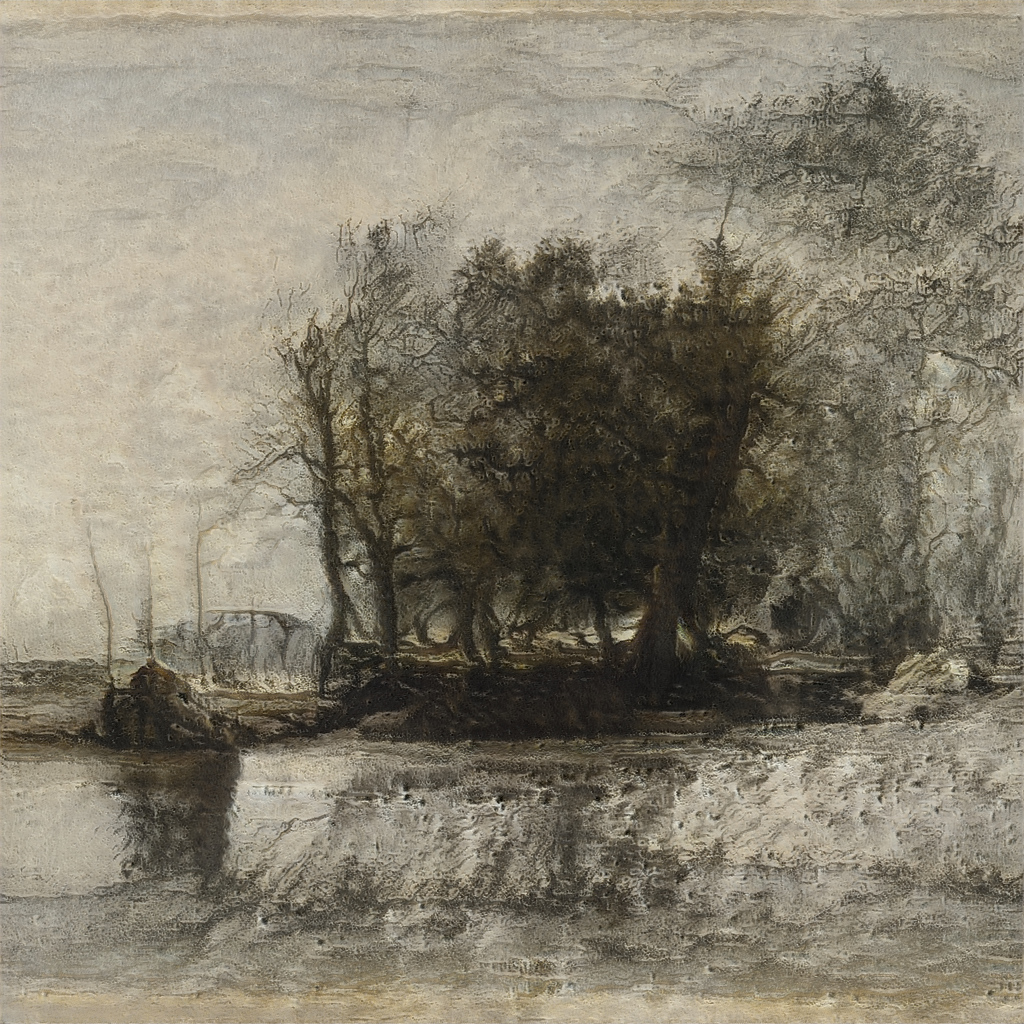
For this selection, we favored the relationship between branches and openings. If the wanted quality were a compact, weighty center, the alternative could be the stronger choice. It was not a failed composition, and this case does not establish that every work we keep must be airy. It shows a preference we can explain—and someone else can disagree with—by pointing to the arrangement.
Use one precise sentence when you look again
You do not need to identify every possible compositional device. Try finishing this sentence: “The picture connects ___ and ___ through ___.” For Cassatt, our completed answer is: “The picture connects the foreground rower and the mother with child through the extended arm and crossing boat structure.”
For a reference that makes several figures at different depths easy to discuss, I would choose Cassatt here: the arm and boat supports connect the rower with the mother and child. Change the question to one prominent portrait with unequal surroundings, and Ginevra is more useful; for repeated forms connecting several active areas, I would use A Garden of Teeth. That is a choice of reference for a question, not a ranking of the works.
Then check the full image. Does that sentence account for an important relationship, or only a small detail? If your question is specifically about gaps around and between a subject, continue with our examples of negative space in art. Composition includes those gaps, but also asks how the surrounding spaces, forms, colors, and directions organize the whole.
Questions about composition in art
Is composition the same as the subject of an artwork?
No. The subject is what the work depicts or concerns. Composition is how its visible parts are arranged and related. Two pictures of the same subject can have very different compositions.
Does every artwork need one focal point?
No. A work may organize attention around one prominent subject, several connected subjects, or recurring forms spread across the image. Look for the relationships rather than assuming one arrangement is required.
Must a good composition follow the rule of thirds?
No. The grid is a useful comparison tool, not a universal requirement. Prominent portraits, symmetric arrangements, and distributed patterns can work through different relationships.
How can I describe composition without claiming the artist’s intention?
Name visible relationships: relative placement, scale, tone, repeated forms, overlaps, or directions. Say “I read this as…” when interpreting their effect, and distinguish that reading from documented evidence of intention.