Complementary Colors in Art: How Opposite Hues Work Together
Complementary colors sit opposite each other on a color wheel. In the traditional artist’s red–yellow–blue model, the pairs are red and green, blue and orange, and yellow and violet. In a painting, their relationship depends on where they meet—not on keeping every other color out.
Beside each other is different from mixed together
Two complementary colors can remain distinct on the canvas. The same colors mixed on a palette may produce a much less intense color. These are different operations; a lively red–green painting does not contradict a dull red–green paint mixture.
Tate’s complementary-colors definition gives the traditional pairs and explains their contrasting effect. That wheel is the reference used here. If an RGB screen-color tool gives a different opposite, first check the model; our guide to primary colors in art explains the distinction.
I start with the location of the colors rather than the label “complementary.” A useful description should let another person find the relationship in the picture. The three works below show a scattered contrast, a contrast around a face, and a contrast across a landscape.
Red and green: small marks within Monet’s field
In Claude Monet’s Poppy Field (Giverny), look below the distant row of trees. Red-pink marks appear among the greens of the meadow. They are scattered through a changing surface, rather than placed in two separate blocks.
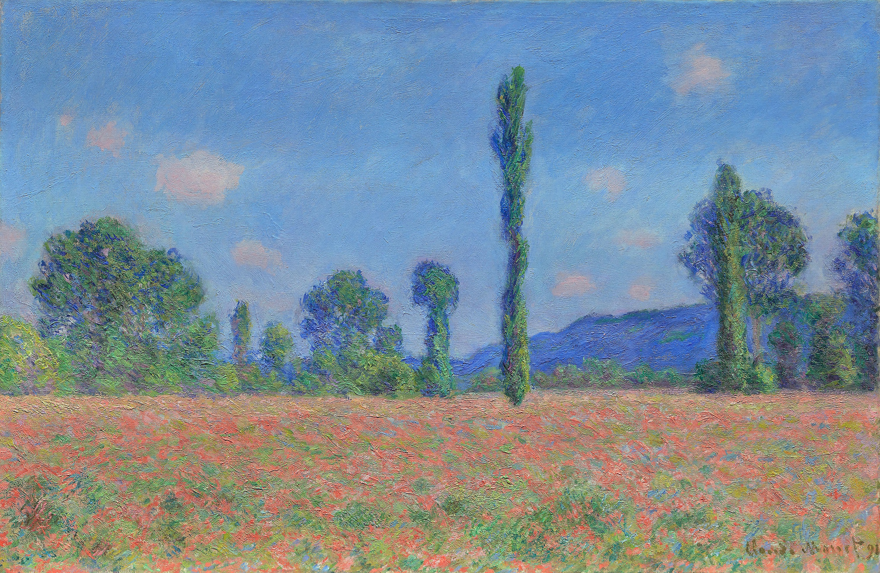
The flower marks remain distinguishable from the green passages around them. The red–green relationship is local and repeated: the eye can encounter it at several places across the foreground. Above it, the blue sky and darker trees belong to the same painting without needing to fit that pair.
My reading is that the repeated contrast helps articulate the field’s surface. I would describe it as red-pink accents among greens, not as a picture made only from red and green. This wording also avoids pretending that every stroke is a pure color-wheel swatch.
Blue and orange: a contrast concentrated around Van Gogh’s face
Now compare the distributed poppy marks with the orange-rust beard in Van Gogh’s 1889 Self-Portrait. The beard forms a more concentrated area within the surrounding blues of the coat and background.
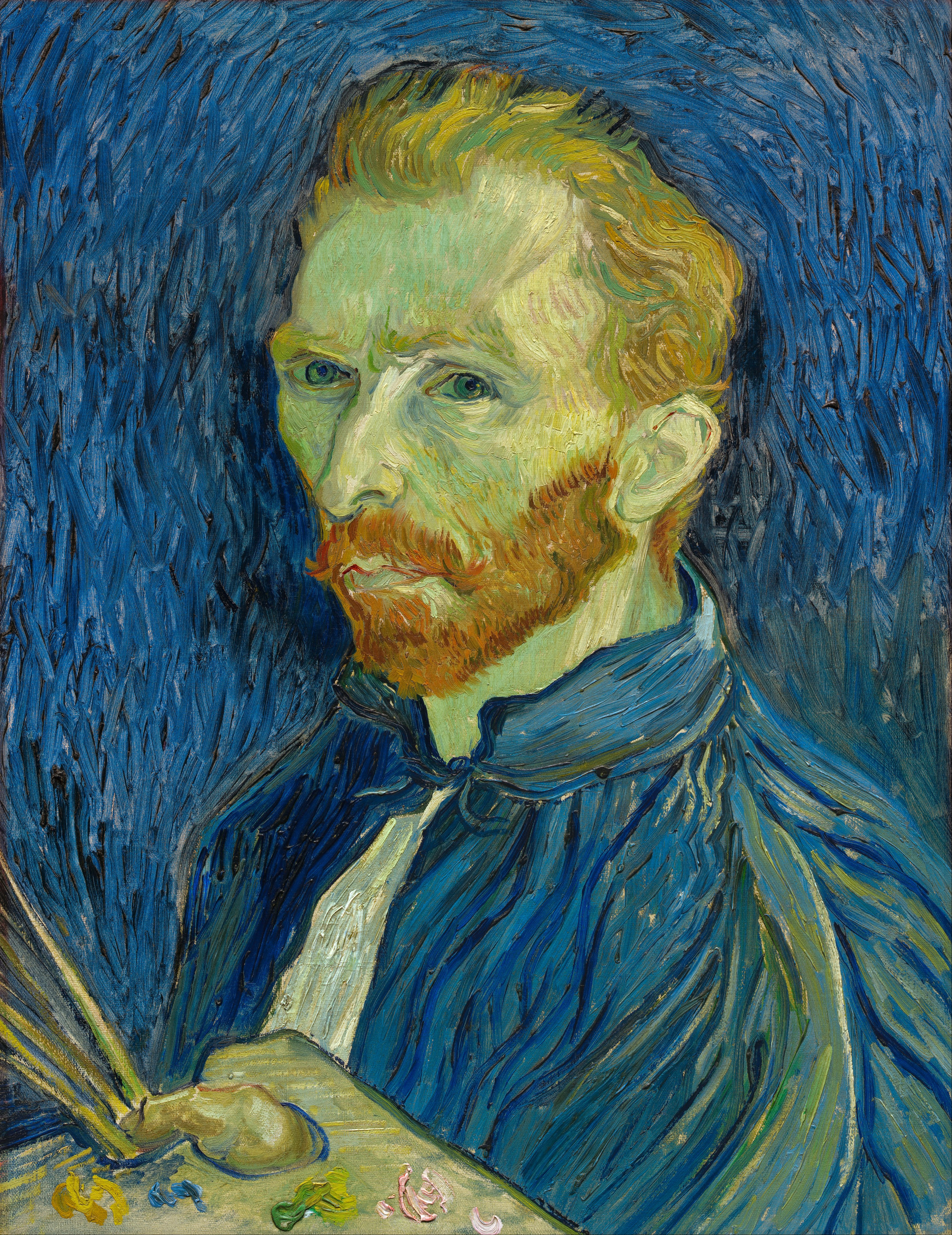
The warm beard gives the lower face a colored boundary, while blue continues across clothing and surrounding space. Pale greenish skin and dark features contribute their own contrasts. The orange does not have to touch blue along every edge for the larger relationship to be legible.
I would use this work to explain where a complementary relationship is concentrated. “Blue and orange” names the pair; “the beard within the surrounding blues” explains its position. It does not explain the portrait’s whole emotional effect, which also involves the gaze, pose and restless marks.
Yellow and violet: read the actual colors in The Sower
In The Sower, the yellow sun and sky sit above a field filled with blue-violet strokes. Look at that upper-to-lower relationship, then notice the orange and lighter marks woven into the ground.
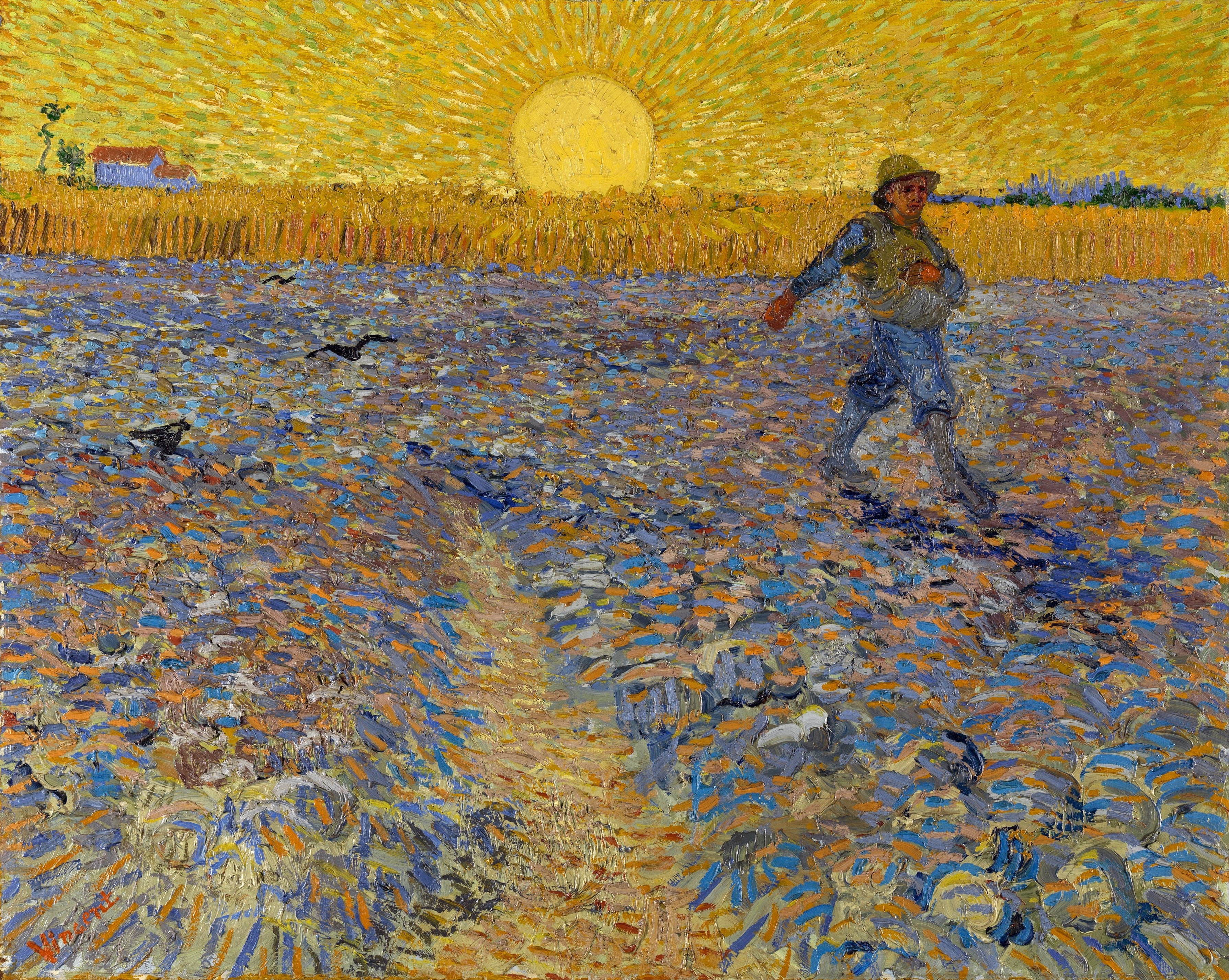
This is a useful yellow–violet comparison with a qualification: the ground is visibly blue-violet and varied, not a uniform patch of pure violet. The museum’s account also identifies blue-violet and orange paint in the field. Calling the whole lower area simply “purple” would miss those distinctions.
Here the relationship spans broad regions of the landscape. In Monet, the red-pink contrast is dispersed within the field; in the portrait, the orange is concentrated around the face. The pair’s placement gives each example a different structure. None needs a strict two-color limit.
Why a complementary pair may feel harsh—or surprisingly quiet
Being opposite on a wheel does not guarantee that two colors will feel balanced. Both can compete for attention; either can be subdued. Lightness, intensity, surrounding colors and the location of their edges all affect what we see. Our muted-color guide develops the intensity distinction.
For a reading of the three paintings, I would keep the observed colors specific: red-pink among greens, an orange-rust beard within blues, yellow above a blue-violet field. If a proposed pair is hard to find, I would revise the description rather than force the painting into the diagram.
Nor does the wheel supply an exact paint recipe. GOLDEN’s discussion of neutralizing color shows why actual pigments and mixing proportions matter. Different paints sold under a broad color name need not neutralize in the same way. A reproduction can help us discuss visible relationships; it cannot identify the artist’s original pigments or mixing ratios.
FAQ
Does complementary art mean using only two colors?
Not here. A painting can use a complementary relationship within a much wider palette. Monet’s field includes a red–green relationship alongside the blue sky and other colors.
Do complementary colors always mix to brown?
No fixed result follows from two broad color names. Actual pigments and proportions affect the mixture, which may be a subdued hue or a near-neutral. Placing colors beside each other is a separate visual effect.
Can complementary colors be muted?
Yes. Opposite hue families can appear in subdued versions. A pair need not be bright to be recognizable, and a complementary scheme is not a guarantee of high contrast in every respect.
Is every attractive pair complementary?
No. Complementary describes a particular relationship on a named color wheel, not a synonym for colors that look good together. Adjacent or other color relationships can also be effective.
Sources and image notes
The linked museum records identify the works and dates. Tate supplies the traditional definition; GOLDEN addresses physical paint mixtures. Descriptions of placement and visual roles are our editorial readings of the reproductions, not a report of viewing or testing the original objects. Screen appearance can vary.
Questions about blending versus neighboring colors and color-wheel relationships informed the explanations; community discussion is not a measure of how all artists work. Cover: Vincent van Gogh, The Night Café, 1888. Yale University Art Gallery, Bequest of Stephen Carlton Clark, B.A. 1903. Museum record; public-domain image source.