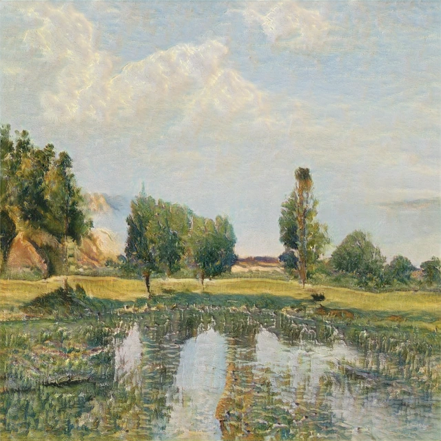
What Are Muted Colors? Soft Color Can Still Have Tension
A silvery landscape, a dark portrait and an ambiguous face can all contain subdued color. Their differences show why “muted” describes only part of a picture.
Corot: subdued color still contains several hues
In Jean-Baptiste-Camille Corot’s Ville-d’Avray, look separately at the sky, trees and foreground bank. Each is subdued, but they are not all the same color.
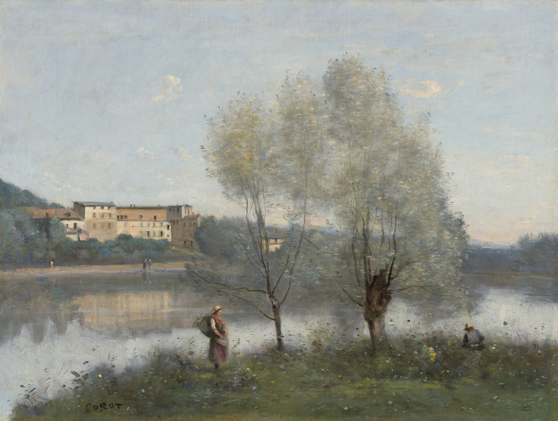
The pale sky and water lean blue-gray; the trees contain silvery greens; the bank moves into olive and brown. Cream buildings add another light, warmer area. Those hue differences survive the subdued intensity.
I find “several softened color families” more accurate here than “almost no color.” The darker trunks and bank also matter. They give the pale sky and water something to stand against, so the landscape does not depend on vivid color alone to remain legible.
This distinction also separates muted color from monochromatic art. Monochromatic concerns a single hue family; muted concerns intensity. A picture can contain many muted hues, as this one does.
Saturation and value answer different questions
Saturation asks how vivid a color is; value asks how light or dark it is. A grayish pale blue and a grayish deep blue can both be muted. Their values differ. Art Prof’s written lesson on saturated and muted colors specifically identifies confusion between value and saturation as a common problem.
On a narrow screen, scroll sideways to read all columns.
| Word | What it helps describe | What it does not settle |
|---|---|---|
| Muted | Relatively subdued color intensity | Whether the color is light, dark or emotionally calming |
| Pastel | A light color, often softened | Whether every color in the picture has low saturation |
| Neutral | Strictly, achromatic black, white and gray; more loosely, restrained browns or beiges | Whether the picture lacks a strong light–dark structure |
These everyday labels can overlap. A dusty pale pink may be both pastel and muted. A dark gray-green may be muted without being pastel. Look at the actual color instead of treating the words as sealed categories.
Whistler: low saturation with a strong light–dark focus
James McNeill Whistler’s The Violin Player gives us a darker example. Compare the dusty pink and lavender of the bodice with the brown-gray background, then find the lightest passages.
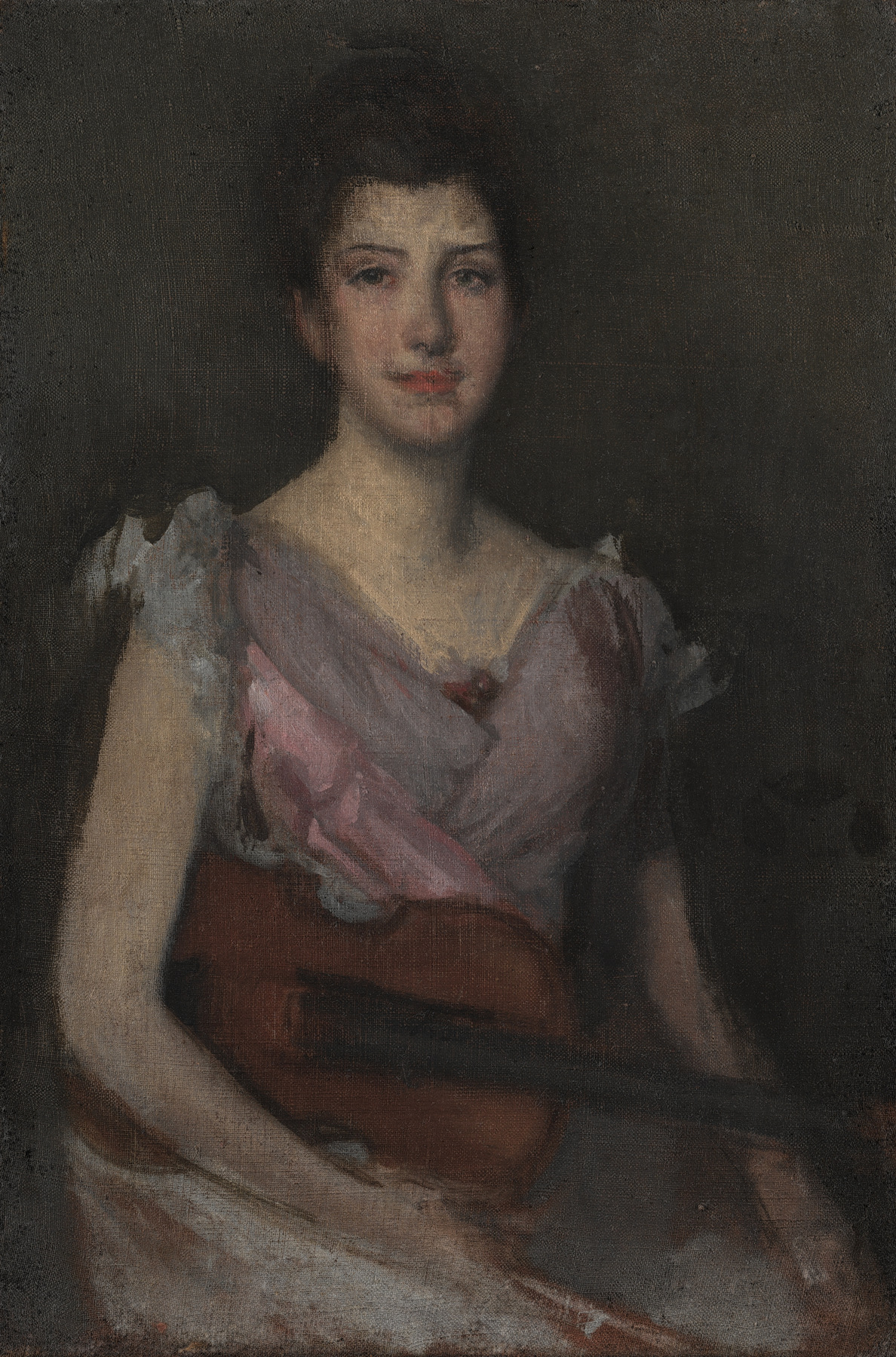
The face, chest and exposed arm stand out against the dark ground. The dress retains pink and violet color; it is not simply gray. The reddish-brown violin introduces another subdued hue near the lower center.
We can therefore describe the work as predominantly dark, with restrained color and a lighter figure. Calling it muted does not mean it lacks contrast. Corot and Whistler are independent works, but together they make the vocabulary concrete: subdued color can occur in a pale open landscape or a dark portrait.
If you want artwork that adds less vivid color to an already colorful space, that is a useful distinction. A low-saturation image can still command attention through light and dark. Our guide to tonal contrast explains that separate property; the reproduction alone cannot predict the effect in your room.
Quiet color can leave the subject unresolved
At Whispart, we value pictures whose structure holds together even when every form does not immediately resolve. That is an aesthetic preference, not a requirement that all good art should be mysterious. Birds Know First offers a specific example to look at.
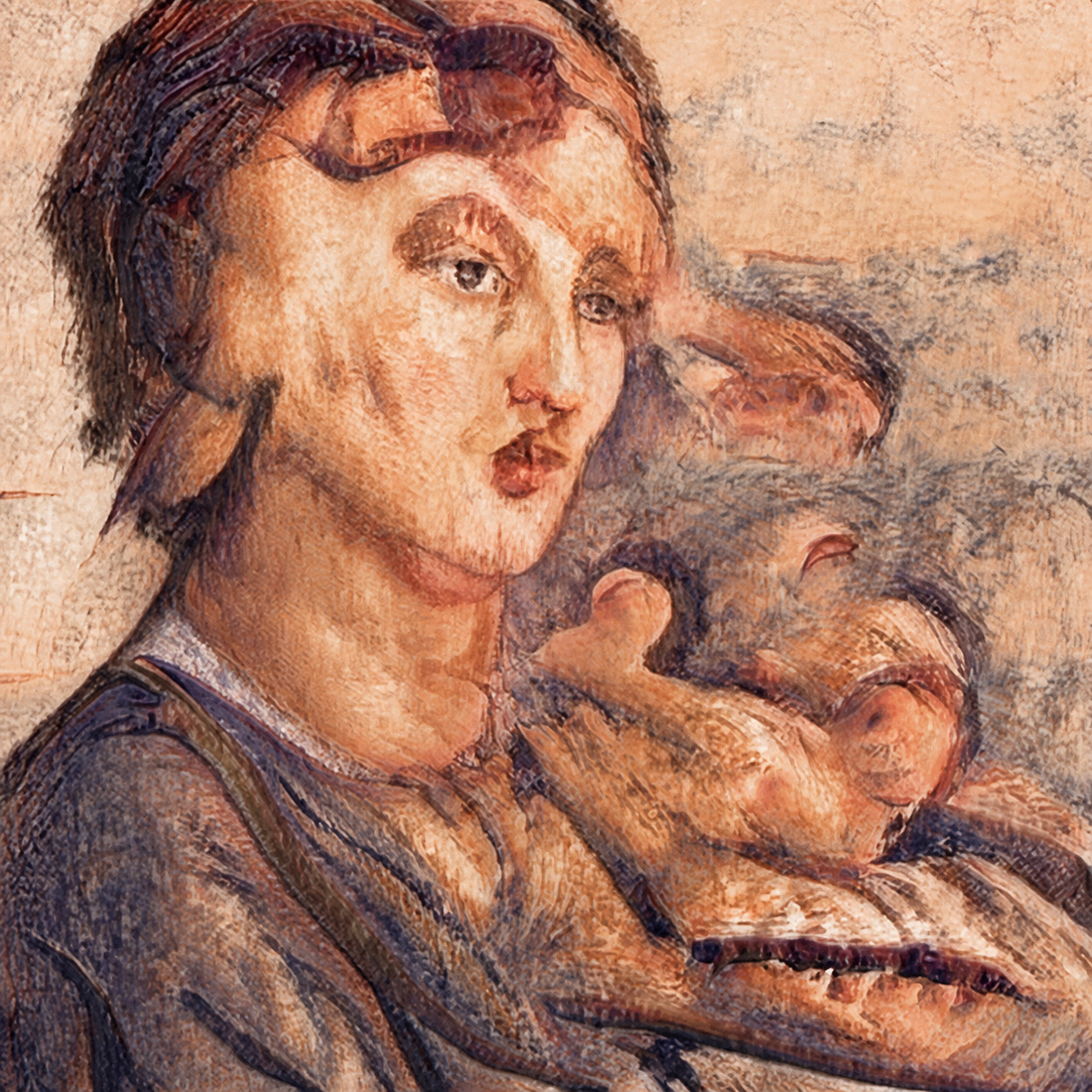
The blue-gray and earth-toned passages are restrained, while parts of the peach and rust are stronger. Dark outlines pull the face and neighboring bird-like forms forward. Their overlapping boundaries leave some of the subject uncertain.
To my eye, the interest lies in that uncertainty more than in a burst of vivid color. The palette can be relatively quiet while the eyes, beak-like shapes and close grouping remain insistent. Muted does not have to mean bland, and it does not promise a peaceful emotional response.
If that combination is what drew you to this example, the linked artwork page is the place to examine its current presentation. The reason to follow it is specific: the relation between subdued passages and unresolved forms, rather than a general claim that muted artwork suits every home.
FAQ
Are muted colors always light?
No. Whistler’s dark background and subdued dress show why low saturation should not be confused with a pale value. Lightness and intensity need separate descriptions.
Are muted colors the same as pastels?
No. Pastel usually describes a light color. Muted describes subdued intensity. A pale dusty color can be both; a dark muted olive is not a pastel.
How do artists mute a paint color?
Mixing with a suitable neutral or a complementary color can reduce its intensity. The result depends on the actual pigments and proportions and may change value or hue as well. There is no universal “add gray” recipe that guarantees all other properties stay fixed.
Are muted colors always calming?
No. They describe a color property, not a guaranteed feeling. A pale landscape, a watchful portrait and an ambiguous cluster of faces can use subdued colors for very different experiences.
Sources and image notes
The National Gallery of Art and Cleveland Museum of Art records identify the historical works and image permissions. Art Prof’s written lesson supplies the distinction between intensity and value. Color descriptions and readings of the three images are our editorial analysis of digital reproductions, not measurements of original surfaces or tests of physical prints.
Public questions about understanding color, muted colors and neighboring terms, and a picture feeling bland helped focus the explanation. Their replies do not establish audience-wide preferences. Cover: Corot’s Ville-d’Avray, public-domain National Gallery of Art image; the complete work appears above. Museum reproduction does not imply endorsement.