Primary Colors in Art: RYB, RGB, and What a Painting Shows
Red, yellow and blue are the familiar answer. Understanding when that answer applies makes it easier to talk about both color systems and actual paintings.
Why do different sources name different primaries?
“Primary” describes a color’s role within a system. Changing from a traditional color wheel to light or process inks changes the starting set and how colors combine.
On a narrow screen, scroll sideways to read all columns.
| Context | Starting colors | What the distinction means |
|---|---|---|
| Traditional art teaching | Red, yellow, blue — RYB | A familiar wheel for discussing primary, secondary and related hues. |
| Screens and colored light | Red, green, blue — RGB | Additive color: combining the light channels at full intensity produces white. |
| Process printing | Cyan, magenta, yellow — CMY; black in CMYK | Subtractive color: inks absorb portions of the light reflected from the surface. |
Adobe’s color-mode explanation describes RGB and CMYK in their digital and printing contexts. It also explains why their reproducible color ranges differ. None of these three-color sets reproduces every color we can see.
In the traditional RYB wheel, red with yellow gives the orange family, yellow with blue gives green, and blue with red gives violet. Treat that as a basic relationship, not a guarantee that any two paint tubes will produce the vivid color you imagine. Actual pigments and proportions matter.
Mondrian: three primary hues, unequal amounts
In Piet Mondrian’s Composition with Red, Yellow, and Blue, find the red at the upper left, the narrow yellow strip at the right and the blue band near the bottom. Then compare how much space they receive.
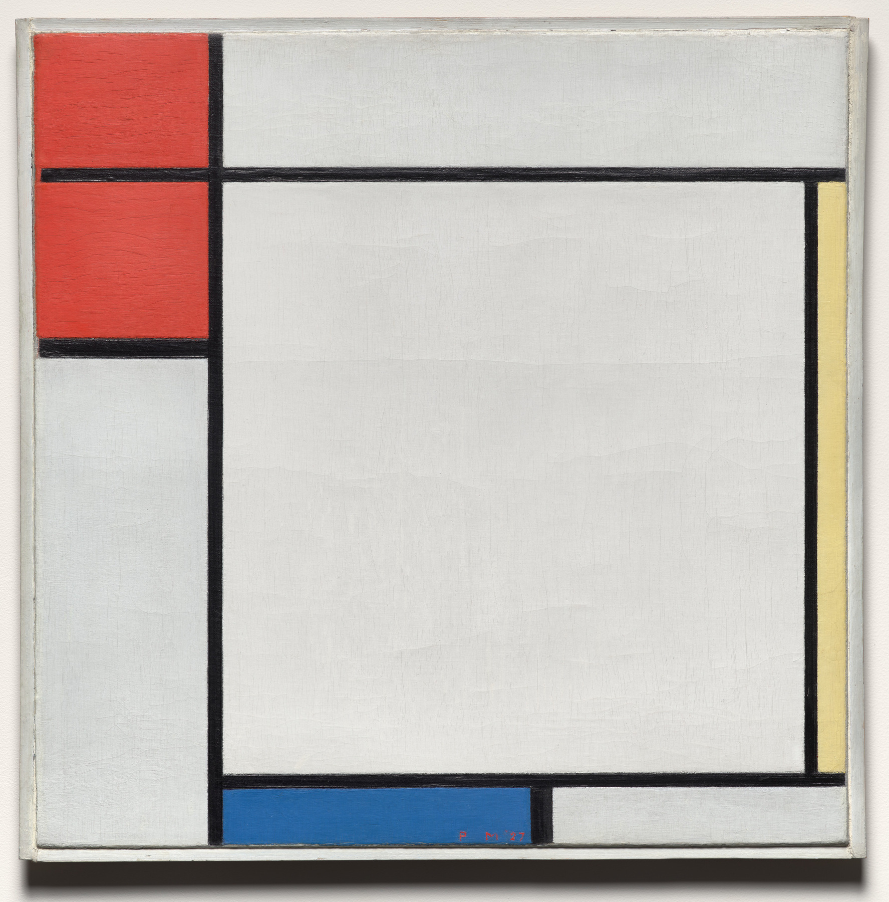
The red occupies more area than either narrow colored band. Black divisions and large pale rectangles occupy much of the picture. Calling this a primary-color palette does not require three equal portions, or the absence of black and white.
I find the unequal distribution more useful than simply counting three colors. The small yellow edge has a different job from the broad red area: it brings color to the far side of a mostly pale field. The blue band adds another colored edge below. Their positions matter as much as their names.
This is a completed description of what we can see: three primary hue families, unequal areas, and a substantial neutral structure. It is not a reconstruction of Mondrian’s paint mixtures. For the broader relationship between areas, edges and balance, see our guide to composition in art.
Cézanne: the same color families inside a wider palette
Now look at Paul Cézanne’s portrait of Hortense Fiquet. The red dress, yellow chair and blue areas of the wall give us a recognizable relationship. They do not behave like three flat, standardized swatches.
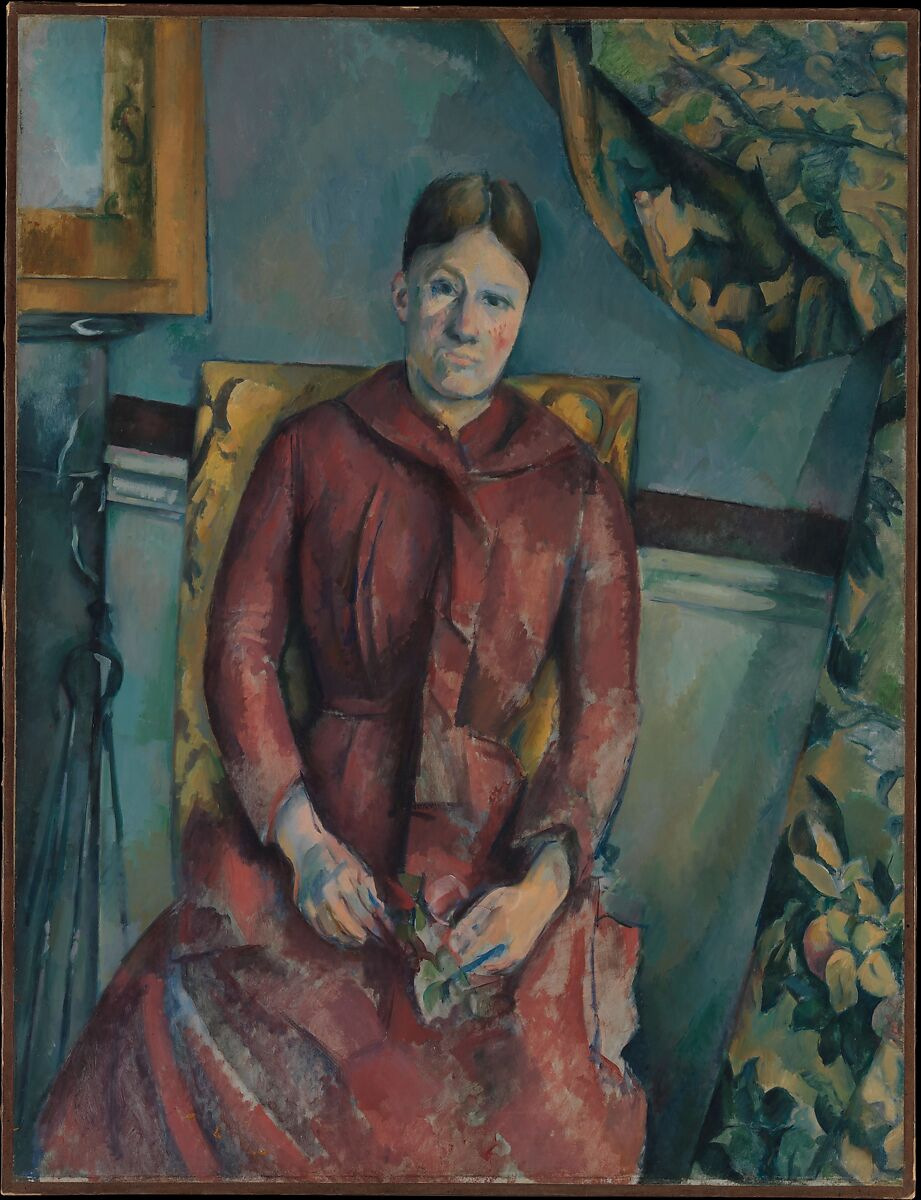
The dress moves through lighter red and darker maroon passages. The chair’s yellow approaches ochre; the wall shifts between blue and green. Browns, grays and pale skin tones also belong to the picture.
We would describe this as a red–yellow–blue relationship within a broader palette. That wording preserves what makes the comparison interesting: recognizable objects carry the colors, and each large area contains variation. Calling the entire work “only primary colors” would erase those visible differences.
Mondrian makes the selected hue families unusually easy to isolate. Cézanne shows why recognizing those families does not require every passage to fit a simple wheel. Neither image tells us exactly which tubes, mixtures or layers produced its surface.
A primary palette is a useful description, not a three-tube rule
Artists may use a limited set of paints, but “primary colors” does not oblige them to use only three. For example, GOLDEN’s OPEN mixing set includes warm and cool choices for each traditional primary, alongside other colors. The material choices are more specific than the word “red.”
When reading a painting, we would keep two questions separate: Which color families organize the image? and What materials produced them? The examples above answer the first. A documented palette or technical examination would be needed for a reliable answer to the second.
If your question is instead how a work can vary while staying within one hue family, our monochromatic artwork guide takes that distinction further.
FAQ
Are the primary colors red, yellow and blue, or red, green and blue?
RYB is the traditional artist’s teaching model. RGB describes additive colored light, including screens. Name the context before deciding which set applies.
Are black and white primary colors?
They are not the primaries in the RYB model. They can still be essential to a primary-color composition, as the black divisions and large pale areas in Mondrian demonstrate. CMYK’s black is an additional printing channel.
Can three primary paints make every color?
No. A particular pigment set has limits, and its mixtures depend on the pigments and proportions. A simple wheel is a teaching aid, not a promise of every visible color.
Does a painting with primary colors have to look bright?
No. Hue family and color intensity are different properties. Cézanne’s ochre chair and varied red dress make the RYB relationship less like three vivid swatches, while remaining recognizable.
Sources and image notes
The museum records identify the works, dates, media and image permissions. Adobe supplies the RGB/CMYK distinction; GOLDEN supplies a concrete example of a manufacturer’s pigment selection. Our descriptions of color areas and their roles are editorial readings of the linked reproductions, not measurements of the original paint.
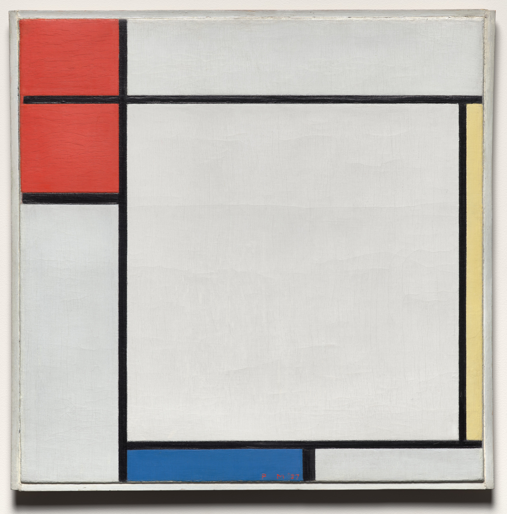
Artist discussions about conflicting primary-color models and working with red, yellow and blue paints helped identify the questions addressed here. They are not evidence of universal artist practice. Cover: the Cleveland Museum of Art’s Mondrian reproduction; the complete work appears in the body. Museum reproduction does not imply endorsement.