AI Art Styles With Examples: A Visual Guide to Finding Your Look
Learn to recognize four visual directions through their edges, shapes, marks, and detail, then turn what you notice into a specific preference.
Start with what changes in the picture
AI art styles are names for different visual treatments, not different kinds of AI. A geometric image organizes clear shapes; a painterly image suggests marks and layered color; a photographic treatment imitates camera-like detail and light. Some labels describe a medium, others a movement, mood, or way of composing a scene. They can overlap in one picture.
This guide takes a close look at four illustrated directions: geometric restraint, soft organic abstraction, gestural abstraction, and surreal collage. It is a small comparison for learning to describe what you like, not a complete catalog of AI art styles or a set of generator presets. Start by looking at edges, shapes, marks, and detail. Choosing a style for a room comes later.
Four examples: what to notice in each
Read the panels from left to right. Compare how each uses a similar muted palette, but organizes edges and detail differently. The compositions differ, so this is not a same-subject experiment or a test of what one prompt will produce.
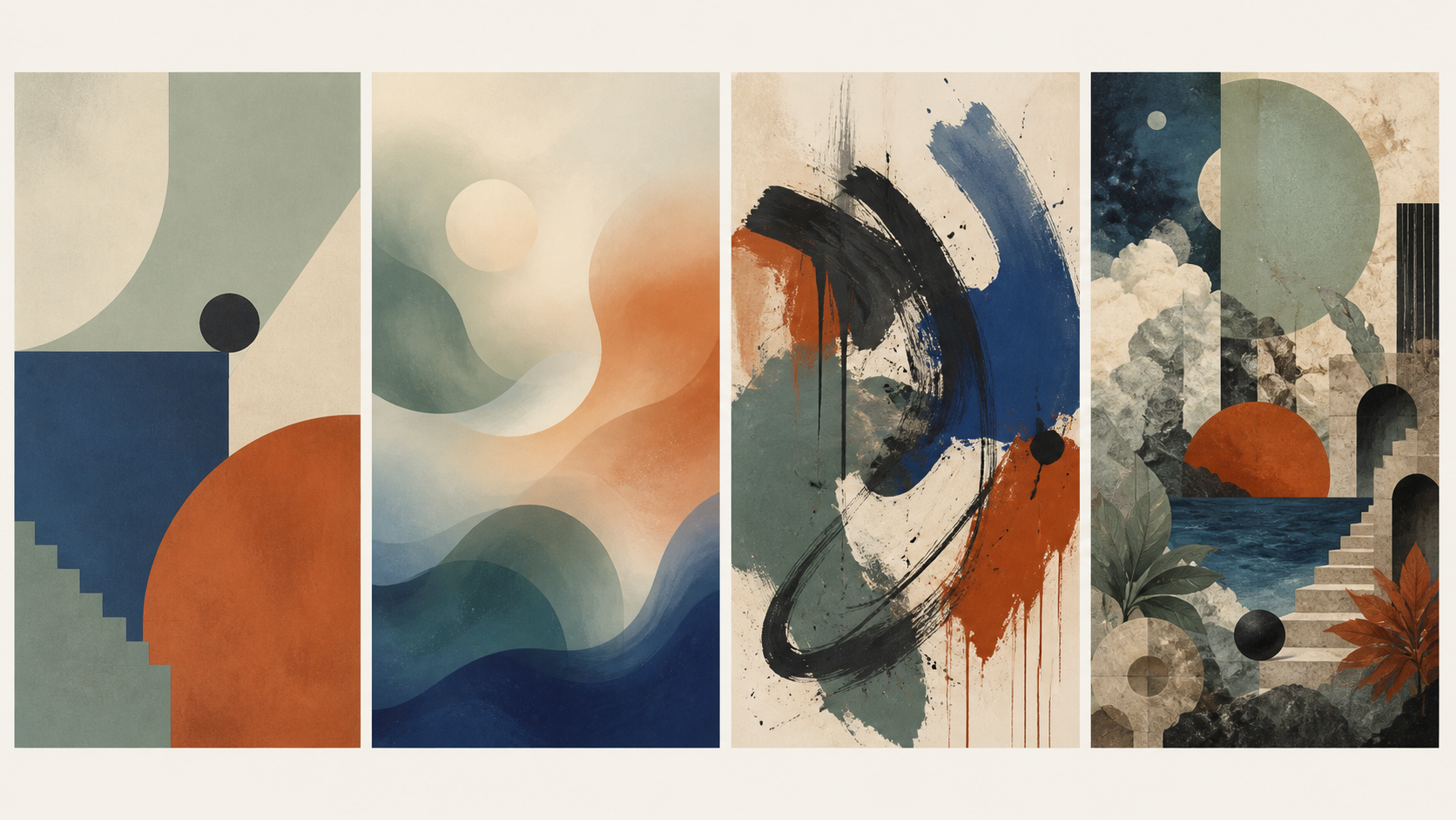
Open the four examples at full size to inspect the edges, surface grain and brushlike marks. On a phone, pinch to zoom after opening the image.
1. Geometric restraint: clear boundaries do the work
In the left panel, the dark circle, broad blue area, stair-step edge, and orange curve remain easy to separate. There is surface grain, but it does not dissolve the outlines. The useful description is “large geometric shapes with restrained detail,” rather than simply “minimal.” Minimalism concerns reduction; geometry concerns shape. A geometric picture can also be busy.
2. Soft organic abstraction: the transitions carry the image
The second panel uses flowing contours and hazy overlaps around a pale circle. Its green, cream, orange, and blue areas seem to pass into one another instead of meeting at a uniformly crisp boundary. This is the softer alternative if you enjoy flowing forms. The pale circle is still a defined shape: “organic” does not require every edge to disappear.
3. Gestural abstraction: follow the apparent movement
In the third panel, black and blue sweeps, streaks, and drips make the marks themselves conspicuous. Compare its forceful dark arc with the second panel’s blended transitions. Both are abstract, but one emphasizes the energy of a mark and the other a gradual change of color. These generated brushlike textures do not establish that the image was physically painted.
4. Surreal collage: recognizable fragments form an impossible place
The right panel combines stairs, rocks, leaves, sky-like areas, circles, and architectural openings in a discontinuous space. You can recognize fragments without being able to map a real location. “Surreal” describes the dreamlike relationship; “collage” describes the assembled look. Neither term tells you which software was used.
A completed choice between two looks
Suppose you like flowing shapes and want quiet transitions, but dislike dense, high-contrast marks. Between panels two and three, choose the soft organic direction in panel two: its overlapping color areas satisfy that preference with less emphasis on sharp dark strokes. You give up some of panel three’s visible energy. If expressive movement is what attracts you most, reverse the choice and begin with the gestural panel.
The outcome is a useful description to carry to the next image: “flowing shapes, muted color, soft transitions, few forceful dark marks.” That is more specific than asking for “abstract AI art,” which could describe both candidates.
What an AI art style actually describes
In art history, style can describe a recognizable manner of expression. In current AI-image guides, it is also used as shorthand for a bundle of visual instructions. Neither use is wrong, but they are not interchangeable. ‘Watercolor’ points toward a medium and its familiar effects. ‘Minimalist’ may point toward restraint in shape, palette, and detail. ‘Cinematic’ often signals lighting, framing, and atmosphere more than any one material.
Other guides also cover watercolor-like rendering, photorealism, anime, and pixel art; these are outside the four pictured examples here. The Kling style guide offers a wider illustrated catalog. For the particular image in front of you, five plain questions can be more useful than a long list of names: Is the surface smooth or tactile? Are the forms geometric, loose, or descriptive? Is the palette quiet or high-contrast? Does the space feel open or crowded? Is the mood intimate, playful, distant, or dramatic? You do not need to speak fluent gallery label to answer them. Your eyes have been practicing since childhood; they just have not always been given a clipboard.
The Museum of Modern Art glossary makes a similar distinction between medium, composition, color, and style. Keeping those parts separate protects you from a common disappointment: buying an image because you like a category, then realizing you do not like the specific color pressure or visual noise of that particular example.
A small looking practice before you commit to a label
- Start with the paletteName the two or three colors that carry the image. Notice whether their contrast attracts you before deciding where the picture might go.
- Follow the edgesHard edges tend to feel more graphic and deliberate. Soft, broken, or dissolving edges tend to feel atmospheric or painterly. The edge behavior often tells you more than a style tag does.
- Check the distanceLook once at thumbnail size and once at the size it would occupy on a wall. A good image usually has a simple first read from across the room and a second read when you are close.
- Say the feeling out loudTry a sentence that begins, ‘I prefer this image because…’ Name a visible reason: open space, soft transitions, energetic marks, or details worth exploring. If the choice is for a room, then ask whether that quality belongs there.
Choosing a style for a real room, not a very persuasive rectangle on a screen
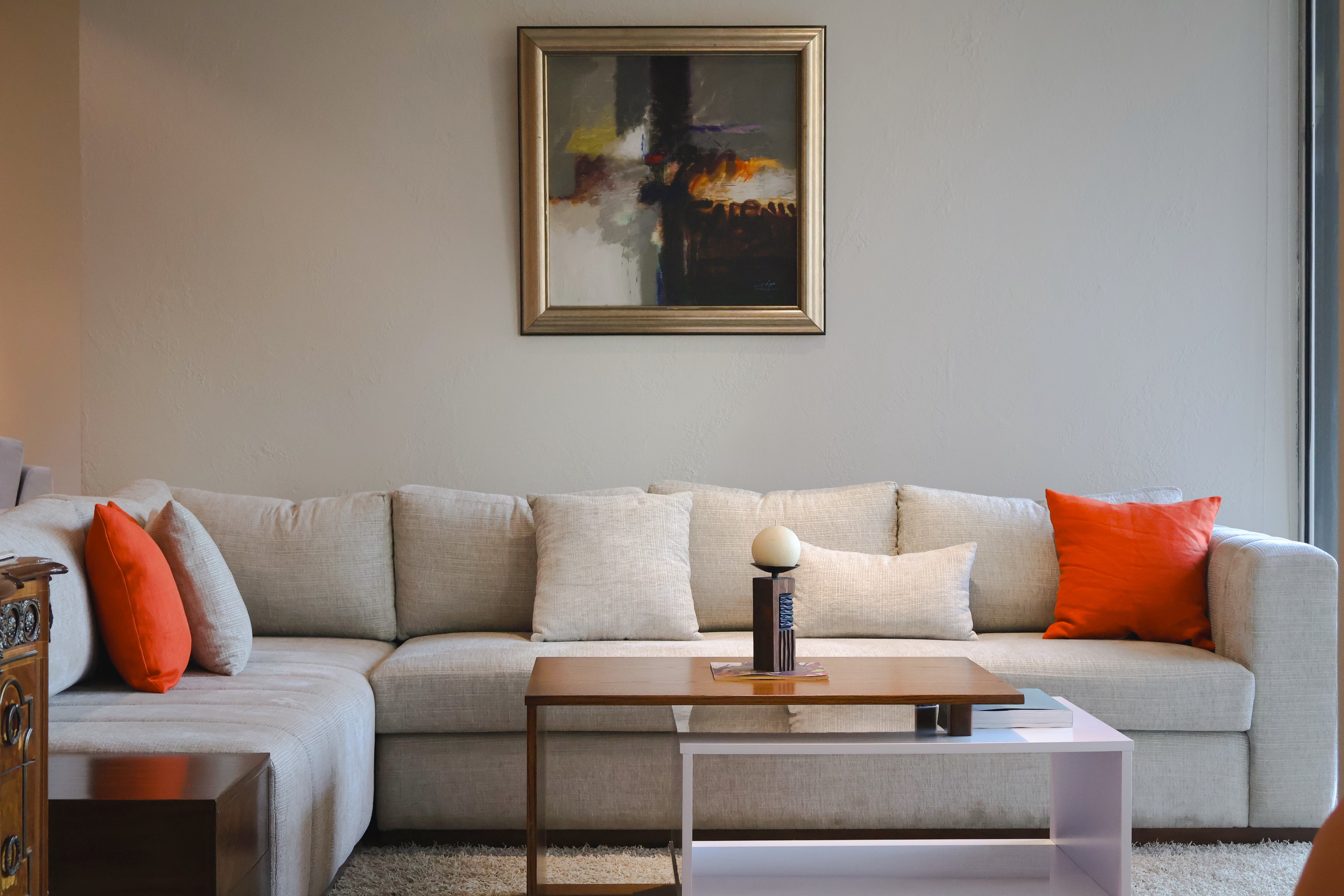
A screen flattens size, texture, and context. A room does not. Before you choose, picture the work beside the furniture, under the light you actually have, and at the distance from which you will usually see it. An abstract image with a muted palette may become a resting place above a sofa; a sharp graphic work may provide the structure a soft, neutral room has been missing.
Notice how much visual activity the room already carries. Patterned textiles, books, plants, and objects can be wonderful company for a quieter image. A pared-back room may welcome work with more movement or color. This is not a rulebook. It is closer to setting a table: you are deciding what gets to speak, and what gets to listen.
If you want to investigate whether an image was AI-generated, our guide on how to spot AI art offers a careful way to inspect cues without treating any single clue as proof. If you are deciding what information you want from a studio before supporting a work, the guide to whether AI art is ethical is a useful companion.
For that application, the living-room art guide covers scale, color, and the wall’s role. For questions about interpretation rather than style names, use the looking and meaning framework.
A gentle boundary around style names
Many current AI-art lists mix broad visual traditions, technical descriptors, internet-native genres, and individual artists’ names. They are not the same kind of thing. A movement, a medium, and a living person’s distinctive practice each carry different histories and different ethical questions.
For a reader choosing art, descriptive language is often more revealing anyway. Instead of relying on a person’s name, try describing the qualities you respond to: muted ochre and indigo, broad gestural marks, a geometric rhythm, soft grain, low contrast, generous negative space. It tells you what you are looking for—and leaves more room for the work in front of you to be itself.
The best outcome is not that you can recite every category in a style list. It is that you can recognize an image with enough confidence to say: this has a point of view, it belongs here, and I would like to see what it becomes in the life of this room.