Line in Art: Marks, Edges, and Paths You Can Follow
A line can enclose a figure, build a shadow, divide two colors, or connect things that never touch. Looking at what it does tells you more than naming its direction.
Describe the line before assigning it a mood
Horizontal, vertical, diagonal, curved, and zigzag describe direction or shape. Continuous and broken describe whether a path stops. Thick and thin describe width; light and dark describe tone. These qualities can combine: a thin curved contour is still a contour, and a thick diagonal can be a boundary as well as a directional cue.
A contour describes the edge of a form. Cross-contour marks follow across a form rather than only around it. Hatching uses grouped strokes; crosshatching adds intersecting groups. The Virtual Instructor’s line guide demonstrates how these marks can build tone and suggest volume.
The National Gallery of Art’s lesson also includes lines suggested by the arrangement of objects. That matters when a painting contains no obvious black outline. A gaze, an alignment, or interrupted edges can suggest a connection without one continuous stroke.
I treat “diagonal means excitement” as a possible reading, not a translation rule. A slant can also describe a stationary roof. Its role depends on the surrounding shapes, contrasts, and subject. The relationship is what we need to explain.
Dürer: one animal, several jobs for line
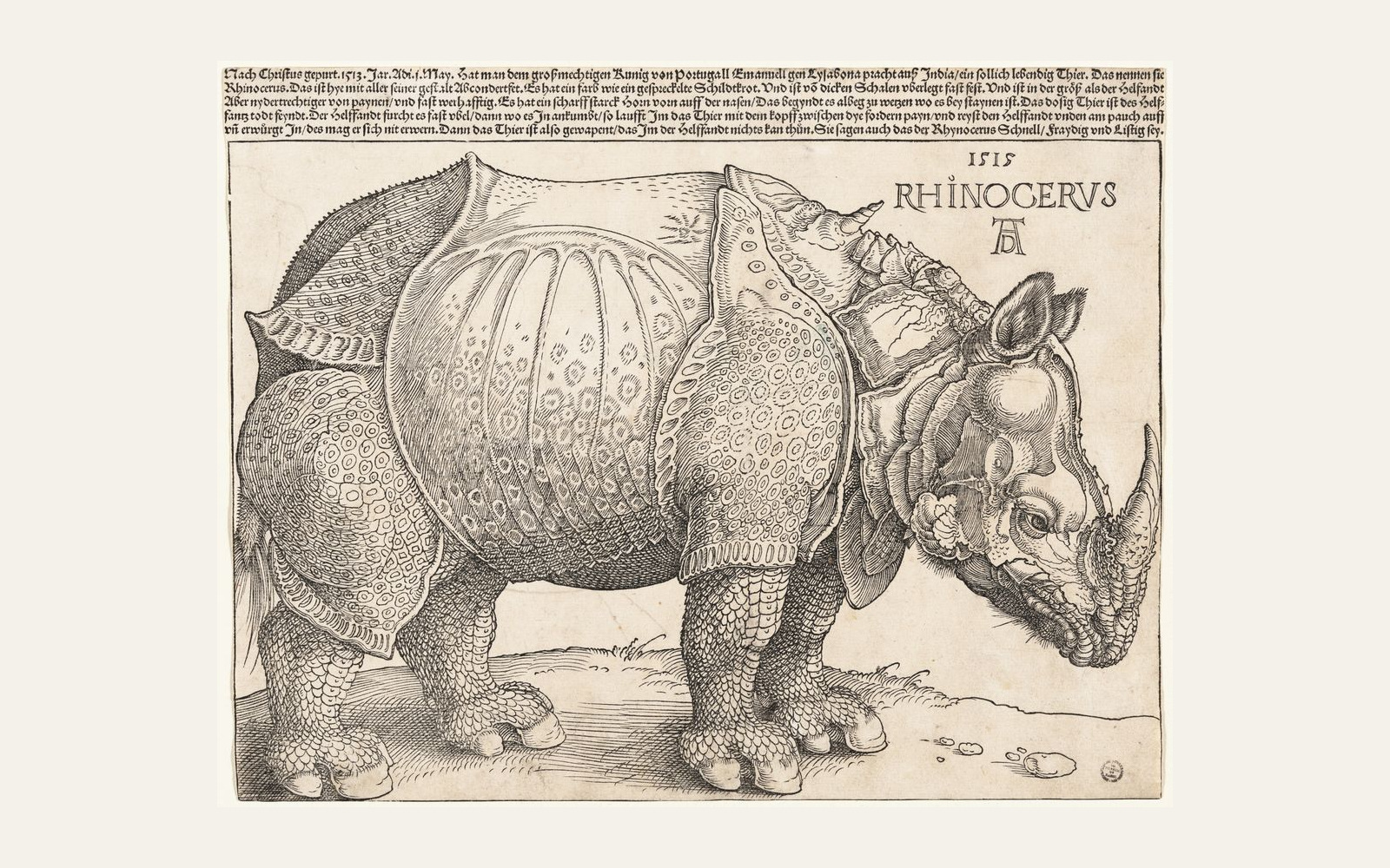
Start at the rhinoceros’s back, then look inside its flank and beneath its belly. The same woodcut gives us more than an outline.
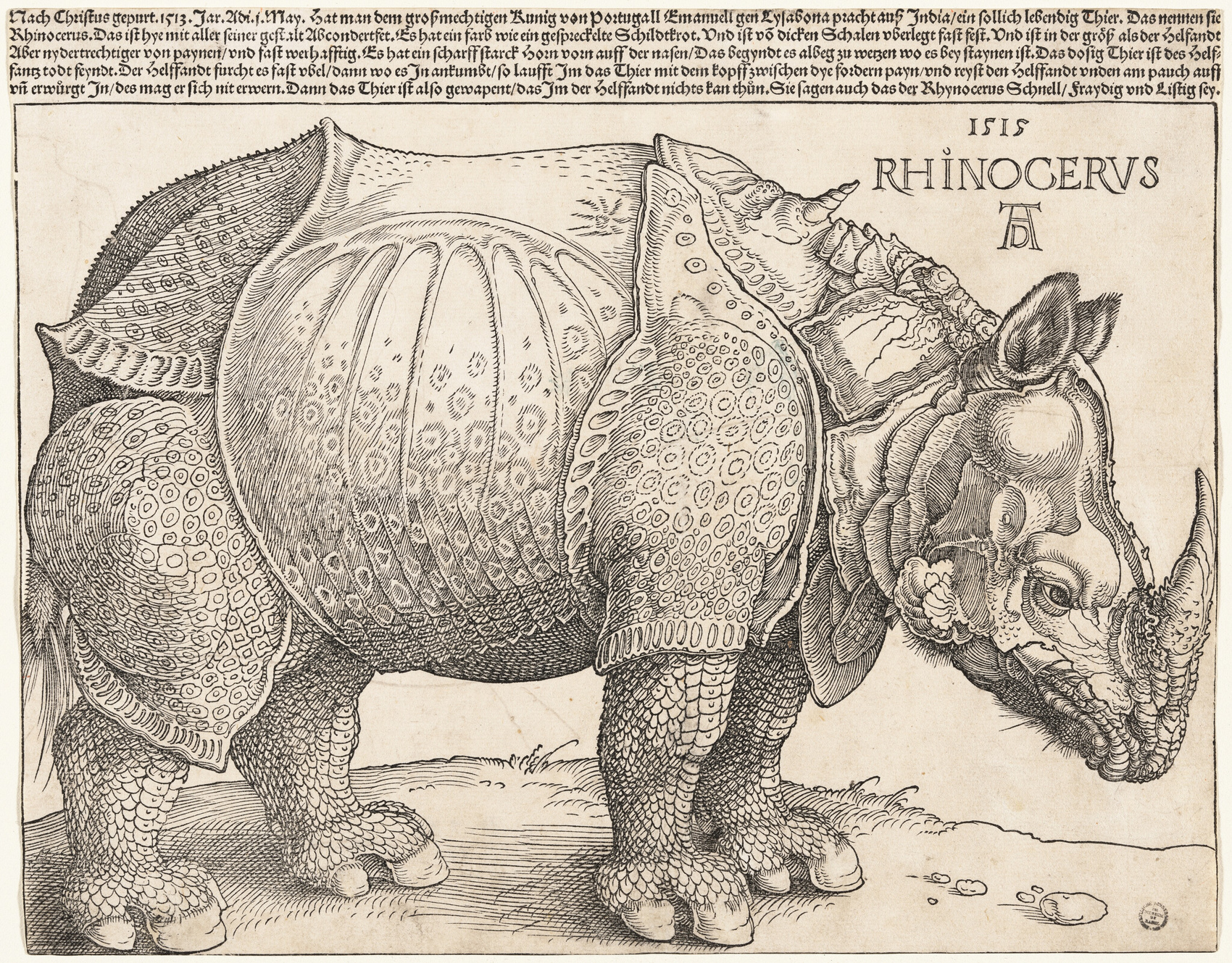
The long upper contour separates the animal from the pale background. Inside that boundary, curved strokes, circles, and smaller marks divide and pattern its plates. Under the belly, dense crossing marks create a much darker area. The line around the animal and the lines within it are doing different work.
If I wanted to explain my attraction to this image, I would write: “I like the repeated fine marks held inside a firm contour.” That preserves both the detail and the enclosing shape. Calling it “minimal line art” would miss most of what interests me here.
This is a reading of the printed image. The museum identifies the work as a woodcut and letterpress; the visible lines are not evidence that the animal’s anatomy is accurate, or that a modern copy offered for sale is an original impression.
Van Gogh: broken marks can make a field feel continuous
In this drawing of The Harvest, compare the open foreground with the tighter architectural marks along the skyline. Look for the differences in length, spacing, and direction.
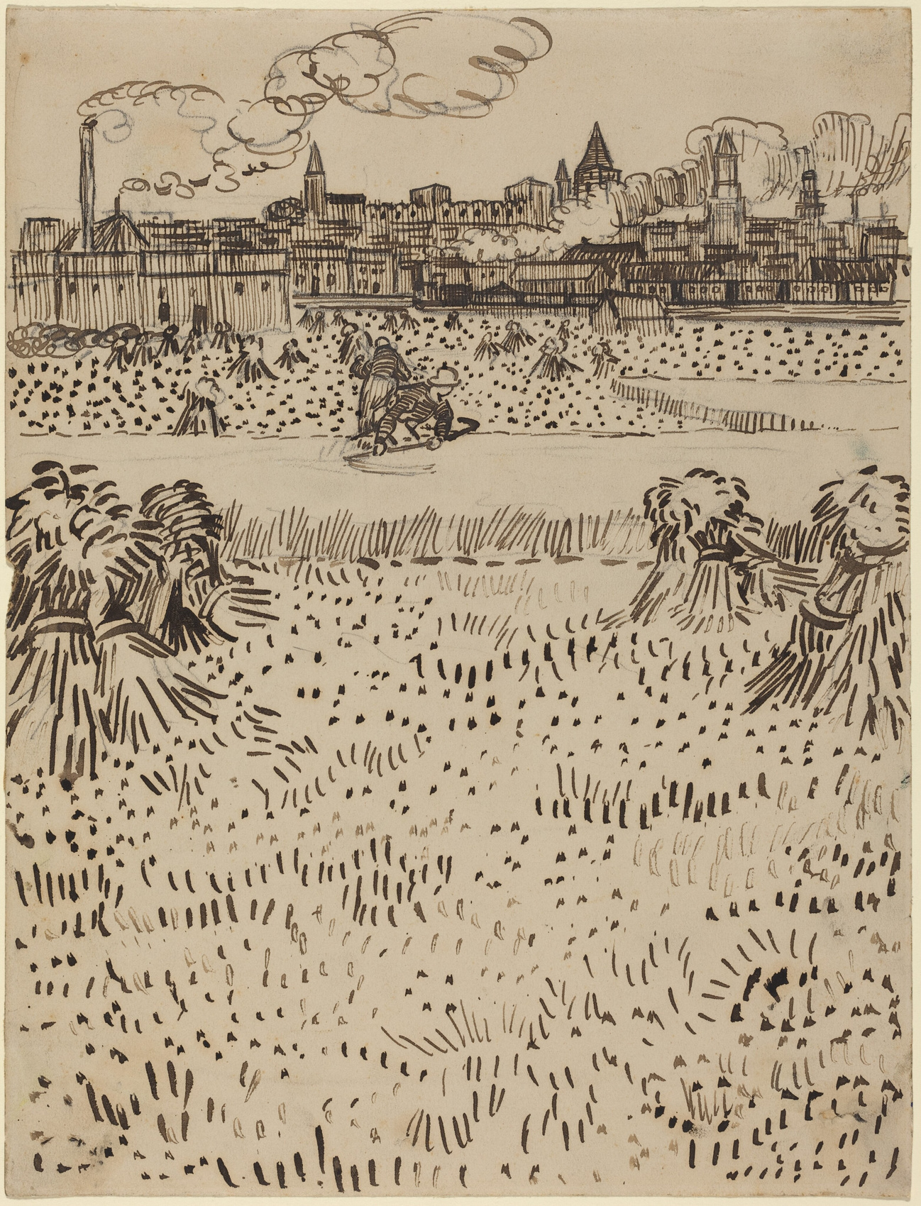
The foreground contains short, separated strokes and dots, with pale paper between them. Around the sheaves, longer curving and slanting strokes describe bundled forms. Farther back, upright and horizontal marks crowd together into buildings. The variety lets us distinguish parts of the scene without a separate color for each one.
The skyline can be read as a continuing horizontal band even where buildings and smoke interrupt it. That connection belongs to separated shapes; it is not one uninterrupted pen stroke. An implied path should still be something you can locate and explain, rather than an invisible arrow added to every picture.
For this work, I would say: “I like how the open field of short marks changes into tightly packed lines at the skyline.” That is a different preference from the rhinoceros’s enclosed pattern. Neither description needs a ranking of the artists.
A digital boundary is not evidence of a brushstroke
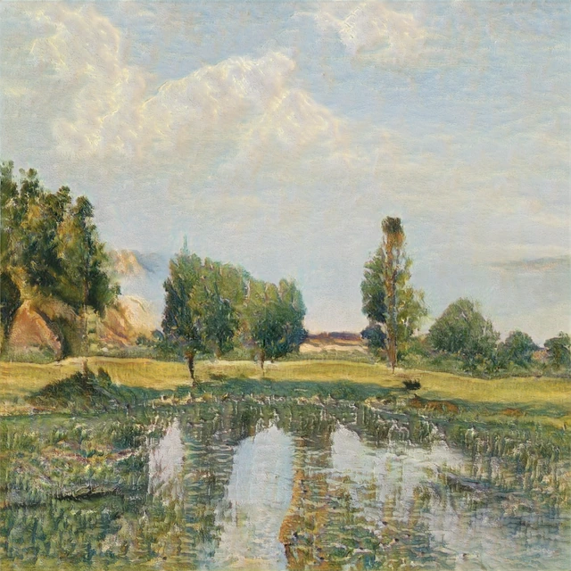
Our digital work Unfinished Rite makes another distinction visible. Follow the long lavender-red boundary down the left side of the pale central region, then compare it with the separate black bands crossing the red field.
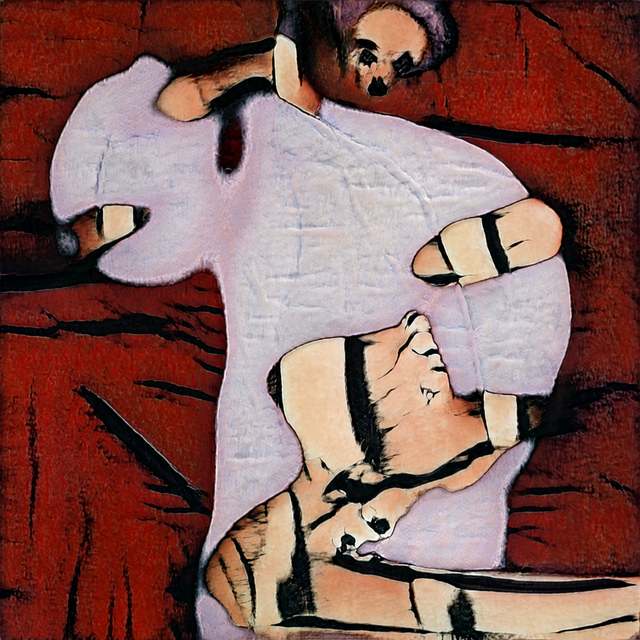
Along part of the lower-left boundary, the change from lavender to red itself describes an edge; other parts have a dark outline. The broad black bands are separate line-shaped areas. I would describe the precise segment I mean, rather than call every boundary a black stroke.
Those observations concern this supplied digital image. They do not show a brush being drawn across a surface, a raised paint ridge, or the appearance of a physical print. A line-like feature can help us read an image without telling us how the finished object was made.
Use the description while looking, not as a style certificate
At an art center, a useful conversation can begin with one located observation: the outer contour, the repeated marks inside it, or the interruption that makes a connection interesting. The same approach works when you are making a personal shortlist. Keep the feature you can point to; you do not have to turn it into a permanent taste label.
If the fine pattern is not what holds your attention, change the sentence. “I like the gaps between broken marks” names another reason. You can enjoy both, or enjoy an image without analyzing it at all. The vocabulary helps when you want to explain a preference; it does not grant permission to like the work.
For the wider arrangement of those features, our composition guide addresses how the parts relate across the whole picture. Here, the completed observation stays closer: which line, where, and doing what?
FAQ
Is “line in art” the same as “line art”?
Line is an element that can be present in many kinds of work. “Line art” usually describes an image organized chiefly through distinct lines, but usage varies. In a public definition discussion, contributors use it for several media and for an outline stage in digital work. Name the actual medium and visible feature when the label is ambiguous.
Can a painting have lines without drawn outlines?
Yes. Color or tonal boundaries can act as edges, and separated forms can suggest a continuing path. Keep a visible boundary distinct from an implied relationship: the latter needs an explanation of what connects across the gap.
Does line art have to be black and white, or a vector file?
No. Lines can be colored, and an image’s visible line qualities do not establish its file format. A scanned ink drawing can contain strong lines without being vector artwork. Check the actual medium or file specification separately.
Are thicker lines or more varied lines always better?
No. Thickness and variation serve different purposes. A consistent fine contour can suit one image; dense or broad lines can suit another. Judge the feature’s role in the whole work rather than treating one kind of line as a quality score.