Psychedelic Art: Color, Pattern, and Letters You Have to Look Into
A word can become a shape. A pattern can pull the eye toward its center. Looking at those relationships explains more than calling a picture “trippy.”
What is psychedelic art?
Psychedelic art is an art and design language associated with psychedelic experience, especially the counterculture of the 1960s. Intense, nonnaturalistic color, flowing or repeating patterns, and inventive lettering are recurring features. The historical context matters alongside the appearance: a colorful spiral made today is not automatically a poster from that movement.
Tate’s definition connects the term with 1960s work and describes heightened color, swirling forms and concealed messages. The Portland Art Museum’s account of psychedelic rock posters places their graphic language around concerts, liquid light shows and film projections. Its designers include Wes Wilson, Victor Moscoso, Rick Griffin, Stanley Mouse and Alton Kelley.
That history gives us a better starting point than a list of anything bright, strange or dreamlike. We can ask how color, pattern and words work together, then distinguish what we see from what we know about a work’s origin.
When the words become part of the image
In a conventional notice, letters carry information through a reasonably steady rhythm. In a psychedelic poster, their shape can become part of the attraction: a word may swell, bend or fit itself into the surrounding composition.
The Portland museum’s activity guide, page 4, shows historical examples by Wes Wilson. It explains how, in some posters, small removed areas define letters within a larger background, and how deciphering the complicated lettering extends the act of looking. Follow that link to see the actual historical posters.
Our simpler illustration below isolates one feature: a curved baseline. Read the upper words, then compare the plain version underneath.

The upper phrase rises and falls as a single colored shape. The lower phrase keeps a steady baseline. Both are readily readable here; this schematic does not reproduce Wilson’s more intricate treatment or establish a measured difference in reading speed.
What interests us is the shift in role. Letters can carry the atmosphere of an image as well as its wording. That helps explain why a poster viewer might enjoy the design while still having to work out what it says. In a discussion of a museum poster exhibition, viewers independently raise that exact tension: the lettering is memorable, but sometimes difficult to recover. Their comments are a prompt for looking, rather than proof of every viewer’s experience.
Color that does not have to describe an object
In Dominik’s 2009 photograph of a liquid-light setup, follow the blue band around the darker red area. Small pale and blue droplets interrupt larger pools. The boundary is irregular; the forms do not need to resolve into a face, a flower or a recognizable landscape.
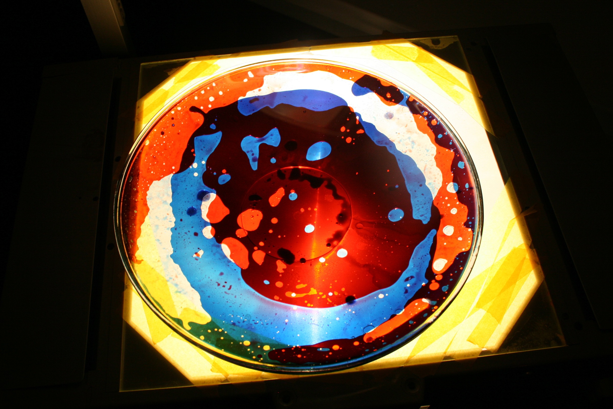
We find the picture absorbing because there is more than one scale of shape to follow: the broad circular arrangement, the uneven colored bands, then the scattered small droplets. “Bright color” names only one part of that organization.
This is a contemporary photograph of an actual setup. It gives us visible liquid forms, while the museum supplies the historical connection between liquid light and rock concerts. The still photograph does not show the movement of a live projection or establish how it would look in a particular nightclub.
A repeated pattern offers a different route through color
Now follow one pointed form in marcello’s Dizzy thorns, also from 2009. Similar forms curve around a small center, becoming progressively smaller as they approach it. This is a much more systematic arrangement than the uneven droplets in the light photograph.
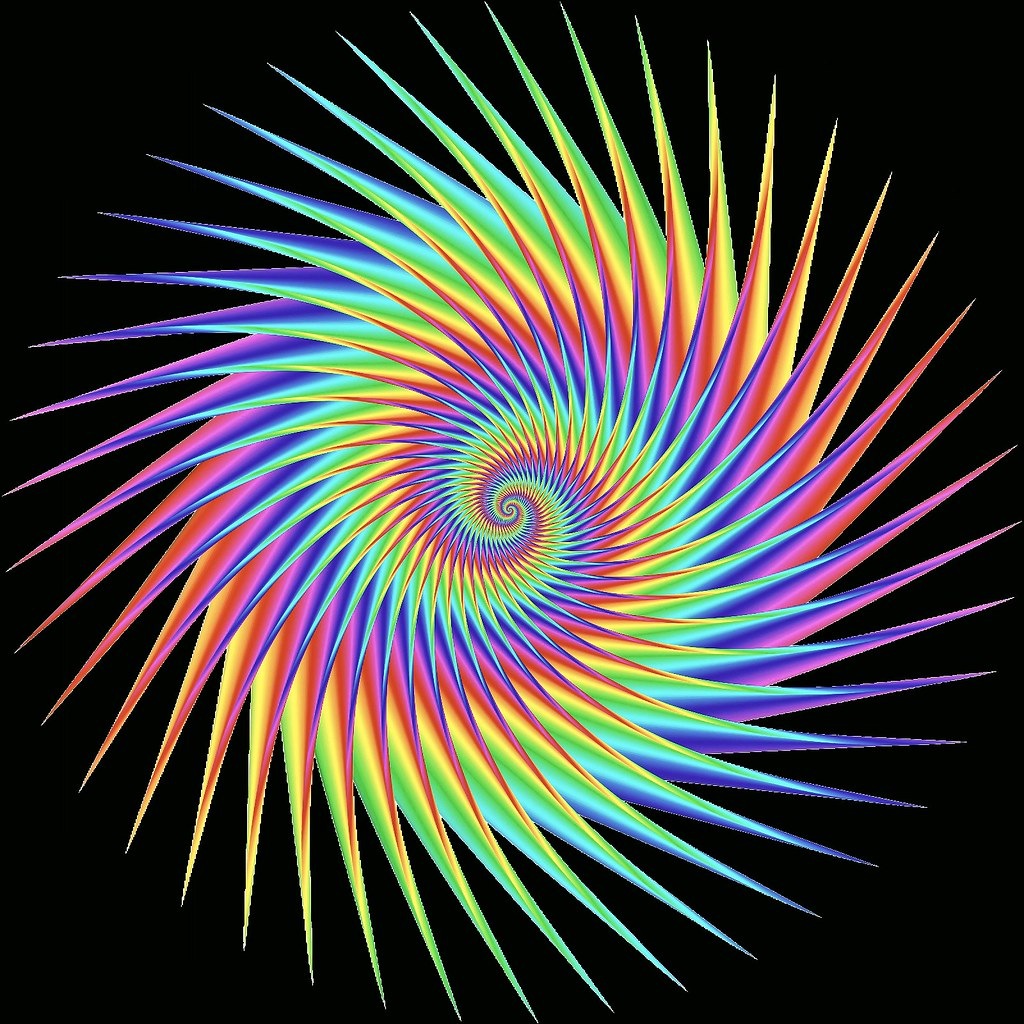
For us, the pointed edges make the direction of the repetition especially clear. The color changes run along those repeated forms, so we keep noticing both their individual tips and their shared inward curve.
The source identifies this as a procedural digital work made with ContextFree. That is information about this particular image, not evidence that every psychedelic-looking picture is a fractal, or that a spiral proves anything about an artist’s experiences. Its title also does not establish a physical effect on a viewer.
Surreal imagery can overlap with psychedelic visual language, but strange subject matter answers a different question from the organization of color and lettering. Our guide to weird art looks more closely at familiar objects becoming uncanny.
One choice for a nightclub’s visual identity
Suppose a nightclub wants an expressive identity image for a music night, alongside the event’s date, time, location and ticket information. This is an illustrative art-direction choice, not a report from a venue project.
We would let decorative lettering carry the identity while keeping the practical information in plain, separate type. The expressive word shape can invite a closer look; the event details should not require the same act of deciphering. This gives up some of the effect of making every word part of one immersive composition.
If the main job is an information-first event notice, our choice changes: make the clear information primary and use color or a limited pattern as the supporting element. The distinction is about the job of this graphic. It is not an installation plan or guidance for required safety signage.
The useful reference note would be specific: curved decorative identity, repeating color forms, straightforward event details. That tells a designer more than “make it psychedelic,” and it leaves room to discuss the actual image instead of assuming that a historical label settles the design.
FAQ
Is psychedelic art the same as surreal art?
The terms can overlap, but they are not interchangeable. Psychedelic art has a particular historical context and visual vocabulary. Surreal imagery can involve impossible or dreamlike relationships without using psychedelic poster lettering or color patterns.
Does psychedelic art have to use a rainbow palette?
No. A full rainbow is one possible treatment, as the digital pattern here shows. The broader question is how color interacts with shape and repetition; a reduced palette can still support inventive lettering or flowing forms.
Are all psychedelic-looking digital images fractals?
No. Appearance alone does not establish a mathematical construction or software process. Use the creator’s source information. The particular work shown here is described as a procedural ContextFree image.
Can I identify a 1960s poster by its style alone?
Style can suggest a connection, but a later work may reuse the same vocabulary. Artist, date and source information are needed before assigning an image to a particular historical context.
Sources & image notes
Tate supplies the concise historical definition; Portland Art Museum supplies the concert context and the historical lettering lesson. Our descriptions of the two contemporary images and our art-direction preference are editorial readings, not measured perceptual or venue tests.
Cover: Dominik, Liquid Oil Projection (2009), full photograph fitted within a wide matte. Resized version and matte derivative licensed under CC BY-SA 2.0. This is an independent photograph, not a WhispArt venue project.
The two contemporary source images are credited beside them. Resized versions and the cover matte retain their stated Creative Commons licenses. The lettering comparison is an original WhispArt teaching schematic.