California Coastal Decor: A Resort Lounge Refresh with Dark Wood
Keep the walnut furniture and camel seating. Two illustrated accent schemes show how textiles, ceramics and art can bring a coastal reference into an existing lounge.
Coastal decor can start with what is already there
For a garden-facing coastal lounge with dark wood and camel upholstery, start with oatmeal textiles, muted sage accents and a little clay or ochre in the art and ceramics. That combination can connect the retained furniture to a planted landscape. Choose sea-blue accents instead when the water, surf culture or an existing blue identity is the reference you want to bring forward.
California coastal decor is usually described through relaxed furnishings, natural-looking textures, light and a relationship with the surrounding landscape. It is a broad decorating vocabulary, rather than a requirement to buy pale furniture or cover the room in beach symbols. NASH Design Group’s guide includes warm colors and contrast, with blue as an option.
Those principles are useful. Applying them to a room whose furniture is staying is the harder part. The example below completes that choice for a hypothetical small resort lounge; it is an editorial color study, not a photographed hotel project.
What the existing room gives us
Our fictional lounge already has dark walnut furniture, camel seating, pale walls and a light floor. Through the glazing, guests see a planted garden with green foliage and dry grass tones. The operator wants that garden connection to be visible inside and is refreshing accessories rather than replacing the furniture.
Keep the walnut and camel as the warm base. Neither has to disappear for the room to feel coastal. The new decision concerns the smaller layers: cushions and throws, a ceramic accent, a rug accent and the picture above the seating.
That constraint also appears in home decorating discussions. In one coastal-apartment thread, the poster describes dark wood and wants coastal references without an overt beach theme. Another room discussion begins with sofas, a chair and a rug that are staying. These are individual home questions, not evidence about resort guests, but they make a useful design constraint explicit: work with the large pieces before proposing replacements.
Two accent palettes around the same furniture
Compare the color groups below. The room, furniture arrangement and lighting are intended to remain consistent so the accents can be judged together. The pictures are invented illustrations of two possible subjects.

Sea-blue accents bring a more explicit water reference into the room. Blue-and-white stripes, a cool blue ceramic and a wave picture form a recognizable group. Against the warm camel and walnut, the blues create a clear contrast. This can be the right direction for a property that wants a surf or sea-facing identity.
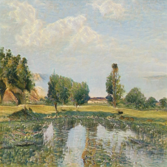
Sage and sand accents draw from the planted view in this brief. Oatmeal supplies a light textile field; sage repeats the foliage; clay and ochre relate to the warmer furniture. The grass-inspired image repeats those greens and warm tones without requiring the furniture itself to change color.
Choose the sage-and-sand scheme for this lounge. It carries the stated garden reference through several small objects and keeps the dark wood visibly part of the composition. The blue scheme is also coherent, but it emphasizes a water reference that this particular brief does not prioritize.
The tradeoff is a less immediately nautical room. If the operator wanted a crisp sea-blue identity, that would be a reason to choose the first scheme—not a decorating mistake to correct.
The finished refresh: a small set of related changes
| Element | Choice for this lounge | What it connects |
|---|---|---|
| Large furniture | Retain walnut and camel | The existing warm base |
| Textiles | Oatmeal field with sage accents | Pale walls, warm seating and garden greens |
| Ceramics | A restrained clay or warm neutral accent | The furniture and ochre details in the picture |
| Artwork | A grass-inspired composition with green and ochre | The planted view and the chosen accent colors |
The finished direction is a retained walnut-and-camel room with an oatmeal, sage and clay accent group. This is enough to specify a coherent visual change. There is no need to add a shell object, rope detail and surf photograph simply to make the coastal label more obvious.
The picture does not have to match every cushion. Here it acts as a bridge: its greens relate to the garden, while its ochre relates to the warm furniture and ceramic. A small amount of another color could remain without breaking the scheme. Exact matching would turn the room into a set; the aim is a readable relationship.
A real painting makes that warm-and-cool relationship easier to inspect. In Albert Bierstadt’s Sea Cove, notice the ochre bank and dark trees above pale sand and blue-green water.

For retained walnut and camel, we would shortlist artwork with a similar balance of warm earth and cooler greens or water tones. Use the painting to judge that color relationship, then compare actual room samples as described below.
Before selecting physical items, place the actual textile and ceramic samples beside the existing upholstery and wood, under the lounge’s daytime and evening light. If a proposed sage reads cold beside the camel, change that accent toward a warmer green or use more oatmeal. The image demonstrates the intended relationship; it cannot verify a fabric’s real color, cleanability or suitability for commercial use.
If the room already has blue accents
A refresh does not require discarding a liked blue rug or picture. Suppose the same operator wants to keep an existing sea-blue rug. Retain it and the walnut furniture, then choose plain oatmeal textiles to connect the warm seating with the lighter floor. Repeat the blue once in a small ceramic or image detail if that makes the group feel intentional.
In that version, the decision is to keep blue as the accent and simplify the other small layers. Buying an entirely new sage group would solve a different brief. Start with the objects and reference that actually matter to the property.
For planning the roles of art across several hotel areas, use our hospitality design concepts guide. This example concerns one room’s color and material relationships, after its furniture and purpose have been settled.
FAQ
Can California coastal decor include dark wood?
Yes. In this example, walnut is the retained warm base. Lighter textiles and selected green or blue accents change the surrounding composition. Replacing all the wood with a pale finish is unnecessary when the existing pieces already work for the room.
Does a coastal lounge need blue?
No. Green foliage, dry grass, stone and warm earth colors can supply the reference. Blue is useful when the water or a blue property identity is what you want to emphasize. The chosen scheme should follow the actual brief.
How can coastal decor feel subtle rather than themed?
Choose a specific reference and repeat a few of its relationships through textiles, ceramics and art. For the illustrated garden-facing lounge, sage and ochre do that work. A nautical object can still belong when it has a reason to be there; it is not compulsory.
Does the artwork need to show the local coastline?
It can, but the connection should be accurate if you describe it as local. An invented grass drawing can relate visually to a planted view without documenting a particular place. A real local photograph or commissioned work offers a different, verifiable connection.
Are natural-looking materials automatically suitable for a resort?
No. This article selects a visual direction. Check the actual product’s care instructions, construction and relevant commercial requirements with the supplier and responsible project team before ordering. A generated room cannot establish durability or compliance.
Sources and illustration notes
NASH Design Group provides the design context; House Beautiful’s California coastal guide offers another account of mixed woods and landscape-related color. The linked Reddit discussions supply individual retained-furniture questions.
The cover and comparison are new AI-generated illustrations. The lounge, artwork and operator brief are hypothetical. The scheme choice is WhispArt’s editorial application of those stated conditions, without claims of a completed customer project or guest-response testing.