Eclectic Gallery Wall: Mix Frames Without Replacing the Art
Keep the pictures you care about. One quieter edge can make a mixed collection feel more connected without turning it into a matching set.
Change the part that is taking over
An eclectic gallery wall does not need identical frames. If you like the pictures but one border keeps grabbing your attention, start with that border—not a replacement set of art. In the example below, a slim black frame replaces a thick pink one around a small chair drawing. The wood and gold frames stay.
This is a useful place to begin when you have just made a home of your own and your pictures come from different moments: a gift, a photograph, a small drawing you kept. They do not need to look as though they arrived in one box. The question is whether their presentation lets you enjoy what you chose.
Give different frames something in common
Black, wood and gold can share a wall. A repeated finish gives your eye a connection, while differences in width, material or shape preserve the collected feeling. There is no requirement to make every border identical or to use exactly three finishes.
This is established decorating advice: Emily Henderson’s gallery-wall guide discusses combining frame styles, and Within the Grove mixes wood, black and gold. The more specific problem is deciding which change helps a wall you already own.
Reader discussions show why “make them match” is too broad an answer. In one gallery-wall discussion, replies disagree over whether to remove a valued picture or change the surrounding frames and mats. In another, a vivid blue mat draws attention even though the owner likes the art. These are questions about presentation and preference, not evidence that one style wins for everyone.
Five pictures, one framing decision
Imagine that these five pictures are already chosen: an ochre abstract, a stair photograph, a blue pear study, a warm landscape and a small ink drawing of a chair. Their subjects and arrangement stay in the comparison. The owner particularly likes the chair drawing and wants to notice it before the border.
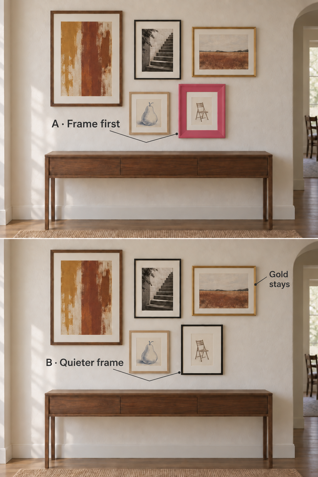
In A, the thick pink band is a strong colored shape around a delicate drawing. It brings a playful note to the whole wall, but it also competes with the small marks the owner wants to enjoy.
Choose the slim black treatment in B for this drawing-first brief. It repeats the dark edge of the stair photograph and leaves a less assertive surround around the chair. The connection is specific: an existing finish returns elsewhere in the group. The drawing does not have to be replaced.
The gold frame stays because it is not the problem being solved. Its warmth also relates to the landscape and the neighboring ochre picture. The wood frames continue to add variety. Replacing all of them with black would discard differences that this owner wants to keep.
The cost of the quieter choice is the loss of that pink accent. If the owner loves the pink frame as an object, or wants a more playful wall, keep it and let that corner be a deliberate feature. There is no reason to “correct” a focal point that is doing what you want.
A finished plan that keeps the collection
| Part of the wall | Decision | Reason |
|---|---|---|
| Five chosen pictures | Keep all five | The owner likes the images; replacing art solves the wrong problem |
| Pink chair frame | Change to slim black | Reduce the isolated bright border and repeat an existing dark edge |
| Stair-photo frame | Keep black | It supplies the finish repeated by the new chair frame |
| Wood and gold frames | Keep | Preserve variety and the warmer part of the collection |
The result is still an eclectic wall: several finishes, different subjects and a mixture of image sizes. The change is confined to how one favorite picture is presented. It does not depend on buying a coordinated print set or giving every frame the same border width.
For a real replacement, identify the size of the work, its current mount and the frame opening before ordering. The illustrated scene does not specify a purchasable size. If the piece already needs special framing, bring the actual work and existing frame information to the framer rather than choosing from the picture alone.
Check whether the color belongs to the frame or the mat
A frame is the outer molding. A mat is the card surround inside it. The distinction matters because changing the wrong component can leave the distracting band exactly where it was.
Suppose a loved pencil drawing already has a suitable wood frame, but sits inside a broad electric-blue mat. For an owner who wants the drawing to take priority, keep the wood frame and change the blue mat to a quieter, light surround. A black outer frame would still leave that bright blue field beside the drawing.
The finished choice is a mat change, not a frame change. A warm off-white could be a useful starting direction beside warm paper; choose the actual shade against the work so that the paper does not unexpectedly look gray or yellow. This is a visual preference, separate from the mat’s materials and suitability for the artwork.
If the colored mat is a cherished part of the presentation, keep it. You can accept a stronger accent without deciding that the art is wrong. The aim is to resolve an unwanted distraction, not erase every difference.
Know when reframing has answered the question
Stop when the new surround serves the picture and the remaining variety still feels like yours. You do not need another purchase merely because one frame has a different finish. The black, wood and gold combination in the example already has enough connections for the stated brief.
If the border is quiet and the collection still feels wrong, the issue may be the pictures’ relationship or the arrangement instead. Reframing cannot settle every gallery-wall problem. Our guide to choosing art for a curated gallery wall addresses which pictures belong together; the example here assumes that choice has already been made.
FAQ
Can black, wood and gold frames work together?
Yes. In this example, black repeats across two pictures while wood and gold keep the warmer variety. Judge how the finishes serve the actual images; there is no compulsory number of finishes or universal matching formula.
Should every picture have the same mat color?
No. A repeated mat color can connect a group, but different surrounds can also work. If one mat becomes the first thing you notice and you dislike that effect, change that mat rather than assuming the entire wall needs identical ones.
Do all my frames need to be the same thickness?
No. Width is one part of a frame’s visual presence, along with color and contrast. The thick pink frame changes here because it competes with a delicate drawing under a drawing-first brief—not because thick frames are inherently wrong.
What is the smallest useful change if I have a limited budget?
First identify the component causing the unwanted emphasis. In the illustrated example it is one outer frame; in the blue-mat example it is the mat. Either diagnosis avoids automatically replacing the whole set, although actual costs depend on the work and framing required.
What if the mismatched frame has sentimental value?
Keep it if that is part of what you want to see. A playful or conspicuous frame can be an intentional feature. The quieter alternative is useful only when it better serves your own preference.
Sources and illustration notes
The linked decorating guides support the established principle of mixing frame styles. The linked community discussions supply individual questions and conflicting preferences. The one-frame decision and mat example are WhispArt’s editorial recommendations for stated hypothetical conditions.
The comparison and frame-corner cover are new AI-generated illustrations, with no named products or photographed customer installation. The five artworks are invented for this article. Small changes in the chair image and frame scale mean the comparison illustrates prominence; it is not a measured test.