Etchings: What the Ink Does Beyond the Drawn Line
Fine rigging, a gray harbor, a storm-dark sky: etched prints can reward very different kinds of looking. Three actual impressions show where those differences begin.
An etching is an intaglio print made from a metal plate whose exposed areas have been bitten by acid. Ink held in the recessed lines transfers to paper under pressure. The finished picture can also depend on ink left on the plate surface and on additional techniques, so an etching need not look like a crisp black line drawing.
For someone buying a first print to live with, that last distinction is useful. You might enjoy tiny architectural details, or prefer a broad gray atmosphere that takes longer to resolve. The word etching identifies a making process; it does not choose your favorite visual experience.
We would begin with the line and the surrounding tone, then consult the particular work’s medium record. The three museum impressions below make that sequence visible. They are teaching examples, not artworks offered for sale here.
How a drawn line becomes a printed line
In the process described by the Met’s etching guide, a protective ground covers the plate. A needle removes that ground where the artist wants a line. Acid bites the exposed metal; after the ground is removed, the plate can be inked and wiped. The recessed marks retain ink while much of the surface is cleared.
The V&A’s print-process guide distinguishes this from a drypoint needle directly scratching into the metal. A work can use both, and the medium line may name them together. Engraving adds another way of cutting the plate. Those distinctions explain why a museum can describe one impression with several techniques.
The same Met guide explains plate tone: a thin layer of ink left on the surface can print a veil around the lines. Think of two visible contributions—the marks retained in the grooves and the tone created by how the surface was wiped. This is a way to read a print, not a recipe for handling etching chemicals at home.
Black Lion Wharf: the pleasure of following a line
Start with the boat’s ropes near the bottom of Whistler’s Black Lion Wharf. Follow their curves, then move up toward the rigging and the buildings. The view keeps offering another small edge or directional change.
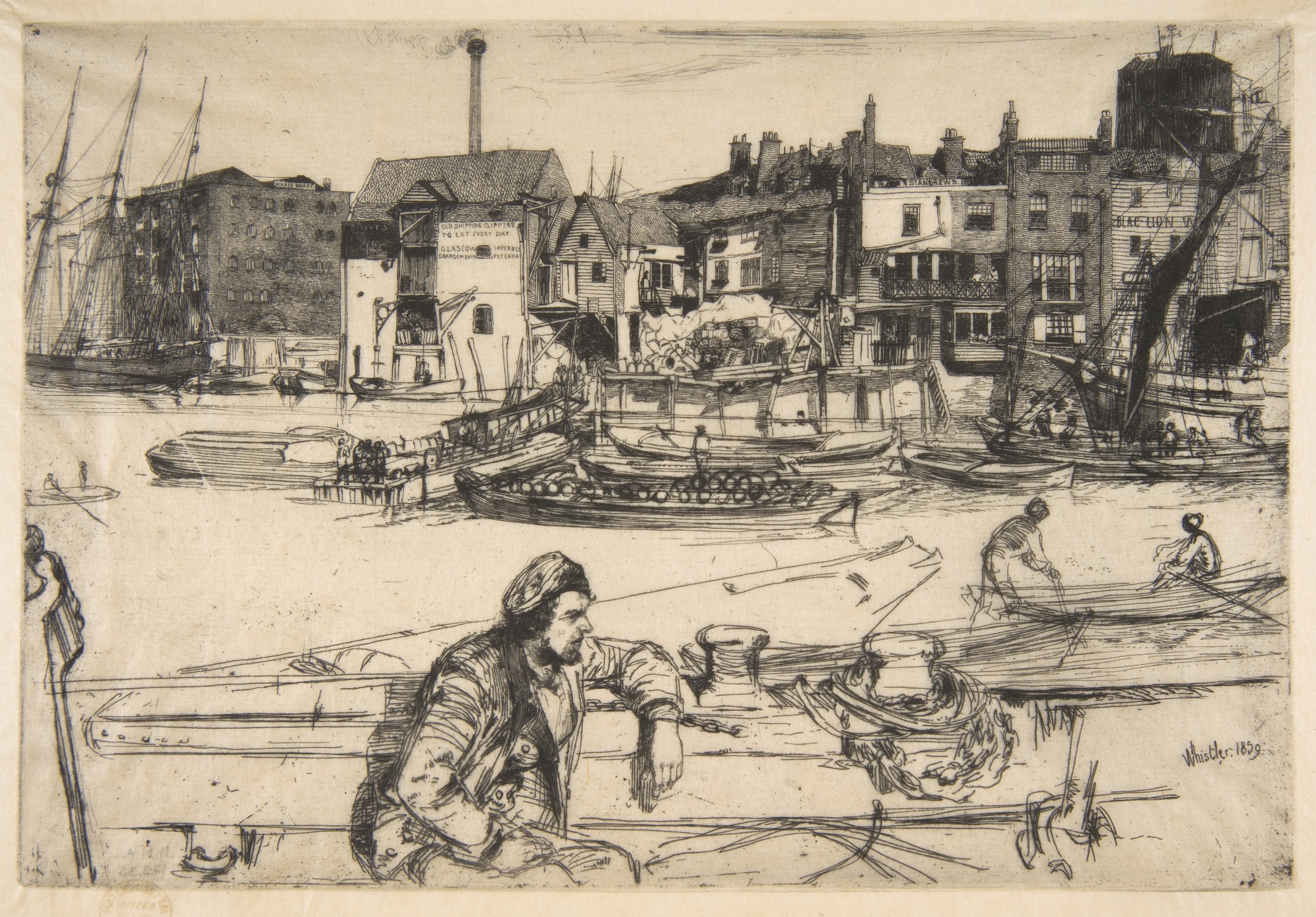
The Met records this impression as an 1859 etching in black ink on extremely fine cream-colored Japan paper, in the fourth state of four. “Black ink” describes the printing material; the yellowish appearance of this digital reproduction is not a separate ink-color claim.
We like how the density changes. The foreground has long, looping lines and open pale areas; the waterfront buildings gather shorter marks into busier surfaces. The seated figure gives the eye a larger shape to return to. If looking closely at architecture and everyday activity is what you enjoy, this is a useful reference for a line-led print.
That preference is more specific than wanting “something old and black-and-white.” It asks for legible fine detail, variation in mark density and small observations that remain interesting on another look.
Nocturne: the ink between the lines carries the atmosphere
Whistler’s Nocturne changes the pace. Boats, masts and distant buildings emerge from a gray field; the lower part of the image is much less sharply described than the waterfront in Black Lion Wharf.
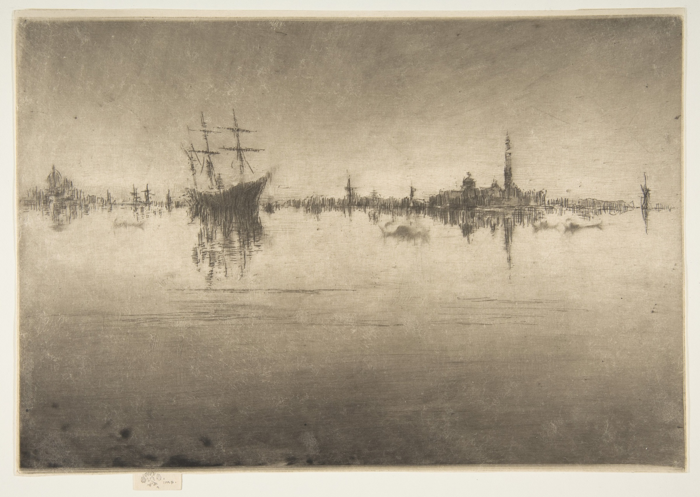
The Met’s account describes ink wiping as central to the nighttime atmosphere. It identifies this 1879–80 impression as etching and drypoint in black ink on heavy cream-colored Japan paper, in the sixth state of nine. The medium record and the description support a more useful explanation than “the artist drew every gray patch.”
Compare the two Whistlers. In Black Lion Wharf, our attention moves along edges, ropes and facades. In Nocturne, our attention moves between sparse marks and the surrounding haze. A large quiet-looking area can be part of the print’s work rather than a place where nothing happened.
We would describe this reference as atmospheric tone with restrained line detail. That gives a buyer a visual direction without pretending that every impression of the title has identical wiping or that a screen can reveal the full paper surface.
The Three Trees: a dark passage does not identify one technique
Now move from the light strip of land in Rembrandt’s The Three Trees toward the dark diagonal marks at the upper left. The contrast feels forceful, while tiny details remain scattered across the landscape.
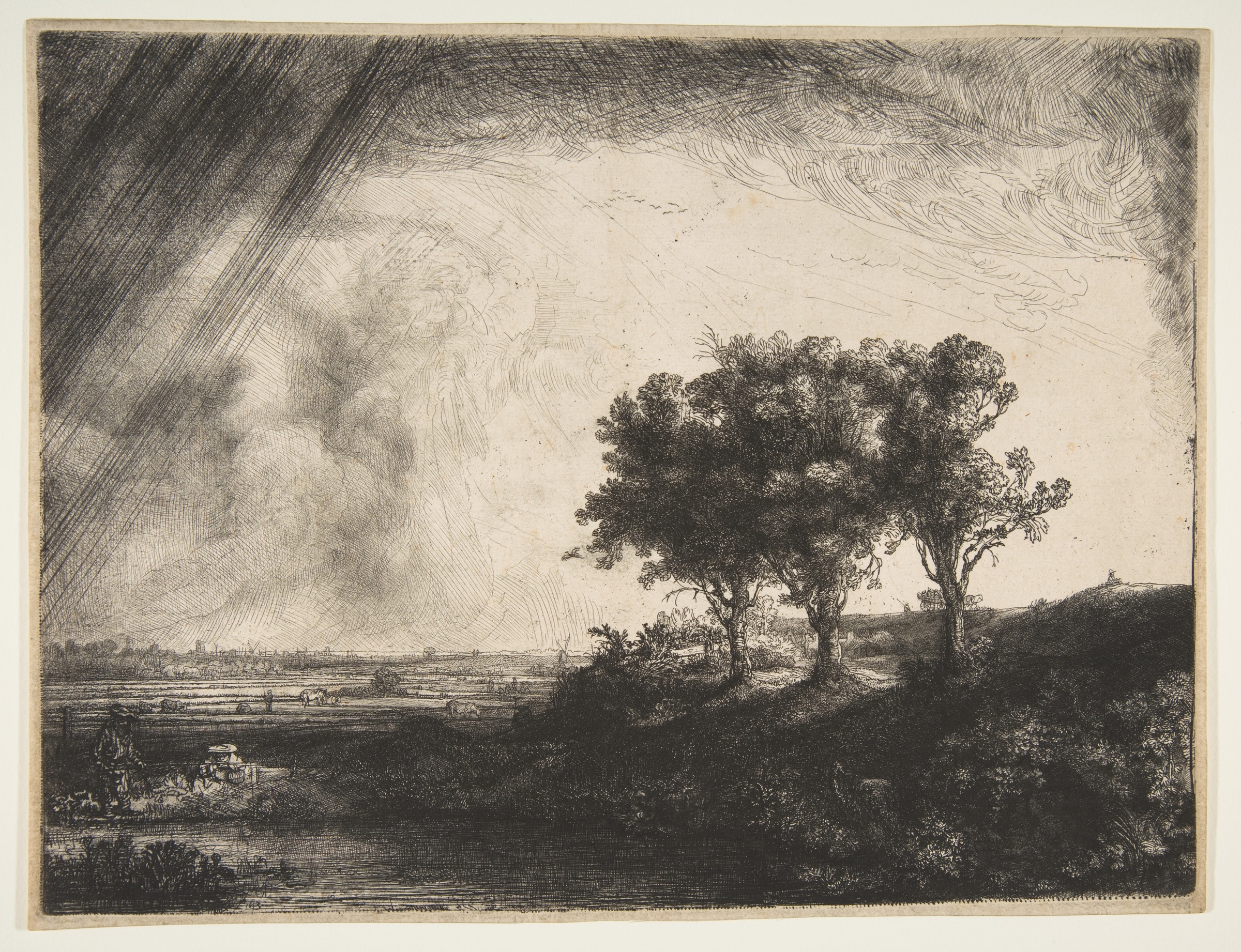
The Met records the 1643 work as etching, engraving and drypoint. That combination matters: calling every dark mark “an etched line” would claim more than the medium record or this reproduction establishes.
We read the trees as a place where the eye can gather after following the diagonals across the sky. Compared with Nocturne, the picture gives a more decisive light-and-dark structure. Compared with Black Lion Wharf, its strongest first impression comes from the large tonal contrast rather than a continuous sequence of architectural details.
The lesson is to describe the visible effect first and keep technical attribution tied to documentation. A soft dark area might involve wiping, a tonal method or overlapping processes. The appearance alone is not a complete production record.
Choose the experience you want to return to
Imagine a first-home buyer who wants a subdued, atmospheric image and does not enjoy following dense architectural detail. This is a preference exercise using museum references, not a comparison of live sale listings.
For that reader, we would choose Nocturne as the visual direction. Its broad tone and sparse marks answer the stated preference. Black Lion Wharf would give more specific detail to explore; The Three Trees would give stronger dramatic contrast. The cost of our choice is less crisp description, which is precisely what another reader might miss.
Change the preference to “I want to keep discovering how buildings, ropes and figures are drawn,” and we would choose the Black Lion Wharf direction instead. The relevant question is which relationship between line and tone you enjoy, rather than which title or technique sounds more collectible.
When a real offered print interests you, ask for a full view of that actual sheet, a useful detail and its medium information. Use those to check whether the qualities you liked are present in that impression. They do not, by themselves, establish authenticity, condition or value. A printmaking discussion about a thrift-store find includes a concrete question about a gray background; the replies are helpful questions to investigate, not an authentication of a different print.
For the separate question of a drawing printed from a flat surface, our lithograph guide explains that process. An etching’s recessed plate is the distinction here.
FAQ
What is the difference between etching and engraving?
In etching, acid bites areas exposed through a protective ground. In engraving, a tool cuts into the metal. Both are intaglio processes, and an individual work can combine them, as the medium record for The Three Trees shows.
Is drypoint the same as etching?
No. Drypoint scratches directly into the plate, while an etching needle ordinarily opens the protective ground for acid to act on the metal. The Nocturne shown here combines etching and drypoint.
Why do some etchings have gray backgrounds?
A gray field can come from plate tone or a tonal technique, sometimes combined with line work. The Met describes wiping the plate ink as central to the atmosphere in Nocturne. Do not assume that every gray area in every print was made the same way.
Does a plate mark prove a print is an etching?
No. The impression left by a plate can occur in other intaglio processes. It is a clue about the physical printing, not a complete technique identification or an authenticity certificate.
How do I choose an etching if I am buying for enjoyment?
Compare actual images for the qualities you like: crisp lines, broad atmosphere or strong tonal contrast. Our hypothetical reader favors Nocturne for atmosphere; a reader who enjoys architectural detail would choose the Black Lion Wharf direction. Check the actual offered impression rather than relying on the technique name.
Sources and image credits
The Met’s etching guide supplies the process explanation, and the three linked collection records identify the pictured impressions. The visual comparisons and hypothetical preference choice are our editorial readings. Museum images designated public domain are reproduced under the Met’s open-access policy. The digital reproductions are not physical condition reports or sale offers.
Cover: James McNeill Whistler, Nocturne. Public domain / CC0. Complete artwork image(s) proportionally fitted within a neutral matte. The responsive hero may show a detail; the full reproductions appear in the article.