Fine Art Lithographs: The Drawing Inside the Print
A grainy coat, a printer at work and a Paris street: three real lithographs show why a printed image can hold our attention on its own terms.
Fine art lithographs are artworks printed through lithography, a process that transfers an inked image from a prepared flat stone or plate to paper. An artist can develop an image for this process from the beginning, so a lithograph can be an original printed work rather than a reproduction of an earlier painting.
That distinction matters when prints feel like a compromise before you have even looked at them. In a first-home art discussion, the question of finally filling long-empty walls led into paper prints, canvas prints and lithographs. We would begin with what attracts us in the image: the restless line, the relationship between colored areas, or the character of a drawn face.
Here, three museum works give that question substance. They are examples for looking, not items offered for sale or a promise about what a particular budget can buy.
A drawing surface that becomes a printing surface
Traditional stone lithography uses the different behavior of grease and water. The artist draws with greasy material on a flat stone. Treatment prepares the image areas to accept oily ink and the surrounding areas to hold water. The dampened surface is inked, then pressure transfers the image to paper. A direct drawing reverses in the transfer; color printing uses separate matrices aligned for successive colors. Prepared metal plates can also carry lithographic images. The Met’s explanation of lithography describes this method.
This helps explain the drawn character we can encounter in a lithograph. The image does not need an engraved groove for every line. A sweeping stroke, a grainy dark passage and a thin contour can all become parts of the printed picture. Their exact appearance depends on the particular work and process.
For a comparison with a recessed-plate process, see the etching examples and plate-tone guide. Keep the technique tied to the work’s medium record rather than treating a grainy or drawn appearance as a universal test.
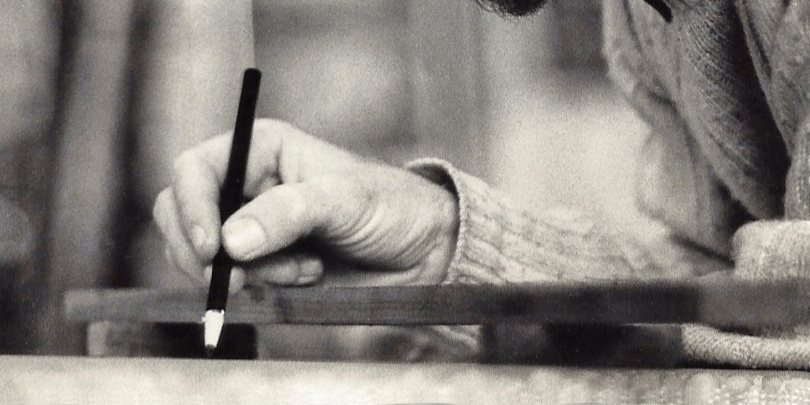
The cover photograph shows Michael E. Arth drawing on a lithographic stone. It gives us a real glimpse of the drawing stage, rather than a complete demonstration of printing.
Daumier: a coat made of energetic marks
Look at the man’s dark coat and lifted hat in Honoré Daumier’s Mr. Prudhomme: My son, salute this monument…. Then compare those dark passages with the child’s outline, the pale facade and the lightly marked pavement.
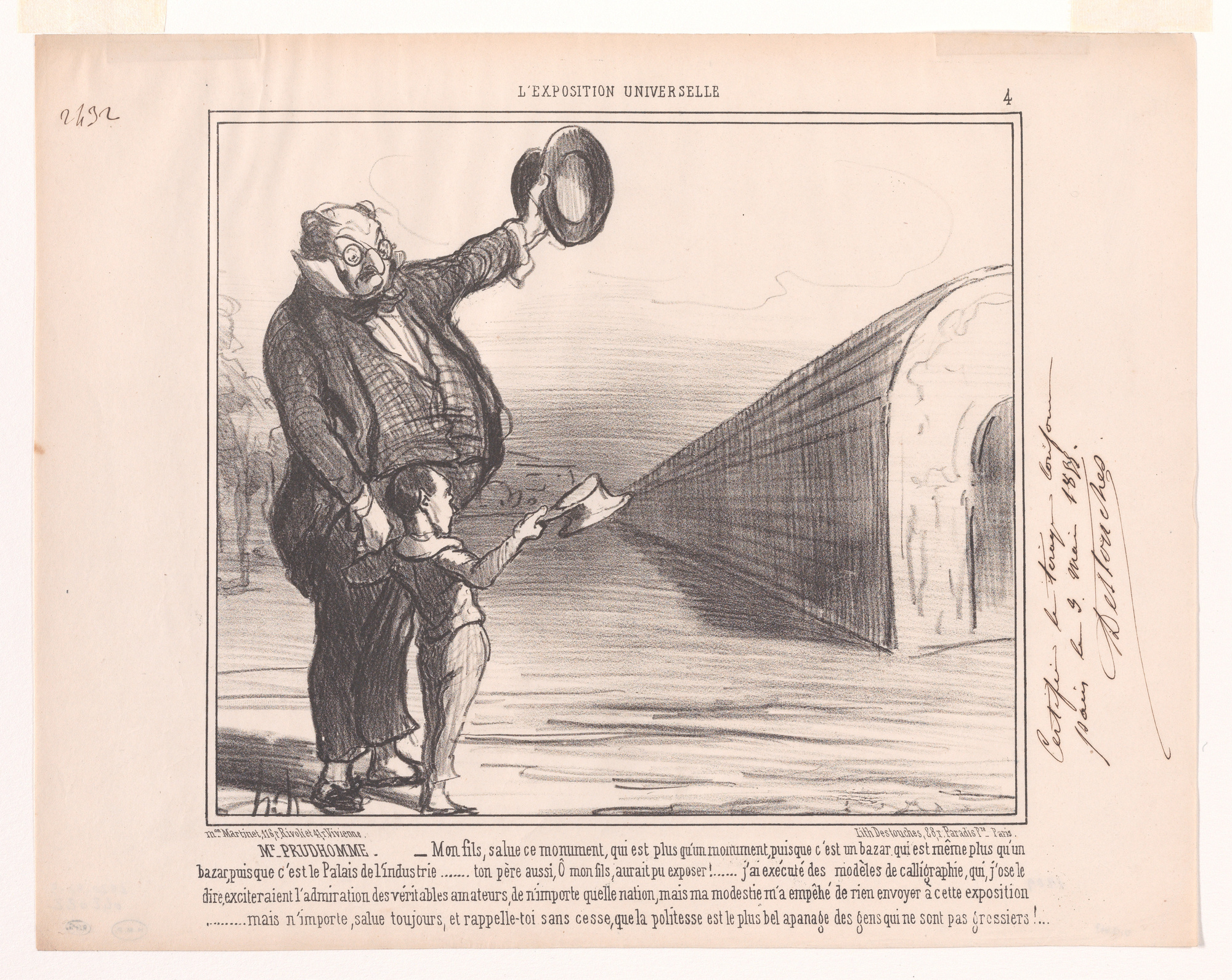
The coat initially reads as a substantial dark mass. Looking closer, we see broken marks, crossing strokes and changes of density. The raised hat has a dark rim around a much paler center. The child’s clothing is more lightly worked. Across the hall, dense hatching along the receding side meets a pale facade described with much sparer lines.
For us, the pleasure is how quickly the drawing shifts from forceful to airy. The man’s emphatic gesture catches attention, while the contrast between the hat, lightly drawn child and pale facade keeps the image varied. It feels active without every part receiving the same amount of finish.
The Met identifies this particular sheet as an 1855 lithograph on thin Japan paper, a proof in its second state. We retain its printed caption and handwritten margin note in the reproduction. Those details belong to this sheet; a grainy appearance in another image would not, on its own, prove it was lithographed.
Toulouse-Lautrec: the printer enters the picture
In the cover for L’Estampe originale, Album I, follow the press on the left toward the sheet held by the woman on the right. Then compare her large dark hat, salmon-colored cape and the thin green lines describing the printer and equipment.
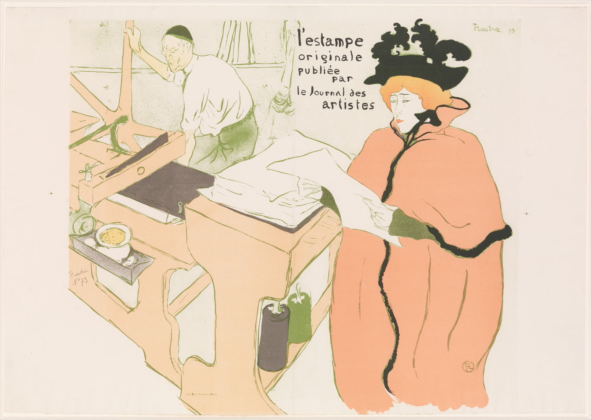
The Met’s record identifies the figures as printer Père Cotelle and Jane Avril. It lists the 1893 work as a lithograph printed in six colors, printed by Edward Ancourt and published by André Marty. The exact color count comes from that record, not from counting apparent shades on our screen.
The broad cape and dense hat carry a different weight from the printer’s fine outline. We like the way the largely pale figure at the press remains present through a few economical lines. Across the foreground, the sheet links the two people and turns printing into part of the image’s subject.
Here, flat color and drawn line cooperate. Neither needs to imitate thick paint for the picture to feel complete. The depicted workshop is an artwork, however, not a technical diagram from which we can reconstruct every press operation.
Bonnard: color keeps the street loose
In Pierre Bonnard’s Street Scene from Above, follow the pale street as it narrows between the buildings. Then move toward the rounded mauve forms above and the yellow areas that open space around them.
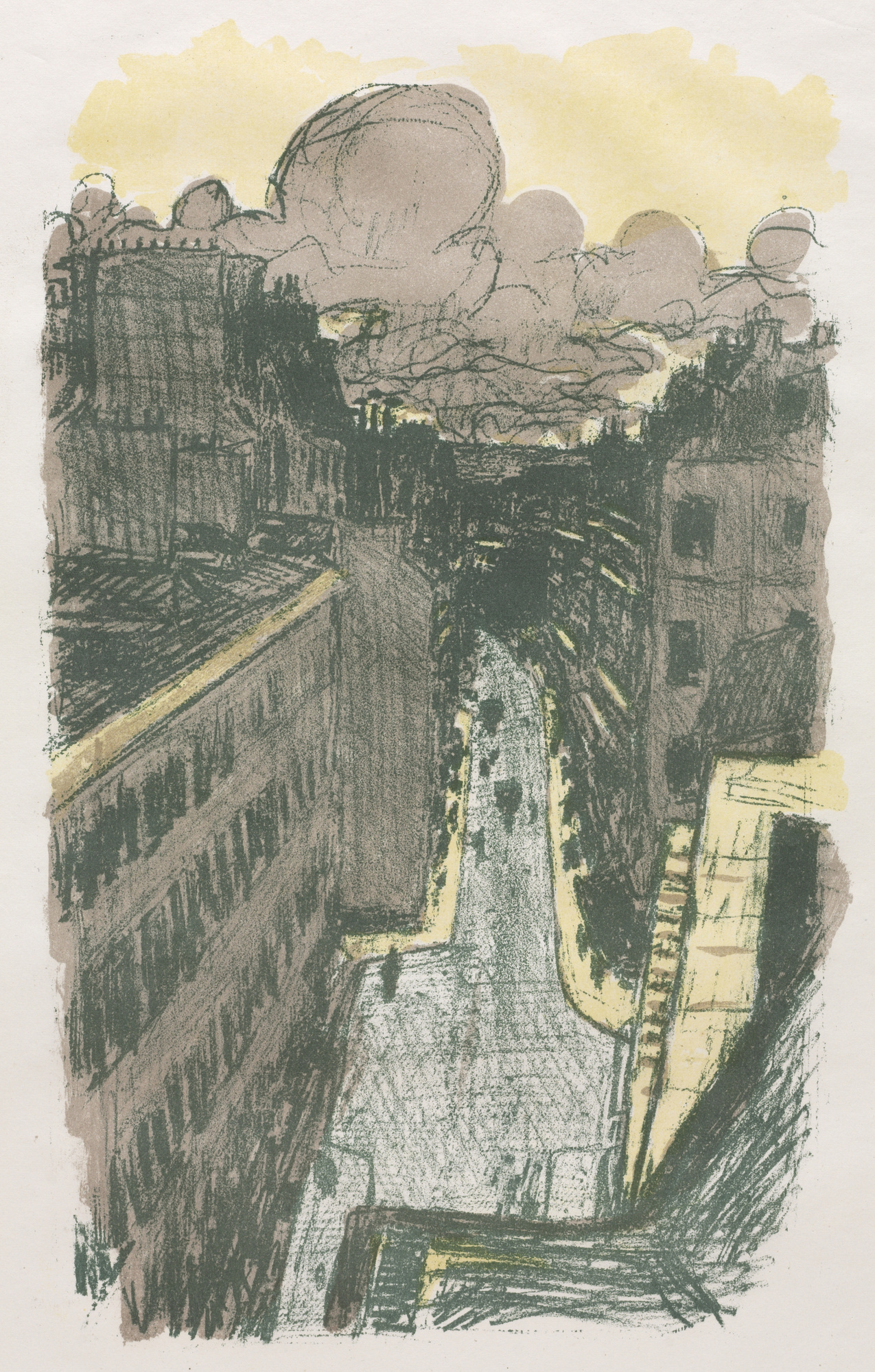
Dark green lines describe balconies, windows and building edges, but they also wander and overlap. Mauve areas spread across walls and the upper part of the image. The pale road has a textured surface rather than a smooth photographic finish. Its edges draw us into the distance while the foreground balcony establishes a high viewpoint.
We find the ordinary street more absorbing because it stays visibly drawn. The yellow, mauve and dark green form a limited-looking set of relationships, yet the image gives us height, distance and a sense of the city extending beyond the sheet.
The Cleveland Museum of Art places this 1899 color lithograph in Some Scenes of Parisian Life, published by Ambroise Vollard and printed by Auguste Clot. The reproduction lets us inspect the broad color areas and drawn marks. It does not reveal the order of printing or justify guessing an exact number of stones.
A reason to explore the medium
Suppose your attraction is an ordinary city subject, loose lines and muted color, rather than an emphatic figure. From these three examples, we would follow Bonnard’s direction: look for lithographs whose street shapes and drawn color relationships remain interesting after the subject is recognized.
That choice trades the strong figure and graphic contrast of the Daumier or Toulouse-Lautrec examples for a more diffuse city view. If a dramatic gesture or bold silhouette is what keeps drawing you back, our preference would change. These are visible image preferences, not rankings of the artists.
If what you most want is the physical relief of thick paint, the digital reproductions here cannot offer that quality. And when a particular sheet becomes a possible purchase, its identity, materials and seller’s description need separate attention. Our art print versus poster guide covers those object-level distinctions.
For a first artwork, we would rather be able to name the attraction—those wandering street lines, that grainy coat, the cape against the pale workshop—than dismiss an entire medium because the image arrives on paper.
FAQ
Is a lithograph an original artwork or a copy?
It can be an original printed artwork conceived for lithography. The term also appears in reproduction and commercial contexts, so it does not authenticate a particular sheet. These examples are identified through their museum records.
Why are the printer and publisher named alongside the artist?
A work’s record can identify several contributors. The Met names Toulouse-Lautrec, printer Edward Ancourt and publisher André Marty for the album cover; Cleveland names Bonnard, printer Auguste Clot and publisher Ambroise Vollard for the street scene. These are roles in the particular works’ production, not competing claims to the same role.
Can lithographs be in color?
Yes. Traditional color lithography uses separately prepared matrices aligned during printing. The Met records six colors for this Toulouse-Lautrec work. Bonnard’s street shows how broad color and loose drawn marks can coexist.
Is a giclée print a lithograph?
No. Giclée generally refers to inkjet prints, although the term’s usage has broadened, as noted in Getty’s terminology record. Lithography uses a different image-bearing process. These names do not, by themselves, decide whether an image is worth looking at.
Does a lithograph have to look grainy?
No. Grain and energetic lines are visible in these particular works, but lithographic images can have other appearances. Use a reliable object record for technique, then look at the individual image rather than treating one texture as a universal test.
Sources & image notes
Technique: The Met, Lithograph. Works and images: the linked Met records for Daumier and Toulouse-Lautrec, and Cleveland’s Bonnard record. Museum images are CC0 and retain their full compositions. Our first-person readings describe these reproductions; we have not examined the original sheets or run a printing experiment.
Cover photograph: Michael E. Arth drawing on a lithographic stone / Wikimedia Commons, CC BY-SA 4.0; cropped. This crop is also licensed under CC BY-SA 4.0.