Landscape Art: How to Compare Pictures Before You Buy
Two paintings of the same mountain can give you quite different reasons to look. Use that difference to turn “I want a landscape” into a more useful search.
Start with the picture, then narrow the catalogue
Landscape art focuses on an outdoor environment. That subject can be carefully described, simplified, rearranged or partly abstracted. Choosing “landscape” narrows what you see, but it does not yet say which treatment you want to live with.
For a first home, that distinction can make browsing less vague. A mountain, a wooded valley and a coast are useful subject filters. Within each, compare the viewpoint, the weather and the way the artist handles the marks. Those differences can matter as much as the location.
One buyer asking for landscape or abstract art describes a familiar difficulty: thousands of images, an interest in something distinctive, and too little useful language for the search. Many art collections already offer filters for subject, color, style and format. The next step is to give those filters a more specific picture preference.
The museum works below are examples for comparison, not paintings offered for sale or a promise about what your budget can buy. We will hold the named subject steady first, so the difference in handling becomes easier to notice.
Same mountain, two ways of organizing a view
Paul Cézanne’s Mont Sainte-Victoire and the Viaduct of the Arc River Valley, dated 1882–85 by the Met, gives us several distinct things to return to. Before examining the mountain, follow the foreground tree trunks and the pale row of viaduct arches.
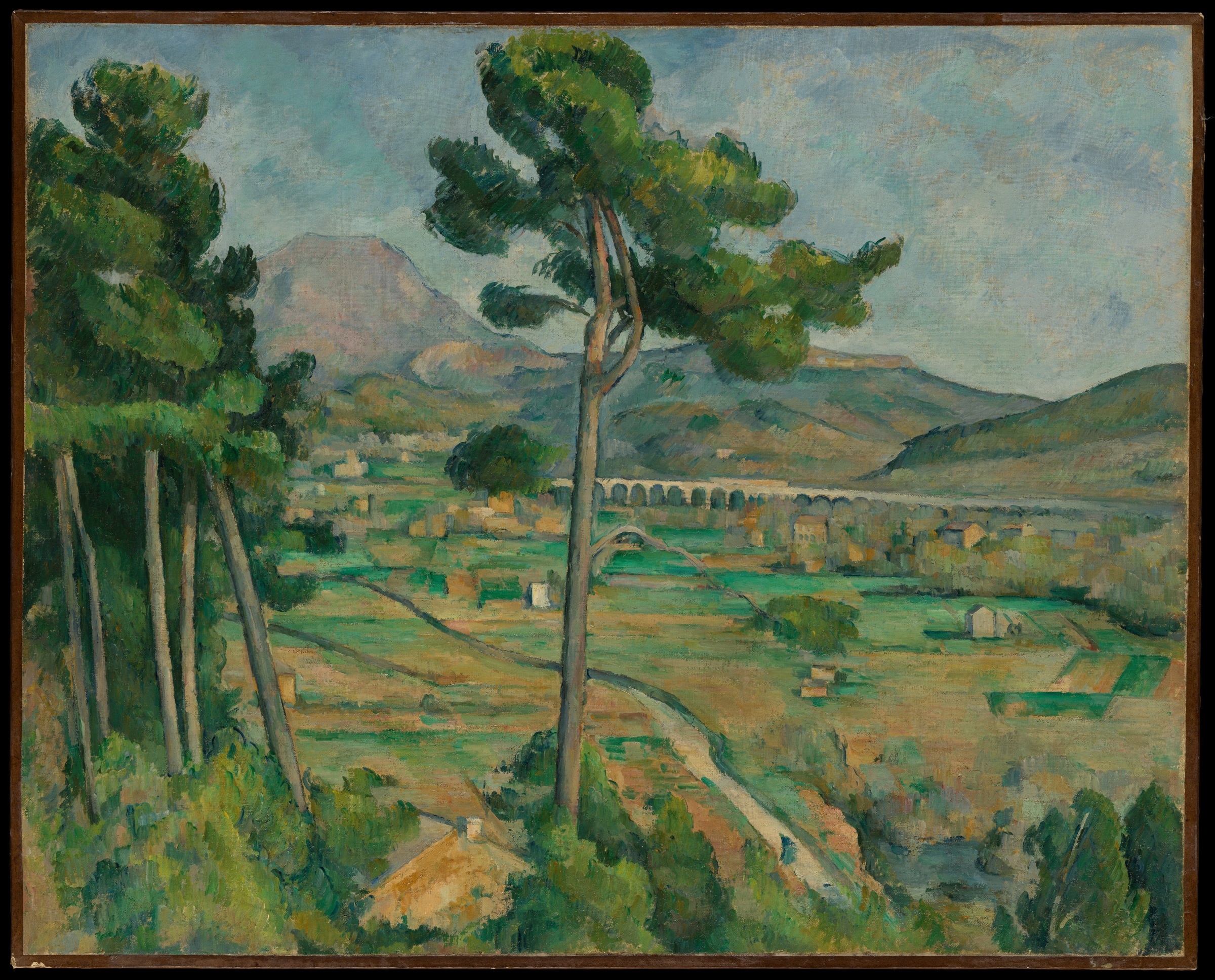
Our eye can move from the trees to the arches, then through the divided green and ochre fields toward the mountain. The tall central trunk interrupts the distant view, giving us a nearby object to look past. The painting offers both a named place and an arrangement of separate, recognizable features.
Now compare Cézanne’s Mont Sainte-Victoire, dated about 1902–6. Look at the valley beneath the mountain, where green, blue and ochre patches sit beside and across one another.
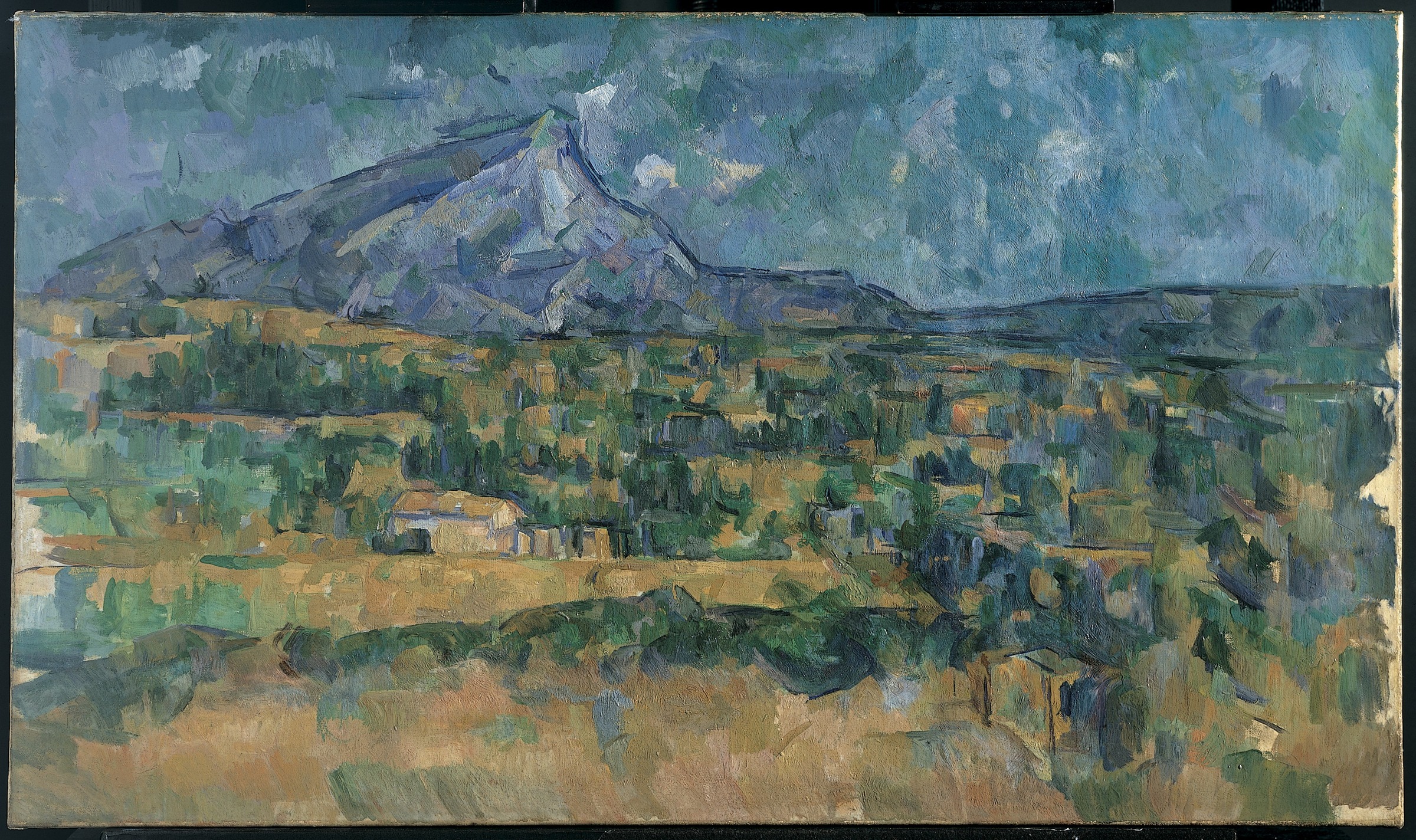
Here we find fewer foreground objects to name individually. The blue-gray mountain remains recognizable, while much of the valley holds our attention through adjacent painted patches. We can keep looking at where one color area meets another without following a row of detailed arches.
Both paintings name Mont Sainte-Victoire. They are not identical viewpoints or a controlled before-and-after experiment. This comparison concerns these two pictures: the earlier view offers foreground framing and distinct features; the later one gives us a more open field of colored marks.
That is already a more useful distinction than “I like blue and green landscapes.” Those colors appear in both. The question is whether the recognizable things or the relationships among the marks keep drawing you back.
Turn that comparison into a first-home shortlist
Suppose you want a mountain or valley picture for your first home. You enjoy recognizing a place, but also want nearby trees, paths or buildings that give you something to revisit after the initial view. A broad, anonymous band of blue and green has not held your interest.
For that preference, we would follow the earlier Cézanne’s direction: a recognizable valley with a distinct foreground and several features to look between. We would keep one picture with looser, broader marks as a comparison, rather than saving ten near-identical mountain thumbnails.
The tradeoff is clear. You gain more individually described features, while giving up some of the later picture’s open, patch-like ambiguity. If that ambiguity is what you actually enjoy, reverse the preference and follow the later direction.
On a narrow screen, swipe or scroll sideways to read all three columns.
| What drew you back? | Useful browsing language | What to compare in the full image |
|---|---|---|
| Foreground trees and a recognizable valley | Mountain valley painting with foreground trees; wooded valley landscape | Whether the foreground creates an interesting view into the distance, and whether the distinct features remain worth looking at |
| Broad color patches more than individual objects | Painterly mountain landscape; loosely painted valley | How adjacent marks organize the picture after you recognize the mountain |
| A dramatic change in weather across a wide view | Storm landscape painting; river valley after a storm | Whether the contrast and weather are the attraction, rather than assuming all nature pictures will feel quiet |
These are search descriptions, not standardized labels that every seller will use. Start with the subject and one treatment phrase. Add the artist’s name when a particular body of work interests you; add medium or format when that is a real preference. Then open the full images. A small thumbnail or a cropped room mockup can hide the foreground and mark relationships that made the original choice useful.
For our hypothetical buyer, the resulting brief is: a recognizable wooded valley or mountain view, with foreground trees and several distinct features; compare it with one more loosely painted alternative. That is a resolved direction to browse, with a reason for each candidate.
Check the weather before you call it a quiet landscape
Thomas Cole’s The Oxbow gives that last search direction a concrete example. Follow the dark, broken foreground tree and storm at the left, then the sunlit winding river and fields at the right.
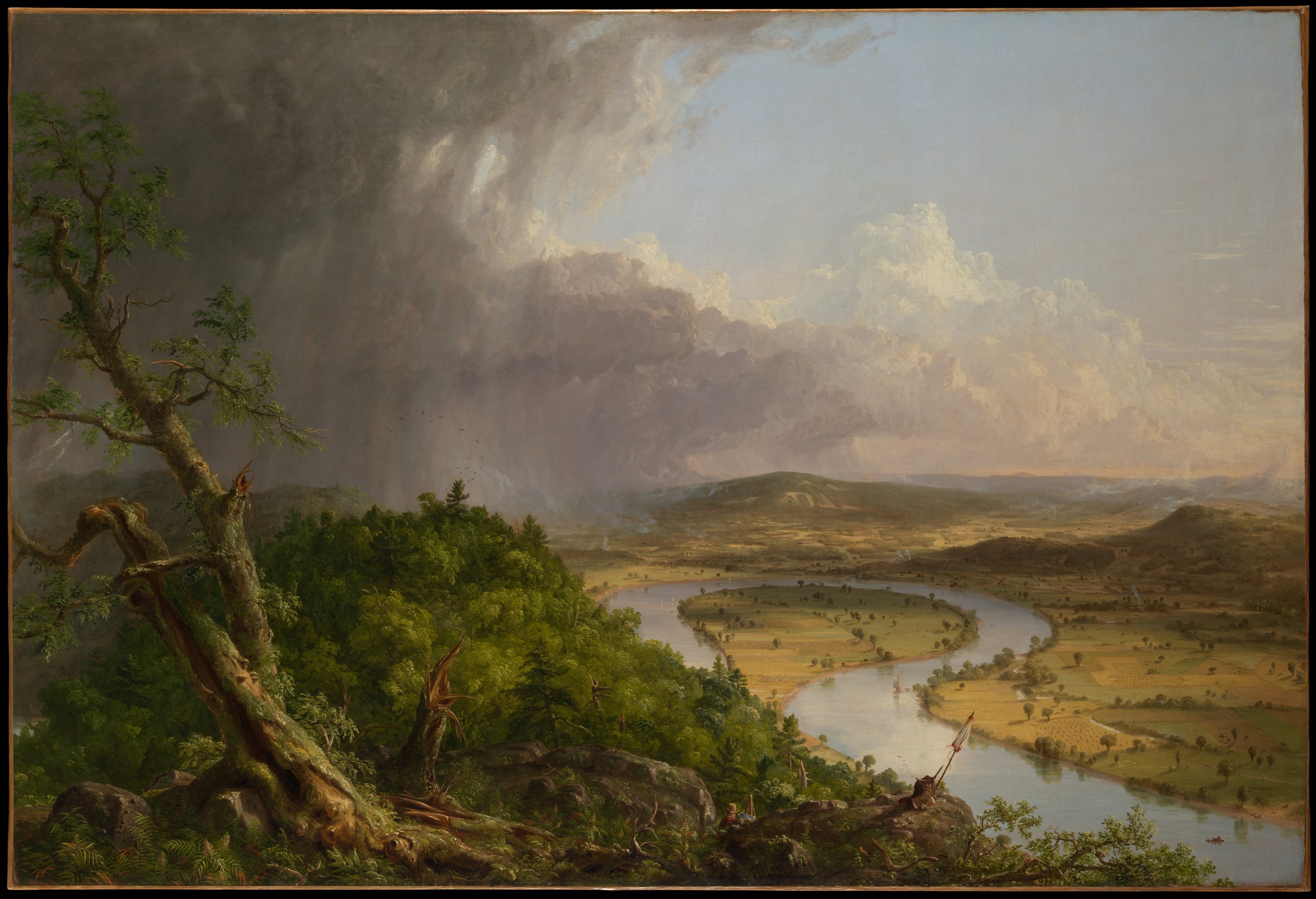
For us, the contrast makes this an expansive but unsettled view. The Met’s interpretation also places the painting within tensions between wilderness and cultivated settlement. It offers more than an undifferentiated scene of peaceful nature.
If you want the dramatic change in weather, that tension may be exactly the attraction. If you want an evenly lit, less eventful view, it gives you a reason to keep browsing. Landscape subject alone does not settle the choice, and our response is not a promise about how a picture will affect everyone.
Keep the image preference separate from the object you buy
These reproductions let us compare compositions. They do not let us feel the paint surface or inspect a seller’s actual object. If thick physical paint is the attraction, a flat reproduction cannot supply that quality merely because it reproduces the same image.
A buyer happy with a reproduction and a buyer seeking a hand-painted original can share a landscape preference while wanting different objects. Once you have a picture direction, our art print versus poster guide explains the printed-object distinctions. Keep that decision explicit rather than asking the subject label to do both jobs.
FAQ
Does landscape art have to look realistic?
No. An outdoor environment can remain recognizable while the artist simplifies or reorganizes it. The two Cézannes here retain the mountain but give foreground objects and painted patches different roles.
Do I need a personal connection to the place?
A familiar place can be a reason to choose a picture, but it is not a requirement. You may prefer the viewpoint, the weather or the handling of the marks. Name the attraction you can actually see.
Which search words are more useful than “landscape art”?
Combine a subject with a treatment you want to compare: wooded valley with foreground trees, loosely painted mountain, or river valley after a storm. These phrases are starting points; sellers may categorize them differently.
Should a landscape match my room’s colors?
Color can help narrow a catalogue, but it does not explain everything you like about the picture. The Cézanne pair shares blue, green and ochre while offering quite different foregrounds and mark relationships.
Will a landscape print show the same texture as a painting?
A reproduction can depict marks and shadows in the paint, but it does not carry the original painting’s physical relief. If the surface itself matters, inspect the actual object and its medium rather than relying on the image alone.
Sources & image notes
The Metropolitan Museum of Art supplies the exact titles, dates, object records and public-domain images linked beside the paintings. Our descriptions and the worked first-home preference are editorial readings of these reproductions, not a purchase experiment or an appraisal.
Cover: Paul Cézanne, Mont Sainte-Victoire, ca. 1902–6, The Metropolitan Museum of Art (1994.420). Public domain / Met Open Access CC0. Full image fitted within a wide matte; no composition detail cropped.