Space in Art: Real Depth, Painted Distance, and the Gaps Between
A sculpture occupies a room. A painted church seems to open into one. A crowded still life can keep its objects close to the surface. These are different ways that space becomes part of an artwork.
Actual space: the object has volume, and the opening is real
Start with Auguste Rodin’s bronze The Walking Man. Its torso and legs occupy physical volume. The legs spread apart, leaving an opening above the base. Standing in front of the sculpture, that opening would let you see what lies beyond it; a different viewpoint would change its outline.
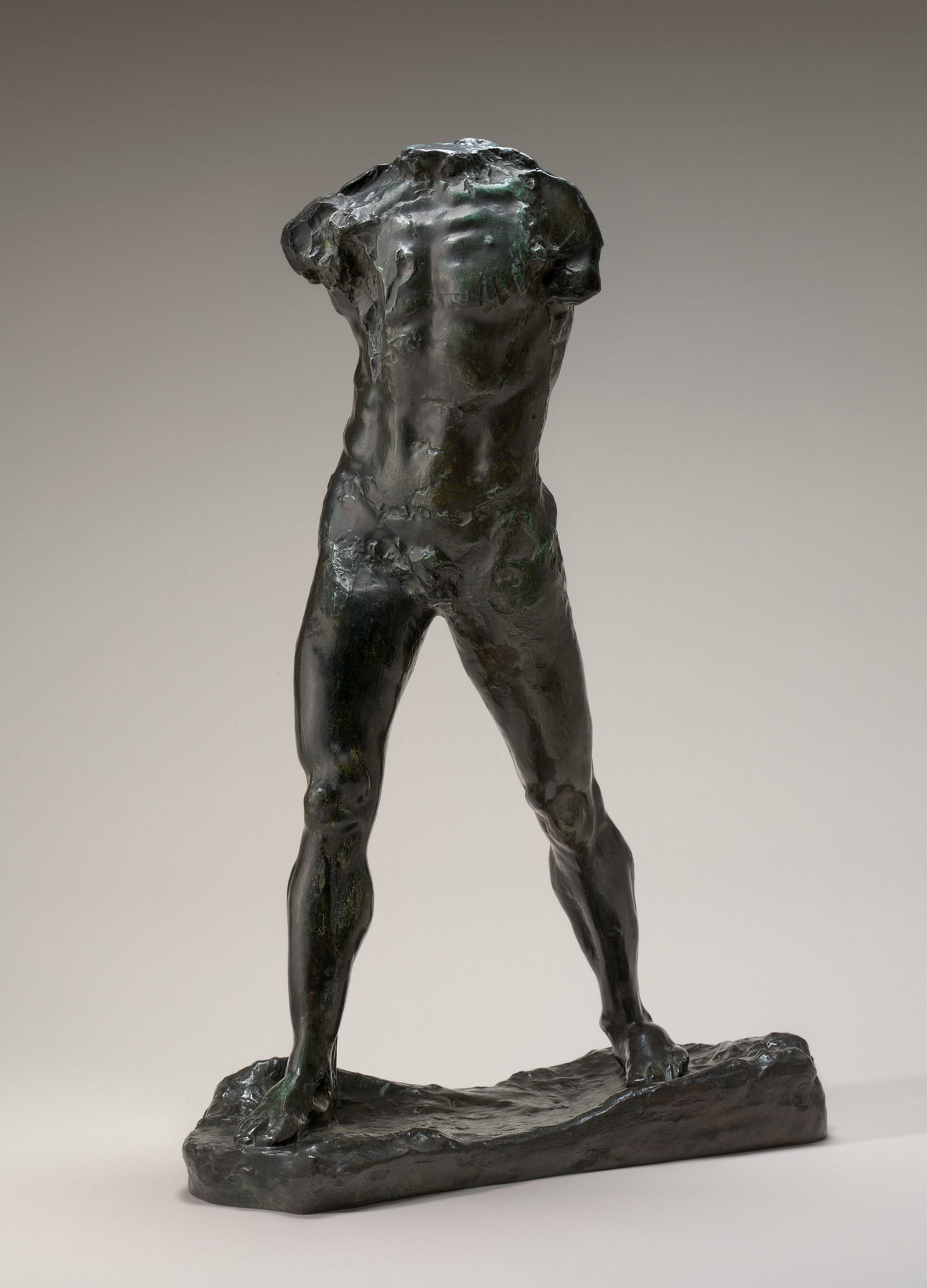
Here we can make two descriptions at once: the bronze legs are positive forms, and the opening is a negative interval. Both belong to the sculpture’s organization of actual space. “Negative” does not mean unimportant or unwanted.
The photograph on this page is a flat representation of that three-dimensional object. Its highlights and shadows help describe thickness, but they are not the bronze itself. This distinction matters whenever we compare a physical artwork with its reproduction: the image can show a view of an object without giving us the experience of moving around it.
A gap in the design is different from distance into the picture
A painted area can act as negative space even when it contains color, texture or background detail. The term concerns its relationship to the forms we are discussing. Our negative-space examples look closely at that relationship.
Depth asks another question: what appears to lie in front of what, and how far does the scene seem to continue? A crowded interior can suggest considerable distance. A picture with broad empty areas can keep everything close to the surface. Counting empty patches will not tell us which is which.
I find it useful to separate those judgments before naming a technique. “The figure has a wide interval beside it” describes an arrangement. “The figure stands far in front of the building” describes represented distance. Either sentence might be useful; neither automatically establishes the other.
Deep space: a painted interior seems to continue beyond the surface
In Emanuel de Witte’s Interior of the Oude Kerk, Delft, begin with the boards crossing the bottom edge, then the two figures beside the large central pier. Look beyond them toward the smaller figures, railings and repeated supports. Several relationships suggest that we are looking into an interior rather than across a flat arrangement of equal shapes.
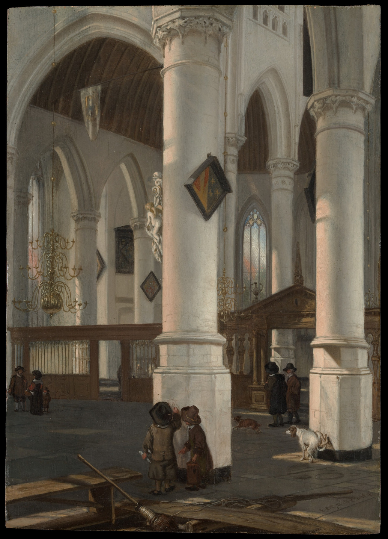
The foreground boards overlap the floor and cut off part of our view. The broad central pier conceals architecture behind it. Figures farther into the church appear smaller than those near the bottom. Floor joints and the repeated supports offer directions into the interior. Together, these cues make some forms seem nearer and others farther away.
This is implied space: the church’s apparent distance is represented on a wooden panel. It is also a useful example of deep pictorial space. “Deep” describes the suggested extension, not the thickness of the support.
There is an important limit to the architectural reading. The Met explains that de Witte took liberties with the actual church. A convincing painted interior need not be a measured record of a real building. We can describe how the picture represents distance without treating it as a floor plan.
Shallow space: overlap can keep the picture close
Now compare Juan Gris’s Fantômas. The green forms, newspaper fragments, wood-grain passages and dark planes overlap, while white contours pass across several areas. There are local suggestions of one thing lying over another, but the arrangement does not open into a church-like distance.
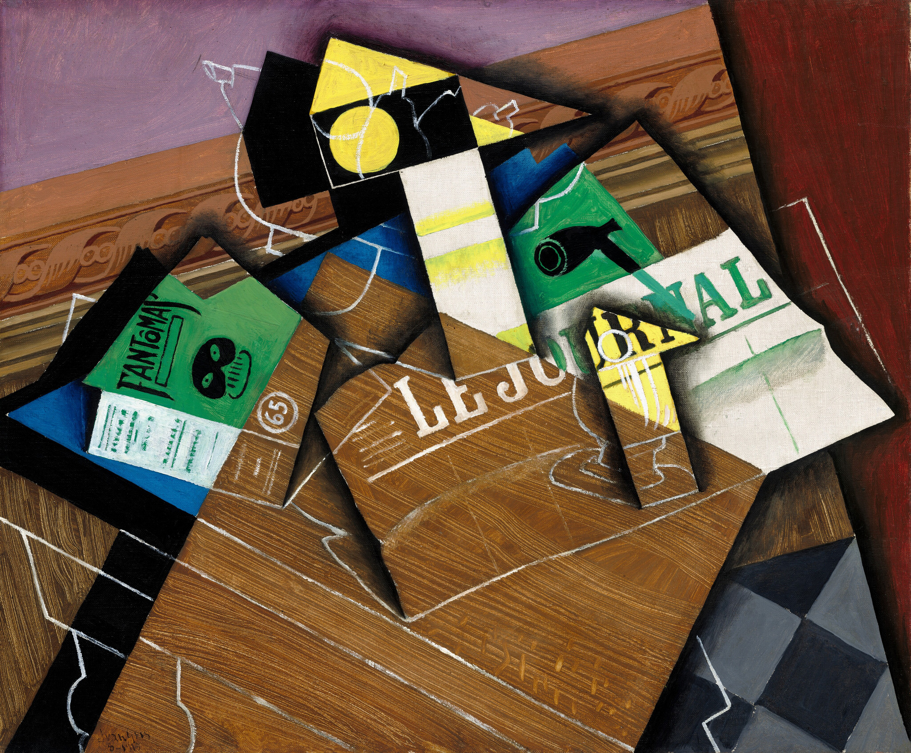
Look at the green Fantômas form at the left against the blue and white areas beneath it. Then look at the white outlines that cross the wood-grain passages near the center and lower edge. Some boundaries suggest a layer above another; other lines continue across those divisions. My reading is of a compressed, shifting arrangement close to the canvas surface.
That is a reason to call the space shallow, rather than to say that the painting has no spatial relationships. Overlap can establish a local order without making a long view into the distance. The brown passages also suggest wood, but the museum identifies the medium as oil on canvas: the depicted material and the physical support are separate facts.
I would keep Gris as a reference when the question is how flat shapes and overlapping planes can remain active together. Replacing it with a more naturalistic interior would change the question. Shallow space is a visible quality to describe, not a lesser grade of painting.
A completed comparison you can use
For Rodin, I would write: “The bronze occupies actual volume, while the opening between the legs brings the surrounding space into the form.” For de Witte: “Overlapping foreground forms, smaller distant figures and repeated architecture make the painted interior seem to recede.” For Gris: “Overlapping planes suggest local layers while the crossing contours keep the arrangement close to the surface.”
Choose Rodin to explain material volume and an actual opening; choose de Witte to explain a deep painted view; choose Gris to explain compressed layers. This chooses a useful example for a particular question. It does not rank the works or assume that every artist wants realistic depth.
Space is only one part of a picture’s organization. To connect it with scale, color, gesture and repetition, continue with how composition holds a picture together.
Questions about space in art
Is space in art always three-dimensional?
No. A sculpture occupies three-dimensional space, while a painting can represent distance on a flat surface. We can also describe the two-dimensional intervals between shapes.
Is negative space the same as the background?
It can include background, but the terms are not interchangeable. Negative space describes the areas around or between selected forms. Those areas can be detailed or colored, and a gap can occur within the overall subject.
Does every painting need a vanishing point?
No. Linear perspective is one way to organize represented distance. Overlap and relative scale can also suggest depth, and a work may use compressed or ambiguous spatial relationships instead of one consistent deep view.
Does overlap always create deep space?
No. It can show that one form lies in front of another without suggesting much distance between them. Gris’s overlapping planes make that distinction useful.
Is a flat-looking painting badly made?
Flatness alone does not establish quality or intention. Ask what the relationships accomplish in the actual work. A compressed arrangement may be precisely the quality you want to study or enjoy.
Sources and image notes
The linked National Gallery of Art and Metropolitan Museum of Art records supply artwork identities, media, dates and public-domain reproductions. Columbus College of Art & Design’s space guide supports the actual/represented-space distinction. Art Class Curator’s examples show the range of spatial treatments; our three close readings are editorial interpretations of the reproduced works.
Public depth-critique and flatness-critique discussions helped identify questions. They are individual art-making conversations, not technical standards or evidence of buyer preferences. No classroom exercise or physical test is claimed. Cover: the complete Gris painting fitted within a neutral graphic surround. Museum images do not imply museum endorsement.