Vintage Art Style: Posters, Photographs, and Bold Color
A sweeping black contour, a crowded city street, a cavern made from blue shapes: all can appear under “vintage art.” Looking closely reveals how differently they work.
Vintage is a starting point, not one visual style
Vintage art style is a loose description for imagery associated with earlier periods, rather than a single art movement or a fixed palette. It can lead you toward a dramatic illustrated poster, a detailed photograph or a simplified graphic landscape. Brown paper, scratches and faded ink are not required for an image to have a historical character.
We find “make it vintage” an incomplete request. It names a feeling about time without saying much about the picture. For someone refreshing the art in a dive bar, that ambiguity matters: a theatrical figure, a neighbourhood photograph and a travel poster bring very different associations. The useful next question is what you want to look at—an emphatic gesture, a place full of small stories, or a few commanding shapes.
The three works below offer concrete examples. They are a small comparison across different media and periods, not a complete classification of vintage art.
The performance poster: a line that keeps moving
Start with the black curve at the bottom right of Jane Avril. Follow it around the edge, then look back toward the dancer. The image makes a border, a musical instrument and a moving figure feel connected.
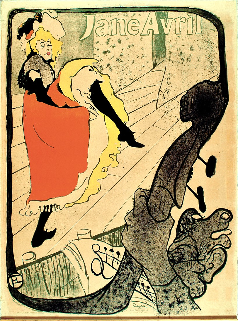
Henri de Toulouse-Lautrec’s Jane Avril of 1893 is a lithograph printed in five colours. The dancer sits off centre; a kicked-out dark leg interrupts the pale floor; a broad orange area gives the figure weight. The lettering is part of the composition, rather than a caption neatly parked underneath.
What attracts us here is the tension between the enormous foreground instrument and the more distant dancer. The image feels animated before we read the name. We would describe this reference as bold contour, asymmetry, a figure in motion and integrated lettering. Those words are more useful than “old French poster” if you want an artist or designer to understand the effect you mean.
The V&A’s poster history traces a much wider range of pictorial and typographic approaches. This particular print shows why a historical reference can be forceful and graphic without relying on fake wear.
The street photograph: detail that rewards another look
Now look at the people nearest the camera, then let the buildings pull your eye down the street. The change in pace is immediate: there is no single gesture that summarizes everything.
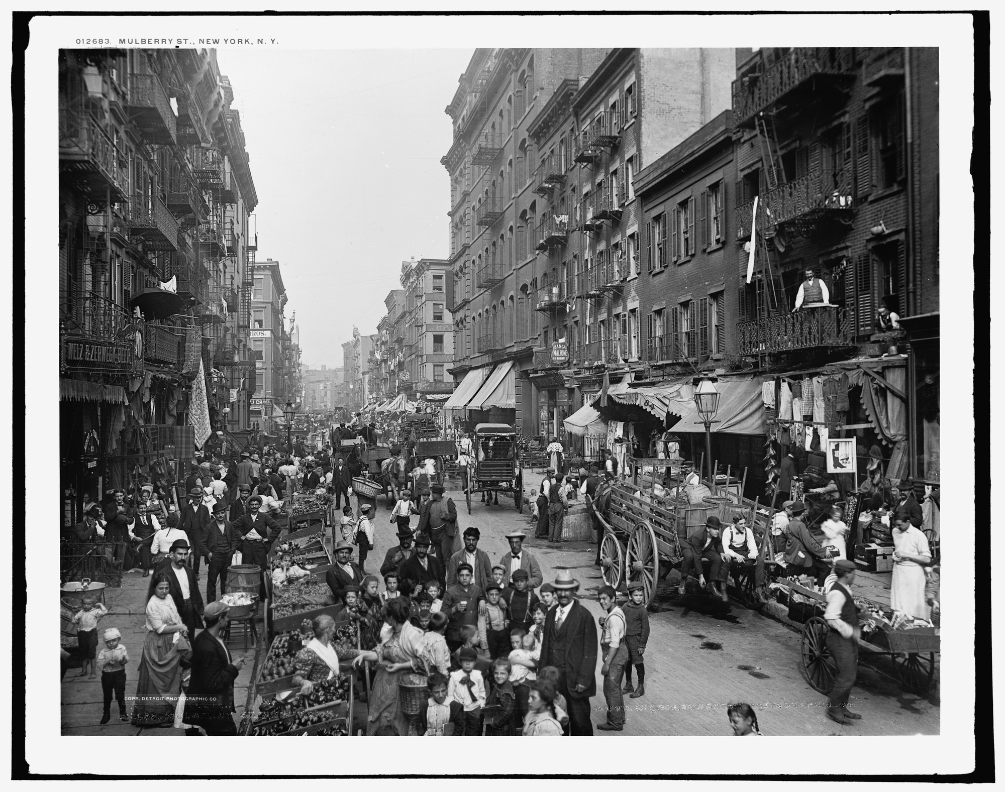
The Library of Congress dates this Detroit Publishing Company image, Mulberry St., New York, N.Y., to 1900. Carts, windows, awnings, faces and signs share the frame. Receding buildings create depth, while pale sky and darker street edges hold the busy scene together.
We keep returning to the small interruptions: a person looking at the camera, a cart angled across the flow, washing high above the street. Its appeal is cumulative. That makes documentary detail, tonal depth and an identifiable place a more accurate brief than “a quiet black-and-white picture.” Monochrome does not automatically mean minimal; this photograph is exceptionally full.
There is also a limit to its story. It records a particular New York street. Hanging a reproduction somewhere else would not make it evidence of that venue’s own past. If a bar wants to tell a neighbourhood story, the next step is to find an accurately credited image of that neighbourhood.
The graphic landscape: a few colours, an enormous space
In the next poster, find the two small visitors before studying the cave. Their size changes how the surrounding blue shapes read.
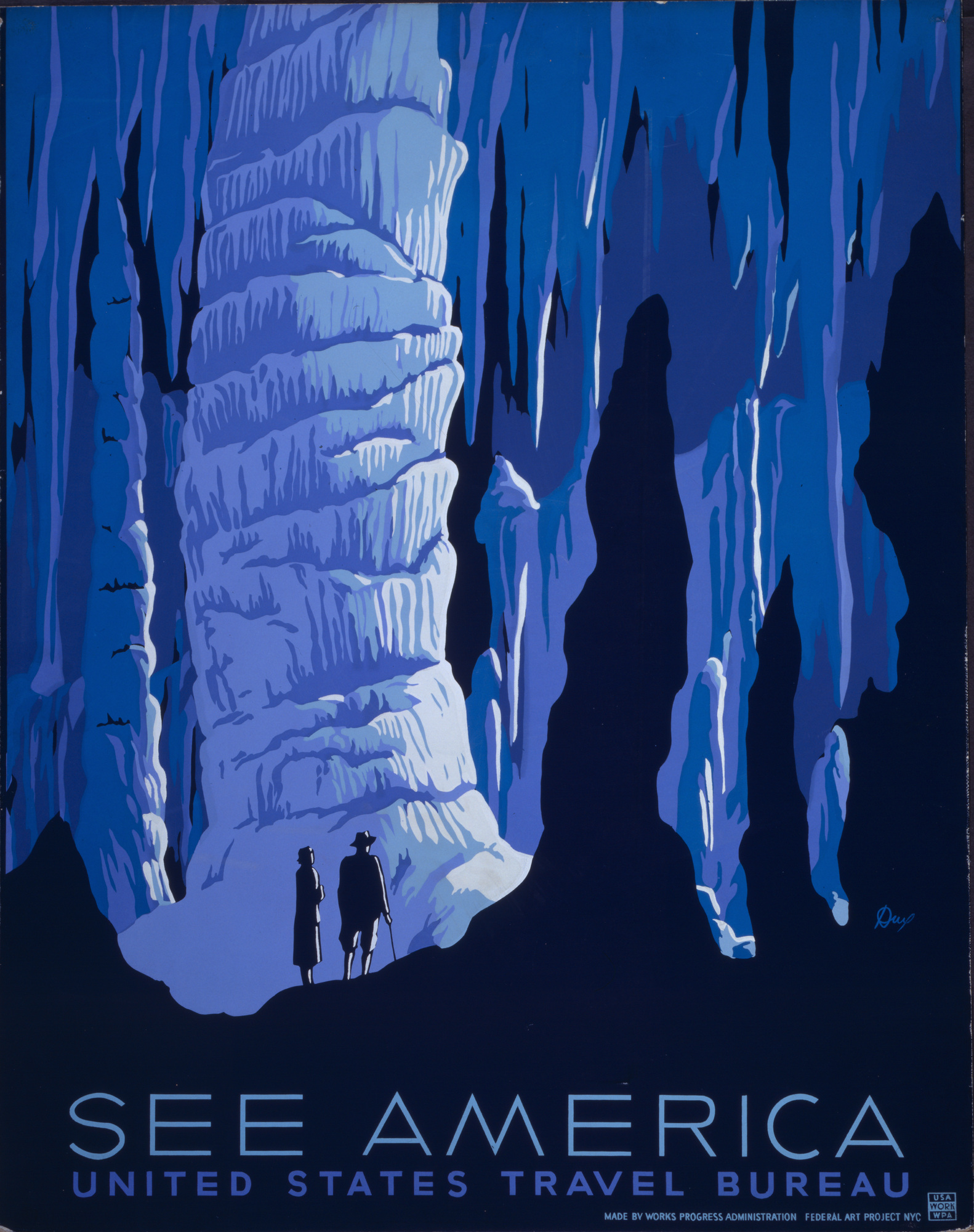
Alexander Dux’s See America, dated 1936–1939 by the Library of Congress, turns a cavern into layers of blue, violet and near-black. The visitors establish scale. A pale rock formation catches the eye, while dark silhouettes give the space its depth.
Here the drawing simplifies surfaces instead of recording every texture. We like the economy: a small number of colour areas does the work of describing a much larger place. The phrase flat colour, clear silhouettes and dramatic scale captures that effect. It also challenges the idea that vintage imagery must be warm, beige or softly faded.
A travel poster can be ornate or densely detailed, and a photograph can reduce a scene to a few shapes. These are observations about the images shown here, not rules imposed by their medium.
Turn “vintage” into a brief someone can use
Imagine a music-led dive bar asking for a lively image with a sense of performance. This is our editorial example, not a client project. We would take the Jane Avril reference forward for its contour, off-centre figure and movement. The street photograph offers slower observation; the cavern poster offers a monumental landscape. Neither answers that particular request as directly.
We want a figure-led poster with a strong dark contour, an energetic pose and lettering that belongs to the image. Use a small, vivid palette. The reference is the movement and composition of late nineteenth-century performance posters; the subject and drawing should be original to our brief.
That is a usable starting point for a commission or an image search. It says what to preserve without asking for a copy of Toulouse-Lautrec. We would not add scratches merely to announce age.
Change the aim to “show the street our regulars remember,” and our choice changes too: a sourced local photograph becomes the stronger direction. Change it to a bold landscape with little figure detail, and the graphic language of See America becomes more relevant. There is no single vintage look that wins all three briefs.
Once the image direction is clear, our separate guide to choosing a lounge bar’s art wall addresses placement. The distinction here is within the picture itself.
FAQ
Is vintage art one particular movement?
No. In contemporary shopping and inspiration language, it can group images from different periods and media. For an individual work, use the documented artist, date and medium; do not assume a movement from the word “vintage.”
Does vintage art have to use faded or sepia colours?
No. The orange in Jane Avril and the blue layers of See America show how assertive historical colour can be. Paper age and surface wear are different questions from the image’s composition.
How can I identify the style of a vintage poster?
Start with any legible artist, printer, title or publication information and look for a matching museum or archive record. Then describe the visible drawing, lettering, colour and composition. A similar-looking poster or a confident comment online is a lead, not a verified attribution.
Which vintage image language suits a dive bar?
It depends on the image brief. Our hypothetical music-led bar calls for a forceful performance poster. A venue telling a documented local story could make better use of a relevant historical photograph. Neither choice requires every decorative object in the room to come from the same era.
Sources and image credits
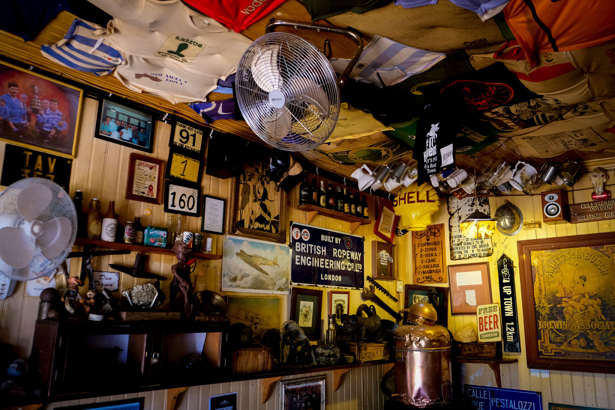
Artwork identities, dates and image rights come from the Met and Library of Congress records linked beside each work. The readings of line, colour and visual pace are ours. A poster-identification discussion and a graphic-design discussion helped identify questions about labels; their replies are not our source for historical attribution. The cover is a real pub photograph by Magda Ehlers / Pexels, used under the Pexels License. It is an independent editorial photograph, not a WhispArt installation.