What Is Chiaroscuro in Art? Look Past the Dark Background
A bright Raphael painting and a dark Caravaggio scene show how light gives figures volume—and how it can make a gesture feel urgent.
Light and dark have a job to do
Chiaroscuro is the use of light and dark relationships to suggest three-dimensional form in an image. Strong contrasts can also concentrate attention and create drama. The useful question is what the tones do across a face, an arm or a whole composition; a dark background alone tells only part of the story.
The word comes from the Italian for “light-dark.” The National Gallery’s definition connects tonal contrast with the modelling of volume and distinguishes Leonardo’s sense of three-dimensional figures from Caravaggio’s dramatic use of light.
We find the term most helpful when it makes us look more closely. Calling a picture “dark and moody” describes an impression. Noticing a cheek turn from light into shade explains how the picture makes that cheek feel solid.
This is a guide to that kind of looking, rather than a course in how to paint. Start with a surprisingly bright example.
Raphael: volume inside a bright picture
Follow the child’s extended arm across the woman’s chest. Its upper surface is pale; warmer midtones lead toward the shaded underside.
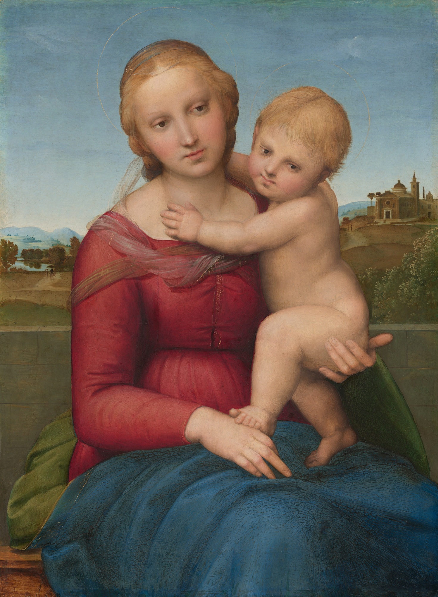
Raphael’s The Small Cowper Madonna, about 1505, has blue sky, a distant landscape and richly coloured clothing. It does not rely on an almost black surrounding field. Yet the child’s arm, torso and face appear rounded.
The arm gives us a completed example of what to look for. Near the top, the flesh catches light. Across its width, the colour deepens into a warmer, darker band. The shift makes the surface seem to turn away from us. The arm’s outline locates its boundary; the changes inside that boundary give it volume.
We read a similar softness across the woman’s cheek and beneath the child’s chin. These passages matter more to the sense of bodily presence than the overall brightness of the sky. If we described this image only as a bright painting, we would miss how its figures are built.
That is the distinction to carry forward: the darkness of the whole picture and the modelling of one form are different things to notice.
Caravaggio: light connects the accusation
Now find the woman’s face at the centre, then the older man’s face and hands on the right. Much of the surrounding space remains dark.
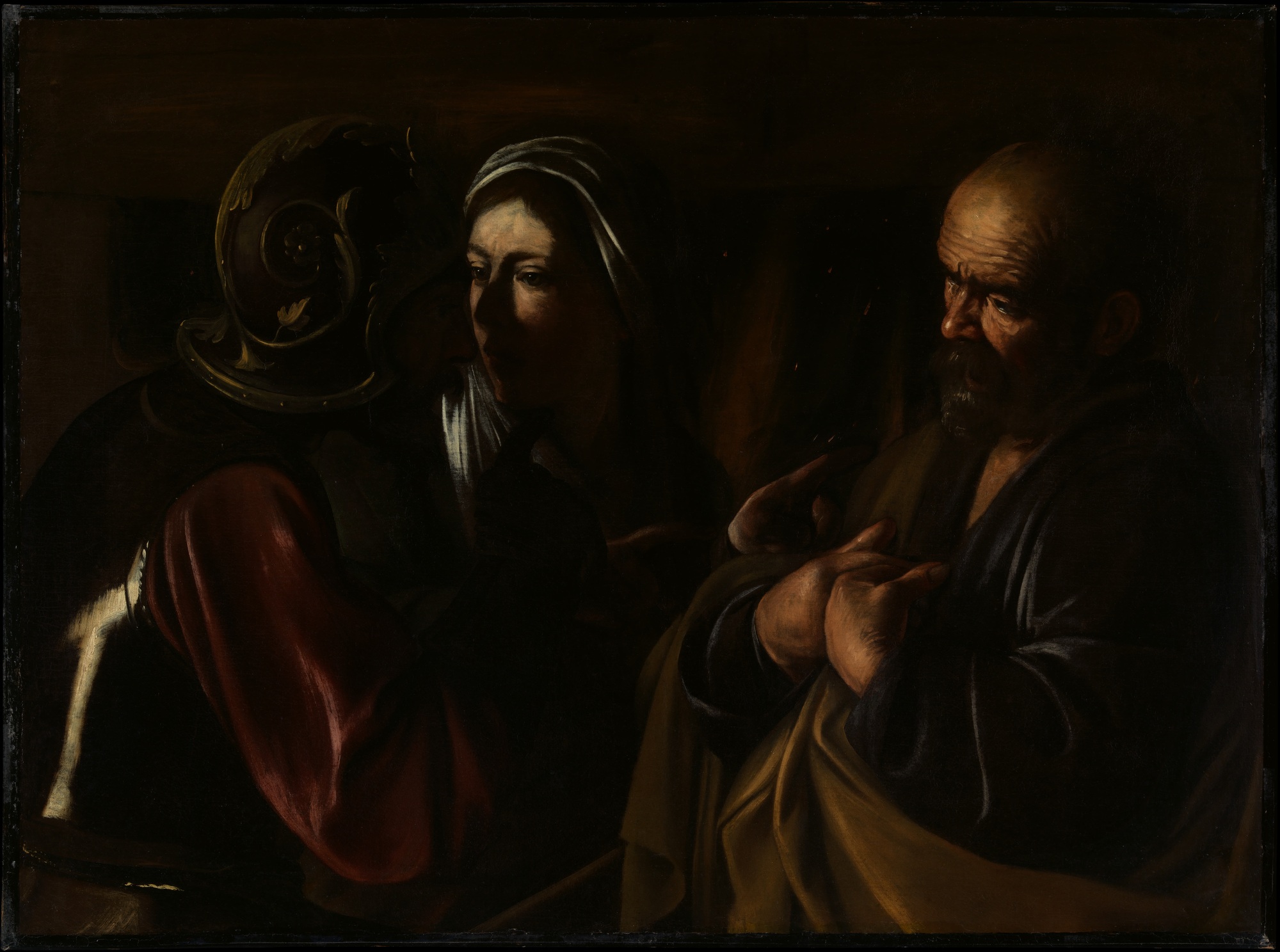
Caravaggio’s The Denial of Saint Peter, 1610, compresses its action into three closely gathered figures. The Met’s account identifies Peter’s denial and the accusing fingers of the soldier and woman.
When we look at this reproduction, the illuminated faces and gestures pull us into the exchange before we have explored the setting. Peter’s forehead, cheek and hands still contain lighter and darker passages that describe their forms. At the same time, the large dark field gives those passages unusual emphasis.
We find the picture tense because the light feels selective: it presents just enough of the people and their gestures to make the encounter immediate. That is our response to this image, not a rule that all strongly contrasted paintings must feel threatening.
Compared with the Raphael, the light is doing more obvious work across the whole composition. It helps shape individual bodies and concentrates the scene around an accusation. Neither operation cancels the other.
Where tenebrism fits
Tenebrism describes paintings in which strongly illuminated details, often faces and hands, stand against a predominantly dark setting. The term is frequently used for late Caravaggio and his followers.
It need not compete with “chiaroscuro.” One description can concern the tonal changes that model a face; another can concern how a few lit elements emerge from darkness. A painting may support both descriptions.
A discussion about choosing between the two labels shows how easily the question becomes either/or. We prefer to name the visible effect first. Is the surface turning through different tones? Is the surrounding darkness isolating a gesture? Those answers make the terminology useful.
How we read a portrait in our own collection
The same question applies to our Last Witness. Look at the changing tones around the nose, cheek and neck, then at the brighter hands below.
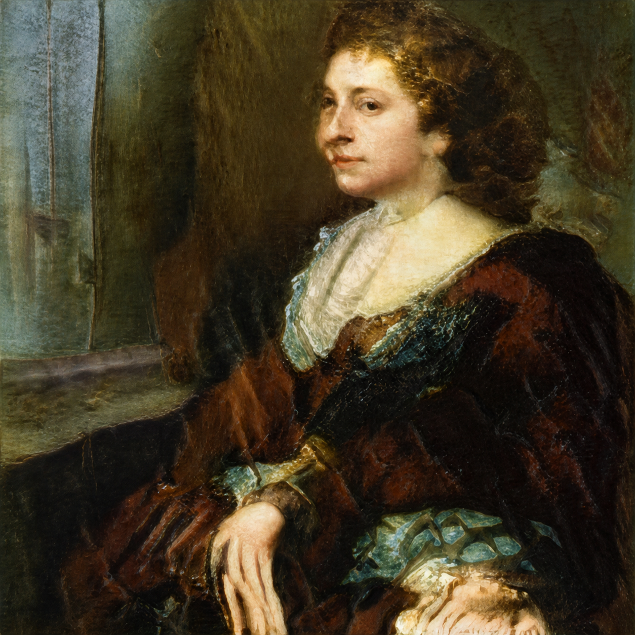
The face reads as rounded because its light areas move through intermediate tones into shadow. Dark hair and clothing give it emphasis, while the patterned fabric offers a more detailed route through the lower part of the image. We like that balance: a face establishes the encounter, and the rest of the picture gives us somewhere else to look.
For a hypothetical cigar lounge seeking a reflective, conversation-led image, we would favor this gentler portrait handling over a scene dominated by stark, accusatory gestures. If the aim were a theatrical or confrontational image, our preference could reverse. This is a judgment about picture character; the reproduction does not establish how a framed work would appear in a particular dim room.
Actual placement is a separate decision. Our lounge wall-art guide considers what guests can see from the entrance and their seats.
FAQ
Does chiaroscuro always need a black background?
No. In the Raphael shown here, gradual tonal changes give the figures volume within a bright landscape. Extensive darkness can intensify the effect, but it is not required for local modelling.
Are chiaroscuro and tenebrism the same thing?
They overlap, but the emphasis differs. Chiaroscuro concerns light-dark relationships, including the modelling of form. Tenebrism describes a predominantly dark setting with conspicuously lit details. A tenebrist painting can also model its faces and hands through chiaroscuro.
Which artists are associated with chiaroscuro?
Leonardo da Vinci and Caravaggio are well-known examples, identified by the National Gallery. Their uses need not look alike: light can build a figure’s volume or make a composition dramatically selective. The Raphael above demonstrates gentler modelling.
Can an online reproduction show the whole effect?
It can show useful tonal relationships, especially when you begin with the museum’s own image. It cannot settle the original’s exact colour, physical surface or appearance under your room’s lighting. Use the reproduction for a traceable close look, with those limits in mind.
Sources and image credits
The National Gallery supplies the terminology linked above; the National Gallery of Art and the Met supply the historical object records and open-access reproductions credited beside each image. Our close readings and lounge preference are editorial judgments, not reports of a client installation. The cover is a real gallery photograph by Jc Siller / Pexels, used under the Pexels License. It is an independent editorial photograph, not a WhispArt installation. The collection image is an unaltered digital artwork reproduction.