What Makes Wall Art Feel Expensive? 7 Things People Notice Instantly
A practical guide to the visual and physical choices that make wall art feel considered, not generic.
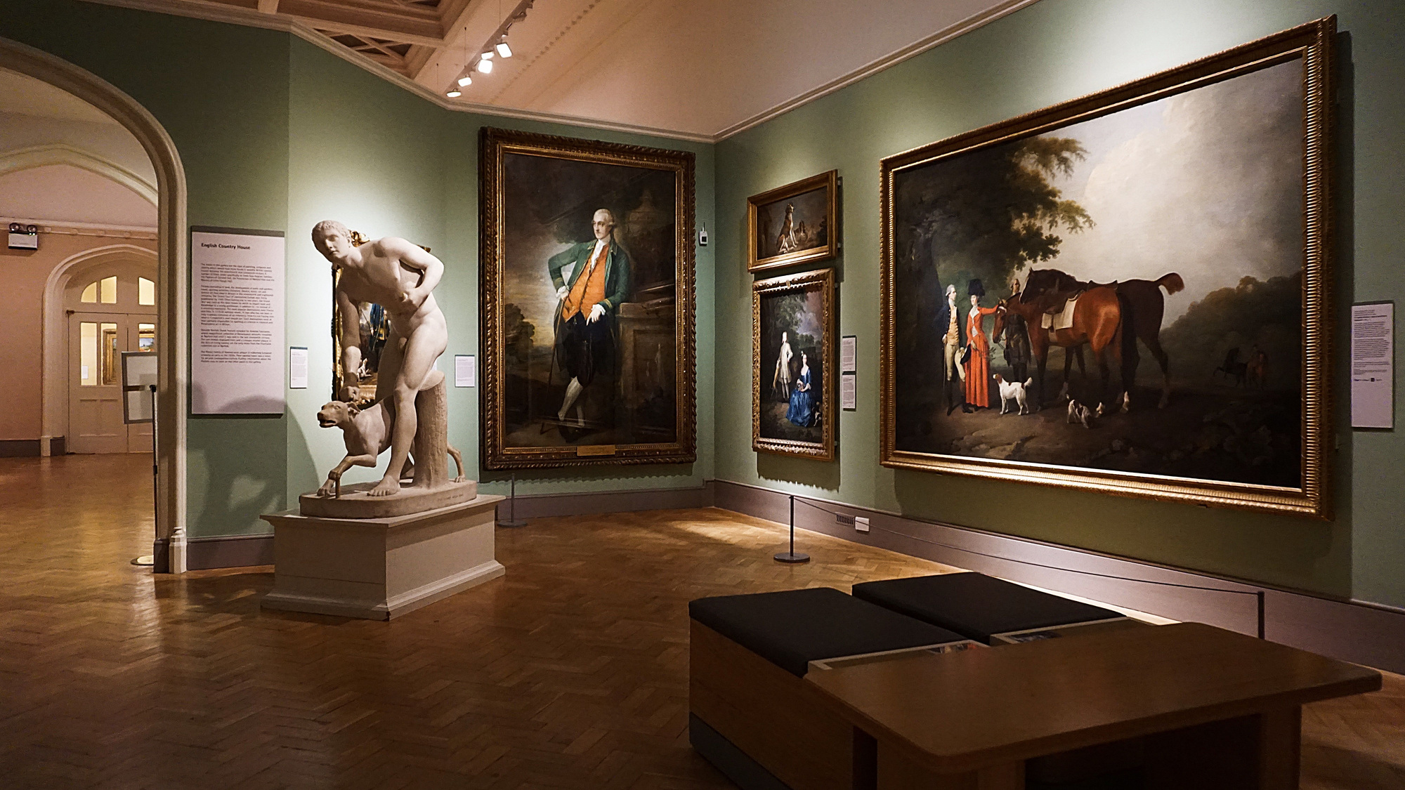
Cover: Central Hall, National Gallery, London. Photo: xiquinhosilva / CC BY 2.0; displayed to fit the page.
Not all expensive art feels expensive.
And not all affordable art looks cheap.
For a considered, expensive-looking display, start with intentional scale, composition, color, framing, verified object details, distinctiveness and placement. These are cues to inspect, not proof of price or artistic quality; the useful first change depends on the effect you want.
When people say a piece of wall art feels “luxurious,” “high-end,” or “gallery-worthy,” they are usually reacting to a set of visual and physical cues—some obvious, some subtle. These cues work together to create presence. They can suggest care in selection and presentation. They do not establish how an unseen object was made or what it is worth.
This has less to do with decoration trends than most people think.
Art feels expensive when it carries conviction.
So what actually creates that impression?
Here are seven things people notice almost instantly.
1. Scale that gives the piece authority
If your aim is a focal work visible across the room, an undersized piece may struggle to hold that role. A small painting chosen for close, intimate looking can be just as deliberate; bigger is not an automatic upgrade.
A piece that is too small often reads as hesitant. It can feel like a placeholder rather than a decision. Even a beautiful image loses force when it lacks enough physical presence to hold its own in the room.
Expensive-feeling art tends to have scale with intention. It does not need to dominate every space, but it should feel proportionate, deliberate, and visually anchored.
For a focal work viewed across the room, a larger format can make its composition easier to read. For a close-viewing corner, an intimate format may do the job better. Choose the role and viewing distance before deciding that the existing work needs replacing.
In this real gallery view, compare the full-length portrait at the center with the smaller portraits beside it. Look at how each reads from the seating area.
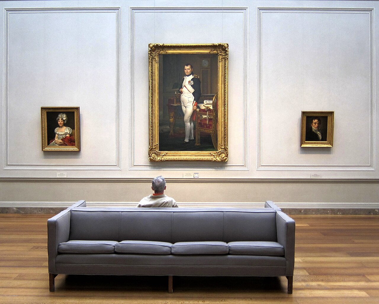
The central portrait registers first from this view, while the smaller works offer separate points of attention. We would decide which viewing role we want before choosing a format. The photograph does not establish the works’ prices, physical quality or measurements.
When the size feels resolved, the whole room feels more resolved.
2. Composition with restraint
If your goal is a quiet display with one clear focal work, composition with restraint can help. This is a preference for that setting, not a test of an artwork's price, originality or artistic quality. A dense composition can be equally deliberate.
It does not need to be louder, busier, brighter, or more literal than everything around it. In fact, expensive-feeling wall art often leaves space—for silence, for ambiguity, for tension, for control.
This is one of the most overlooked aspects of luxury visual language: restraint.
A sophisticated composition knows where to stop.
It knows what to emphasize and what to leave unresolved.
It creates focus without overexplaining itself.
You may not describe the effect in technical terms. Try naming where your eye settles and whether that focus suits the display you want.
That sense of edit—of choosing what not to include—can help a quiet focal work. Ornament and visual density can serve a different, equally deliberate aim.
3. Color that feels developed, not generic
Bright, flat or familiar colors do not make art cheap. In a quiet display, a color that competes with every nearby object may distract from the work; in an energetic room, the same color may be the point. Judge the relationship to the setting, not saturation alone.
Expensive-feeling art tends to have more nuance.
The palette may be quiet or bold, but it usually feels considered. Tones relate to one another. Neutrals are not dead. Darks have depth. Highlights do not feel harsh. Even contrast feels controlled.
This matters because color relationships create atmosphere within an image. They can make light and dark feel layered. How a supplied print reflects the light in your room is a separate question about its surface and surroundings.
A developed palette can make a room feel calmer, richer, and more complete. It can also make the artwork feel harder to replace—which is often part of what people mean when they say a piece feels valuable.
For a concrete color example, look at the pale curves of the flower in John La Farge’s Nocturne, then the quieter blue field around it.

The pale bands give us a concentrated point of contrast; the surrounding blues vary without becoming a single flat block. That is one visible way to build a focal form and related color. We are describing the reproduction, not assigning a price or claiming that a muted palette makes every artwork better.
4. Framing that supports rather than competes
A poor frame can make a strong artwork look ordinary.
A good frame does something quieter. It stabilizes the work. It gives it edge, clarity, and architectural presence without stealing the conversation.
When art feels expensive, the framing usually shares a few qualities:
-
the proportions feel balanced
-
the material feels intentional
-
the finish does not distract
-
the frame belongs to the artwork rather than fighting it
Before replacing a frame, name the actual problem. Is its ornament drawing attention away from the image, is a reflection hiding the work from your usual seat, or is a corner physically loose? The first is a styling choice, the second needs a lighting or glazing check, and the third needs repair. A thin profile or a bold frame is not automatically poor quality.
People often underestimate how much the perimeter changes perception. But the frame is the threshold between the artwork and the room. When handled well, it makes the piece feel complete.
5. Separate the image you see from the object you will receive
A listing photograph can help you judge composition and presentation. It cannot reliably establish paper weight, canvas tension, frame strength or how the surface will look under your light. Dark areas, gradients and reflections may also change with the photograph, compression and your screen.
On a small screen, scroll the table sideways to read the evidence and next action together.
| Check | Useful evidence | Next action |
|---|---|---|
| Visible image and finish | A whole-work image and an unfiltered close-up may reveal an obvious broken gradient, edge damage or distracting reflection in that photograph. | Ask for a second angle or close-up before calling it a printing defect. A photograph is a screening view. |
| What is being supplied | Written image and outer dimensions, substrate, print process, frame material, glazing and what the quoted price includes. | Ask the seller to identify the specific variant. Words such as premium or gallery quality do not replace specifications. |
| Physical construction and surface | Inspection of the actual object, or a relevant material sample plus a clear return policy when buying remotely. | Check corners, joins, visible damage and the surface in your own light. A sample supports material expectations, not the condition of an unseen individual object. |
If the seller cannot confirm the material or finished size you need, pause the purchase. Better evidence is more useful than a more luxurious photograph. This is a buying check, not a claim that one substrate or print process always looks more expensive.
6. Enough distinction to feel curated
Expensive-feeling art usually does not feel like it could have been picked up anywhere.
It has a point of view.
That does not necessarily mean it is strange, difficult, or ultra-conceptual. It simply means the work feels chosen rather than defaulted. It has enough identity that it resists becoming background noise.
This is where curation becomes powerful.
A curated piece often carries a sense of intentionality:
-
the subject feels specific
-
the mood feels authored
-
the composition feels edited
-
the overall work feels selected for more than trend alignment
For a vivid example of a specific visual identity, look at Franz Marc’s Tiger. Follow the animal’s dark stripes, then the angular green, blue and red forms around it.
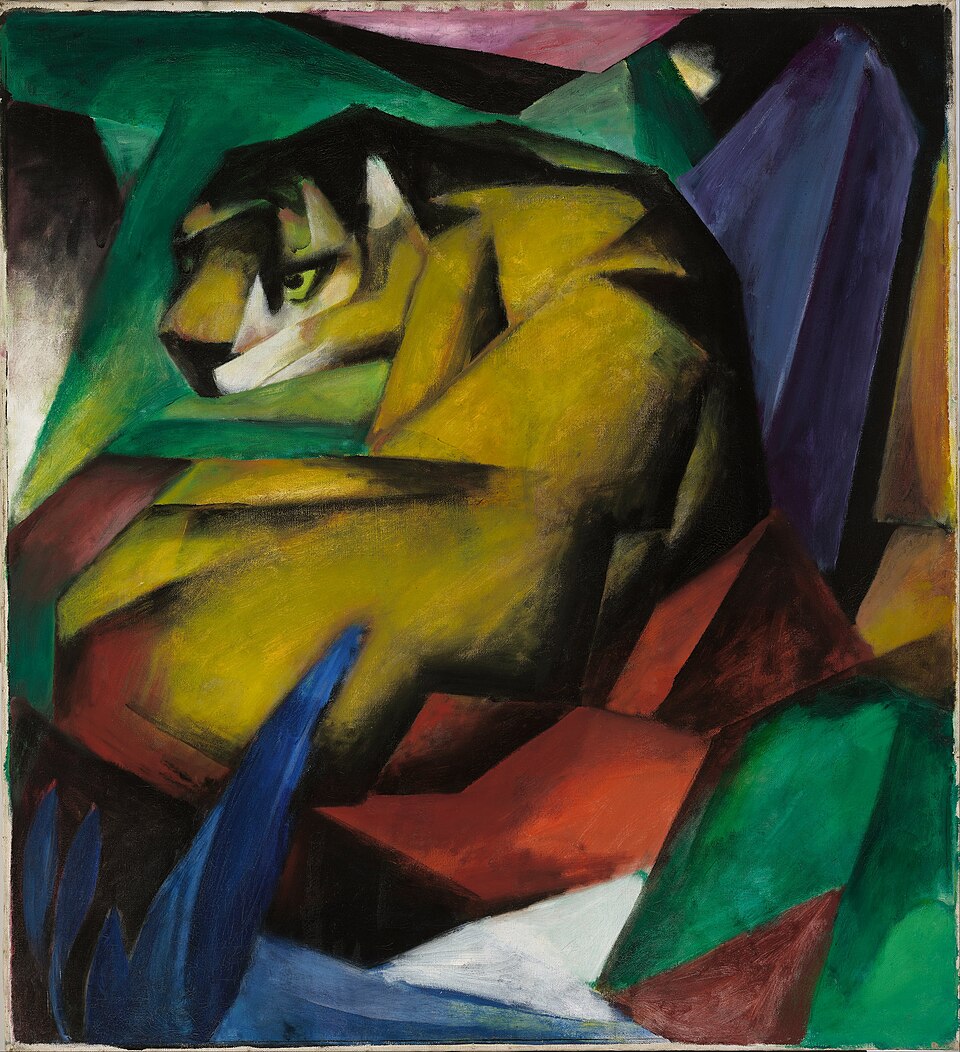
The recognizable animal and angular surroundings give us features we can name: a curled yellow body, strong stripes and pointed color passages. A work can be vivid and crowded yet still have a clear identity. For your room, ask which particular relationship makes you want to look again; unfamiliarity alone is not the test.
When something feels curated, people assume more care went into it. And that assumption changes how they read its value.
If distinctiveness is your goal, ask what specific subject, color relationship or composition makes you return to this work. A familiar image can still be meaningful; rarity and unfamiliarity do not automatically make it better for your room.
7. A relationship to the room that feels architectural
The most expensive-feeling wall art does not merely occupy a wall. It helps structure the room.
It acts almost like an architectural decision.
A work above a sofa can set the emotional register of the entire living area. A piece in an entry can define the house’s tone within seconds. A canvas in a bedroom can control whether the room feels serene, dramatic, intimate, or unresolved.
This is why luxury art selection is rarely only about “matching.” It is about placement, proportion, negative space, and rhythm.
For a calmer display with one focal artwork, space around the work can help it register before nearby objects. A layered gallery wall or energetic collection has a different goal; surrounding the work with other things is not automatically a mistake.
In other words: expensive-looking art is not only about the piece itself. It is also about the confidence of its placement.
A small decision before buying something new
This is a fictional planning example, not a product quote or a tested room. Maya likes her existing 50 × 70 cm framed print. The frame is sound, but several bright objects below it attract her attention first. Her goal is a calmer display; she has a $120 spending limit.
Compare the same artwork before and after moving the bright objects below it. Follow the red vase in A, then the unchanged artwork in B; the labels describe the change, not a quality score.
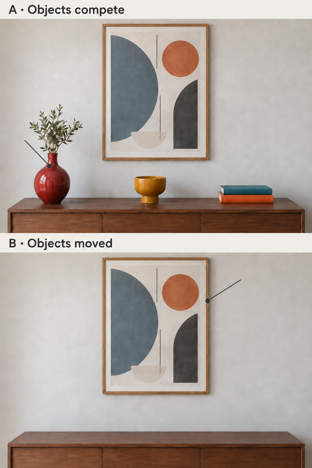
For Maya’s stated calmer-display goal, we would try B first: move the objects and keep the art she likes. The picture shows the relationship to consider; the choice below makes the cost and limits explicit.
On a small screen, scroll sideways to compare each option’s cost and decision.
| Option | Cost in this exercise | Decision |
|---|---|---|
| Move the competing objects and keep the print | $0 | Do this first. It preserves the image she likes and tests the stated distraction without committing the budget. |
| Replace the frame | No usable quote yet | Hold. She has not identified a frame problem or checked the print fit, glazing and total fitted price. |
| Buy a different print from an attractive listing photo | $100 hypothetical item price; final cost unknown | Hold. The substrate, finished dimensions, frame, delivery and returns are unconfirmed. The item price alone does not establish a $120 total. |
The first decision is to spend nothing and move the competing objects. If Maya still wants a change, she must identify the remaining issue before seeking a quote. A damaged frame reverses the keep decision and calls for repair; glare calls for a light-angle or glazing check; wanting an energetic display reverses the reason for removing the bright objects. None of these choices requires replacing art just because it is affordable.
So what makes wall art feel expensive?
Usually, it is not one dramatic feature.
It is a combination of decisions:
-
meaningful scale
-
compositional restraint
-
developed color
-
refined framing
-
confirmed material and construction details
-
curatorial distinction
-
strong placement within the room
When those elements come together, the artwork begins to feel less like decoration and more like an object of consequence.
That is the difference people notice.
Not just whether something is beautiful.
But whether it feels believable.
Whether it holds the wall with confidence.
Whether it seems temporary—or lasting.
Final Thoughts
The wall art that feels most expensive is rarely the piece trying hardest to announce its value.
More often, it is the piece that feels settled in itself.
It has clarity.
It has proportion.
It has material credibility.
It has enough presence to quiet the room around it.
That kind of art does more than elevate a space. It changes how the space is read. And over time, that is often what people are really paying for—not just an image, but a deeper sense of atmosphere, permanence, and intention.Explore artworks in the Whispart collection
FAQ
Can affordable wall art look expensive?
Yes. A display can feel considered through proportion, color relationships, a suitable frame and placement. Price alone does not establish those choices, and an expensive-looking photograph does not prove the supplied object’s quality.
Should I buy a larger print or a new frame first?
First name the problem. If the sound frame and liked image are distracted by nearby objects, try moving those objects before spending. If the work cannot serve its intended viewing distance, investigate size; if the frame is loose, repair it. These are different problems.
Do muted colors and thin frames always look more refined?
No. A vivid palette, dense composition or bold frame can be deliberate. Our quieter-display example is a conditional preference, not a ranking of artistic quality.
What should I verify before buying from a listing image?
Ask for the exact variant’s image and outer dimensions, substrate, print process, frame and glazing details, total delivered price, and return terms. Photographs can screen visible concerns; they do not replace specifications or inspection of the actual object.