Eclectic Gallery Wall Ideas for a First Solo Apartment
You finally get to hang the strange, lovely pictures you chose for yourself. The question is how to make several of them read as one deliberate wall, without sanding away what makes them yours.
The short answer
Start with the artworks you already want to see, then try two arrangements of those same pieces on the same wall. If you want one playful focal point, gather the smaller works around an anchor so the whole group has a readable boundary. If you want the wall to feel exuberant from corner to corner, test a deliberate route through the pictures; simply pushing the same five farther apart will not make an expansive composition. You do not need to replace a surreal portrait with neutral filler merely to look grown-up.
Many gallery-wall ideas show beautiful variations and suggest laying pieces out before hanging. That is useful. Our question here is narrower: when the pictures are already yours, what changes if their positions change and nothing else does?
Three ideas before you make a hole
One compact cluster
Use the strongest work as an anchor and let the others form a single shape around it. This works when the wall has a sideboard, sofa or dining table that gives the group a visual center. The edges need not form a perfect rectangle. The important test is whether your eye recognizes one collection before it jumps to individual frames.
A loose, whole-wall collection
A room-spanning collection can work when the wall is wide and the resident wants viewers to move along it, rather than see one focal point from a seat. With these five works, we would test a stepped route or two related groups and keep the small pieces within the visual route. The pictured Trial A below is a first attempt, not a successful version of this idea: its gaps leave the works disconnected.
A small beginning, with room to grow
If only two works feel essential today, hang those two as a complete relationship and leave the rest unbought. In a discussion about whether gallery walls are too much, one participant said buying things merely to make a gallery wall felt odd. We agree with the distinction: a smaller group of art you care about is more convincing than a full wall of placeholders.
The same five pictures, two ways
Imagine one first-solo apartment with a fixed sideboard between the living and dining areas. The resident already owns five framed images: a large dark moon-and-hill picture, a small peculiar pink portrait they love, a green botanical, a blue wave and a little dotted image. Their aim is a visible, playful focal point above the sideboard. The images, frames, furniture and wall stay unchanged in both trials. This is our editorial schematic, not a customer installation or a product photograph.
Trial A: let each picture claim its own patch
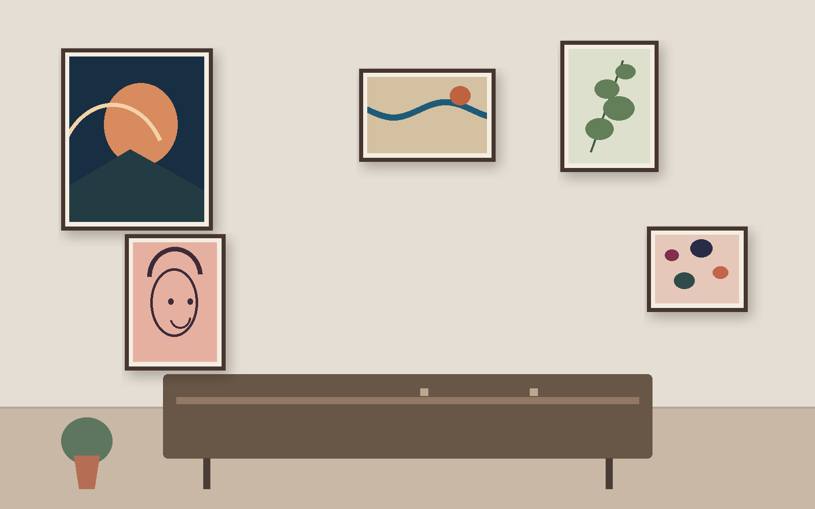
We would not choose A for this resident’s stated goal. The long gaps make the works feel like separate stops, and the portrait they care about gets stranded at one edge. A does not become successful merely because the wall is wider. If the resident instead wants a collection that unfolds as someone walks along a wide wall, we would make a third paper trial: move these same five works into a stepped route or two visibly related groups, and bring the dotted work back within that route. We would compare that new trial from the walking approach before choosing it; pictured A still fails the one-focal-point brief.
Trial B: bring the odd portrait into the group
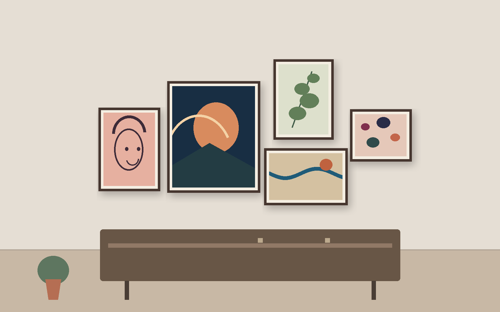
Our choice is B. The large dark image gives the eye an entry, and the pink portrait becomes a purposeful companion rather than an apologetic oddity. The botanical, wave and dots keep the mix lively. The cost is less wall coverage, which is acceptable here because the resident asked for one focal point, not a full-wall salon. If their real wall were exceptionally wide and they wanted a route through the pictures rather than one focal point, we would test the deliberate third arrangement described above. We would not hang pictured A unchanged.
This is a composition judgment, not proof that one arrangement is objectively more “adult.” In a gallery-wall request, the owner had carefully selected and framed the art but still felt the wall looked accidental. Some replies wanted closer grouping; others wanted more or larger art. That disagreement is a reason to test the actual wall and desired reading distance instead of copying a fixed gap number.
Test the relationship at full framed size
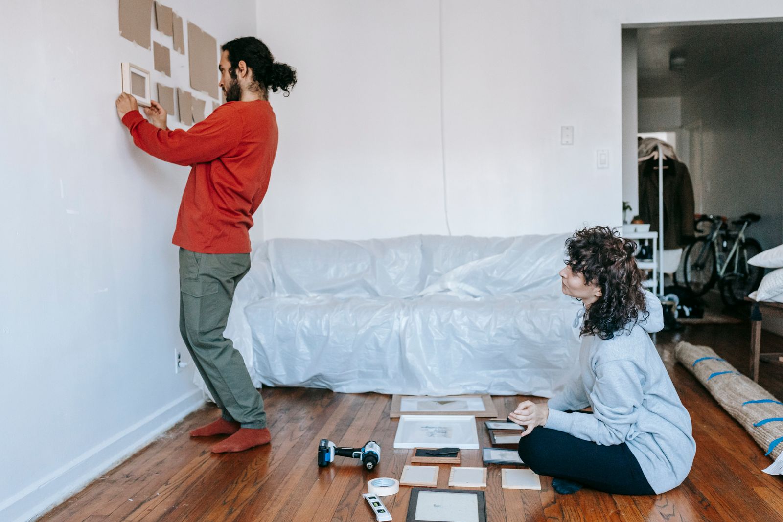
We would make paper outlines of the outside dimensions of all five frames and label them by picture. Lay out A on the floor, first check whether temporary tape is suitable for the wall surface and permitted under the lease. If so, tape the outlines to the wall and photograph them from the sofa and dining approach; otherwise compare both arrangements on the floor or hold the outlines in place without attaching them. Move the same outlines to B and take the same two views. Ask two questions: can you read the entire group as one shape, and can you still notice the picture you most wanted to keep? The inspected gallery guide also recommends a floor or tape trial before hanging; our addition is to compare two completed outcomes with the art held constant.
In the illustrated trial, B wins those questions. If the real outlines collide with a switch, a sconce or each other, we would stop and use a smaller group or a different wall rather than squeeze in all five. The paper check only tests visual placement. Check your lease, surface and mounting method separately before installing frames.
Keep your point of view in the room
We do not think a picture becomes childish because it is odd, pink, surreal or difficult to label. A reader of the room may still dislike it; that is a preference, not a verdict on your taste. In one discussion about a beloved ballerina painting, the owner worried she had outgrown it. Replies ranged from “keep what you love” to practical suggestions about location and scale. Another resident asked whether surreal, darker art might unsettle guests; answers varied with the imagery and room.
Our editorial call is to preserve the work you would miss, then decide how publicly and prominently to display it. The pink portrait in our example stays. If a particular image genuinely makes someone who lives in the room uneasy, or you would rather encounter it privately, a bedroom or reading corner can be a better home for it. That is a placement choice, not a command to buy a safer replacement.
If your problem is which distinctive picture to own, start with our unique-art apartment guide. If the pictures are right but one frame distracts, our mixed-frame guide handles that separate decision. Here, both artworks and frames remain fixed so arrangement can do the work.
FAQ
How do I make an eclectic gallery wall look intentional?
Give the collection a readable boundary and one clear point of entry. On the illustrated sideboard wall, the dark work anchors four smaller pieces; the same five works scattered across the wall lose that collective shape. Test the complete group from the places you actually sit and enter.
Do all the gaps between frames need to match?
No fixed number suits every wall and frame mix. Start with gaps that keep each picture legible and let the whole group read as one composition. If the rhythm looks arbitrary from your usual view, adjust the paper outlines before hanging; do not force a quoted inch rule onto a different wall.
Will strange or playful art make my apartment look childish?
The subject alone does not decide that. Keep a work you value, then check whether its placement gives it room to be seen. If its imagery truly changes how someone uses a shared room, choose a more private location; you do not have to erase your taste to make a considered choice.
Should I buy more art to complete the wall?
Only if the new piece matters on its own and improves the group. If your paper trial works better with two or three existing pictures, stop there. A gallery wall can grow as your collection grows; filler is not a requirement.
What if I cannot mount all five frames?
Keep the strongest smaller grouping or postpone the wall. Confirm the lease, wall surface and appropriate mounting plan before installation; the illustrated layout and paper templates do not verify physical suitability.
Sources and image notes
We inspected The Spruce’s gallery-wall examples and layout advice and a commercial set guide for the search-result baseline. The linked Reddit conversations supplied individual concerns and conflicting suggestions, not population-level evidence. All five artworks, the sideboard and both layouts are original schematic illustrations made for this article; no customer home, WhispArt product or installed arrangement is depicted. The process photograph is credited in its caption and used under the Pexels License.