Lobby Art Placement: When the Reception Wall Is the Better Choice
A quiet side wall is not always the strongest location. Compare what the same artwork can do at arrival and during a longer look.
Place lobby art behind reception when you want one image to register on arrival, the wall faces the entrance, and the artwork remains clearly visible around staff, signs and equipment. Choose a seating-area wall when the main purpose is a longer, closer encounter and a real seat-to-picture sightline supports it.
The reception wall often carries several jobs already. That can make another picture unnecessary. But it can also be the only surface a new arrival sees nearly straight on. The better choice depends on the view and the artwork’s purpose, rather than a rule that reception must always be dramatic or always remain bare.
This guide completes one placement decision in an invented compact boutique-hotel lobby. It compares two locations for the same work. It does not propose a whole-hotel art collection or certify an installation.
Give the artwork one main viewing job
“Make the lobby feel finished” is difficult to test. “Give the entrance view one identifiable image above the reception desk” tells you where to stand and what to examine. “Give someone waiting in a chair an interesting image to look at closely” leads to a different viewpoint.
Write the primary job before comparing wall areas. For this example it is: make the artwork’s main image readable from the entrance while keeping reception information separate. We are choosing an arrival image, not trying to display every small detail at the doorway.
Large blank walls are only candidates. Franklin Arts’ lobby service offers customization by size, color and style, illustrating how broad the available choices can be. Those choices still need a particular wall and viewpoint. A picture can fit a surface yet be poorly placed for the encounter you intend.
If the hotel’s larger atmosphere and public-space roles are still undecided, use our boutique-hotel concept guide first. Here, assume that work is already done and the decision has narrowed to one artwork and two usable walls.
Compare the same lobby with the artwork in two places
In the illustrated scenario, reception faces the entrance. A small sign sits on the counter, leaving the wall behind it available. The seating-area wall runs along the right side of the room, so a person entering sees that surface at an angle.
The comparison keeps the room, viewpoint, light and artwork consistent. The major change is location: A puts the picture behind reception; B moves it to the side wall. Both are plausible compositions.
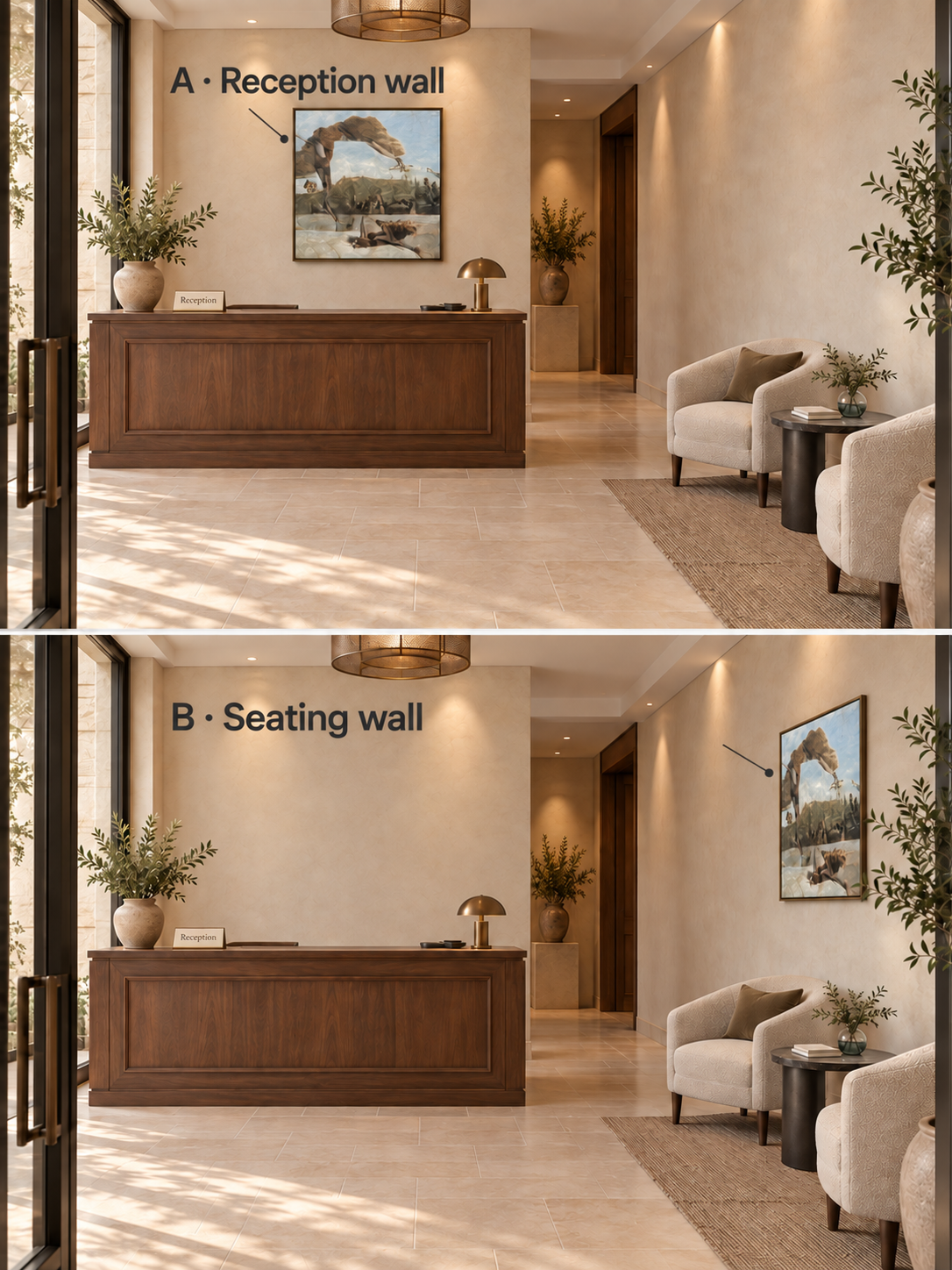
For the arrival-recognition brief, choose A: the reception wall. The artwork faces the entrance more directly. Its dark arch and lighter opening are easier to inspect as one image in this view. In B, the same picture remains visible but its angled presentation compresses the image.
This choice gives up the possibility of putting the picture nearer someone who wants to pause beside it. That tradeoff is acceptable for the stated brief. It would be a poor justification if the real intention were to encourage detailed looking from a chair.
The illustration contains no staff or queue, so it cannot establish that those people would leave the view clear. Before using A in a real hotel, check the proposed framed work with normal reception occupancy. An attractive empty-room view is only the starting comparison.
Turn the comparison into a test on your actual wall
Use the proposed work’s outside-frame dimensions, including any mat or mounting surround. A canvas size alone does not describe the footprint the finished piece will occupy.
- Mark the two candidate footprints. Use a removable full-size paper outline or another property-approved temporary method. Keep the proposed framed size the same in both locations so that size does not quietly decide the placement test.
- Mark two viewing positions. Choose the actual entrance approach and a chair from which the work could reasonably be viewed. Photograph each proposed location from those same positions, at a consistent camera setting. A chair directly below the picture may not offer a useful view of it.
- Add the image, not only its rectangle. Use a temporary image mockup or correctly scaled overlay to compare the main shapes. A blank outline tests fit; it cannot show whether the composition remains readable at an angle or distance.
- Repeat under normal use. Include the typical staff position, counter equipment and queue arrangement. Check the planned glazing or a suitable sample in the actual lighting where reflections might obscure the image.
- Record one choice and one reason to reverse it. Save the matched views with the proposed frame size. If neither location delivers the brief, change the candidate work or wall before placing an order.
Do not turn a poorly visible reception picture into a successful arrival image merely by moving it higher. That can create a different viewing problem. Compare another framed size or composition, or choose a different wall, using the same viewpoint test.
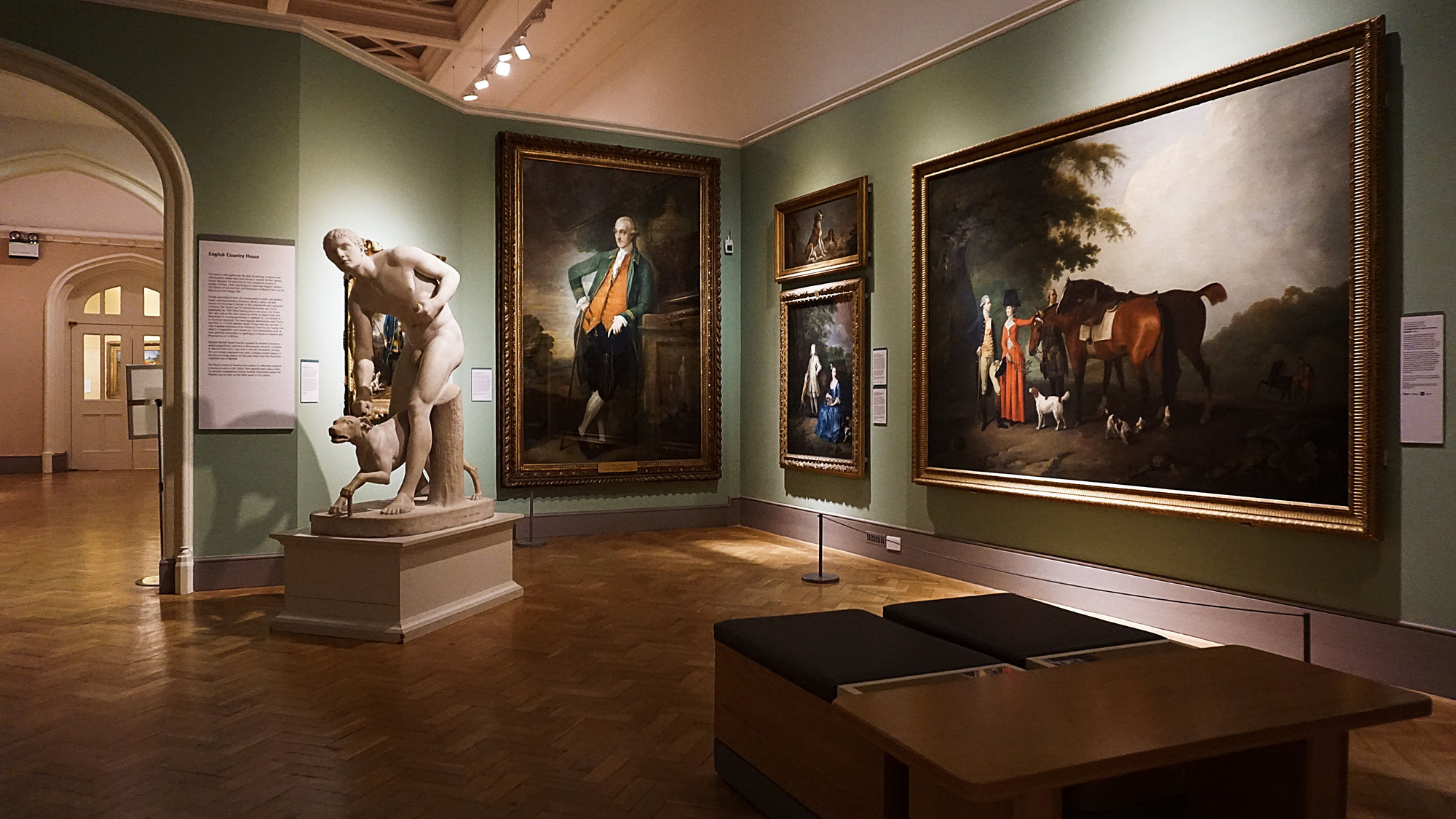
Visual access can be a real limitation in lobbies: the independent Museum of Lobby Art describes New York corporate-lobby works that may be visible only from restricted positions, including through windows or around guarded areas. That is a useful reminder to examine the view people actually have; it is not evidence about guest behavior in this hypothetical hotel.
A completed decision—and the change that reverses it
For the invented lobby, assume the later footprint check confirms that the reception picture remains visible above normal staff positions, the counter sign is legible, and reflections do not obscure the main image. These are declared scenario inputs, not observations from a hotel visit.
The decision record can now read:
Location: reception back wall. Job: one readable arrival image. Reason: the front-facing view preserves the arch and light opening more clearly than the oblique side-wall view. Tradeoff: the picture is not positioned for a close seated encounter. Revisit if: staff, signage or reflections interrupt the entrance view.
Now change just the brief: the hotel wants a work that rewards someone waiting and looking for longer. Assume a chair opposite the side wall provides a clear view at a comfortable distance, confirmed in the room. For that close-view brief, choose the seating-area wall instead.
B becomes a useful candidate because the arrival angle is no longer the deciding criterion. Its success now depends on the opposite chair’s view, which the arrival illustration does not show. If the only chairs are directly below the work, that assumption fails: check another seat or wall rather than declaring B the winner from the rendering alone.
The useful output is a location tied to a viewing task, with the actual comparison photographs attached. Mounting details and any relevant property requirements remain for the responsible installer or facilities team to confirm.
Match the image’s character to the chosen encounter
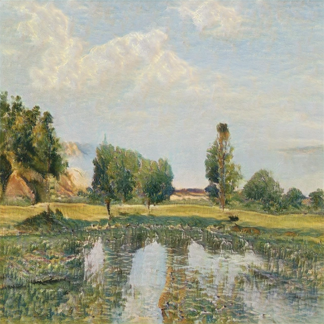
The placement test also reveals which parts of an artwork do the work. A broad dark arch around a bright opening can organize the distant image. Smaller irregular marks and ambiguous spaces may become more rewarding when the viewer is nearer. The same picture can offer both, but a given wall may emphasize only one.
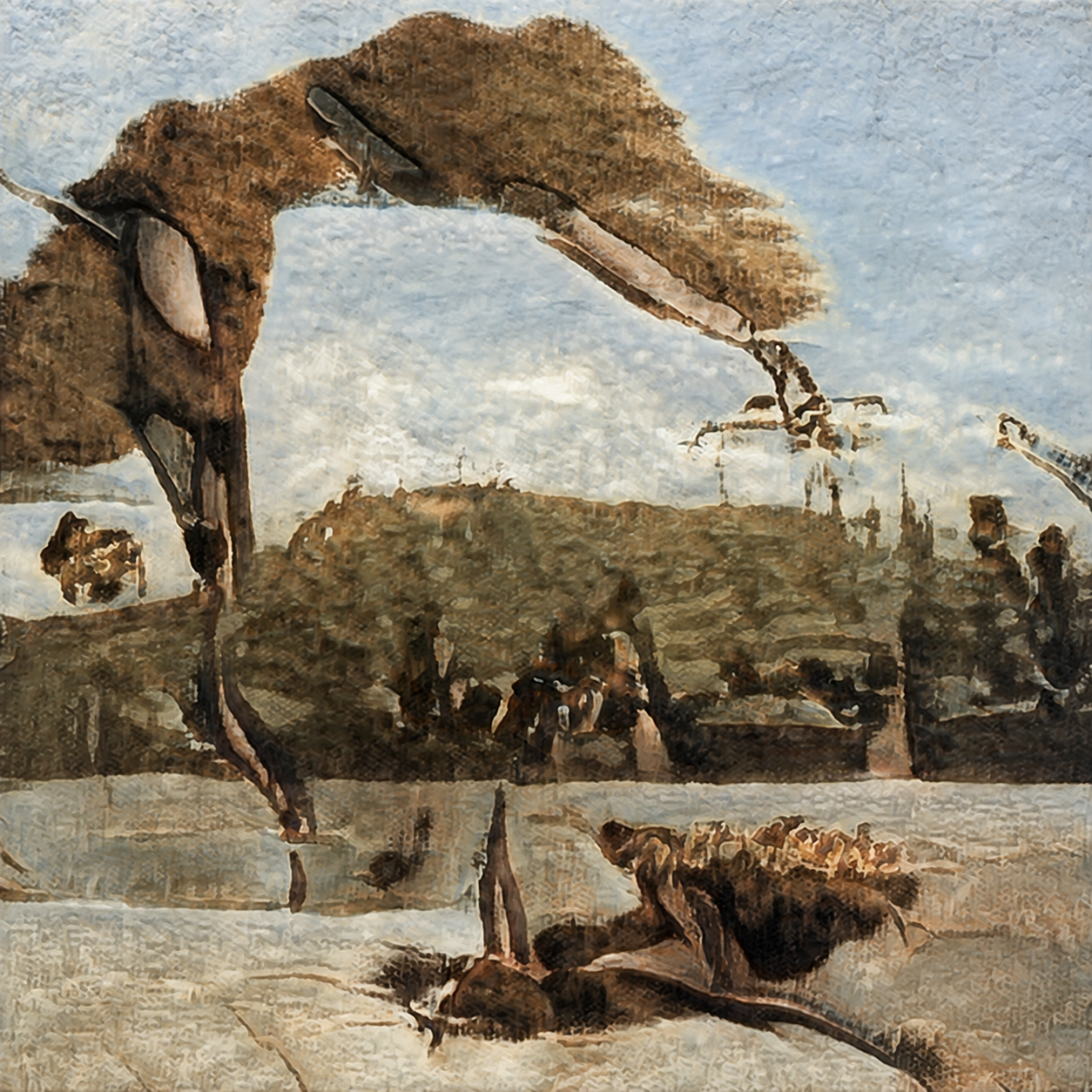
In this WhispArt example, architectural forms remain recognizable while their relationship feels dreamlike. We would describe that visible character as surreal, with areas of abstraction. The description explains why the image can work as both an identifiable silhouette and a closer visual puzzle; it does not establish a historical classification.
For your shortlisted work, cover the fine detail in a small preview and ask what main structure remains. Then inspect the full image. Use those two readings to decide whether you are buying an arrival image, a picture for longer looking, or a work that can serve both positions.
If the eventual location is a passage broken by doors, it needs a different arrangement test. Continue with artwork ideas for door-heavy corridors rather than extending this reception example along every spare wall.
FAQ
Should lobby art always go behind the reception desk?
No. Reception is a strong candidate when the entrance view is clear and arrival recognition is the main purpose. A wall already occupied by branding, information or equipment may not provide that opportunity. Compare the actual view before choosing.
Is a seating-area wall better for detailed artwork?
It can be, when a real seating position allows a clear, sustained view. A picture above or immediately behind a chair is not necessarily visible to the person sitting there. Test from the actual chair, not only from the entrance.
How large should artwork be in a hotel lobby?
Start with the usable wall and actual outside-frame size, then test the image from the intended viewing positions. This example provides no universal ratio or size. A large work can still be poorly placed if its composition is compressed by an angle or obscured by normal activity.
Can art share a reception wall with a hotel logo?
It may, if both retain a clear role in the real view. Try the actual logo, picture and counter arrangement together. If they compete or the information becomes harder to read, simplify the composition or use another art location.
Does a luxury lobby need abstract art?
No particular style guarantees a luxury impression. Choose an image whose character suits the intended encounter and the hotel’s broader concept. The surreal work here is one visual example; its placement is justified by the view, not by the word “luxury.”
What if neither the reception nor the seating wall works?
Keep the brief and change the candidate. Test another artwork composition, framed size or wall with the same marked viewpoints. Leaving a surface empty while resolving that choice is better than treating an available rectangle as an instruction to fill it.