What Is Color in Art? From Description to Expression
Color is a visual element of art: the reds, greens and other hues we perceive, together with their lightness and intensity. Artists can use it to describe how things appear, to transform that appearance, or to build an imagined setting. A picture can keep its recognizable subject while departing strongly from its everyday colors.
What is the color doing to the subject?
Knowing the names of colors gives you a starting point. The next question is how they relate to what the picture represents. A skin tone may help describe a person; an unexpected green or violet may reshape how that person appears. Both uses can occur in the same work.
Descriptive color helps convey the appearance of a subject: a material, a surface, or the light falling across it. It does not require a perfectly neutral, camera-like record. Expressive color is used for an effect beyond that description. A painter may exaggerate, simplify or invent color relationships while keeping the depicted objects easy to recognize.
Tate’s color guide explores this movement from descriptive color toward less literal uses, including artists who stopped trying to match the world’s colors closely. It also cautions against a fixed equation between a hue and an emotion. These are useful ways of reading art, rather than two exclusive boxes into which every painting must fit.
Three terms help keep a description precise: hue is the color family, value is its lightness or darkness, and intensity describes how strong or subdued it appears. They name different qualities. Our muted-color guide explains why subdued does not necessarily mean dark.
Gauguin: the sea remains recognizable, but its color changes the world
In Paul Gauguin’s In the Waves, a figure moves diagonally through green water. Her orange-red hair sits above a pale back, and curved white marks indicate surf. You can recognize the scene before deciding whether its color seems plausible.
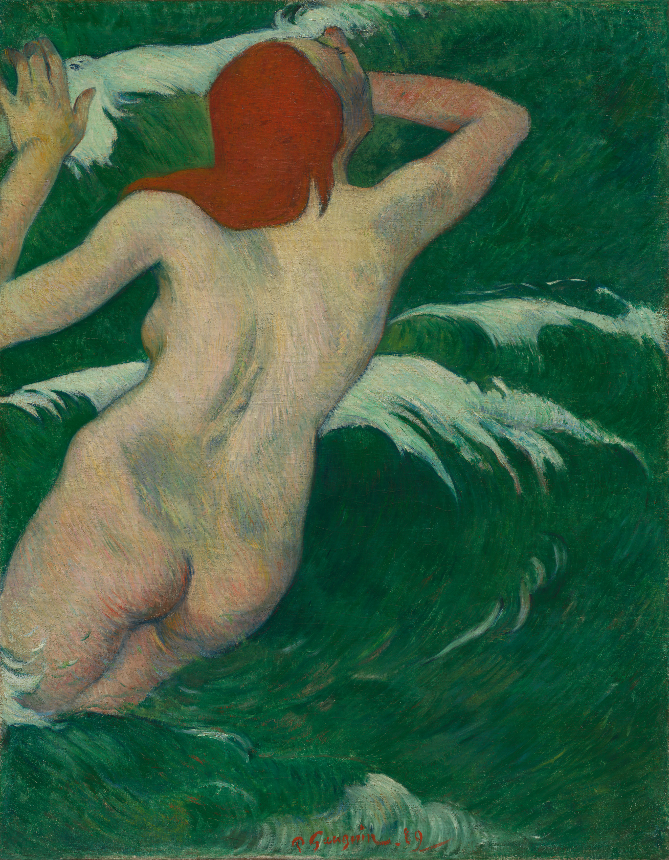
The Cleveland Museum of Art describes the green and orange as exaggerated and seemingly invented rather than observed from life. That is a more specific claim than saying the painting is colorful: it concerns the relationship between the depicted world and the artist’s treatment of it.
Look at how broadly the green extends. The water is still readable through the white wave marks and the figure’s position, yet it becomes a continuous colored setting around the body. The orange-red hair provides another strongly stated color within it. My reading is that this treatment makes the encounter with the sea feel constructed and concentrated, rather than like a passing glance at an ordinary beach.
A completed description might be: “Gauguin keeps the bather and surf recognizable while pushing the water and hair toward exaggerated green and orange.” It says what remains descriptive and what has been transformed. It does not claim that green universally means calm, or that orange proves a particular emotion.
Nor would I call the whole painting nonrepresentational. The figure and waves remain visible subjects. Nonliteral color describes their treatment more accurately than a label suggesting there is nothing recognizable to see.
Redon: a portrait and an imagined setting can coexist
Odilon Redon’s Violette Heymann offers a different relationship. The woman’s profile, brown hair, pale face and mint-colored clothing make a coherent portrait. Around her, blue, violet, green and orange floral forms spread across a gray ground.
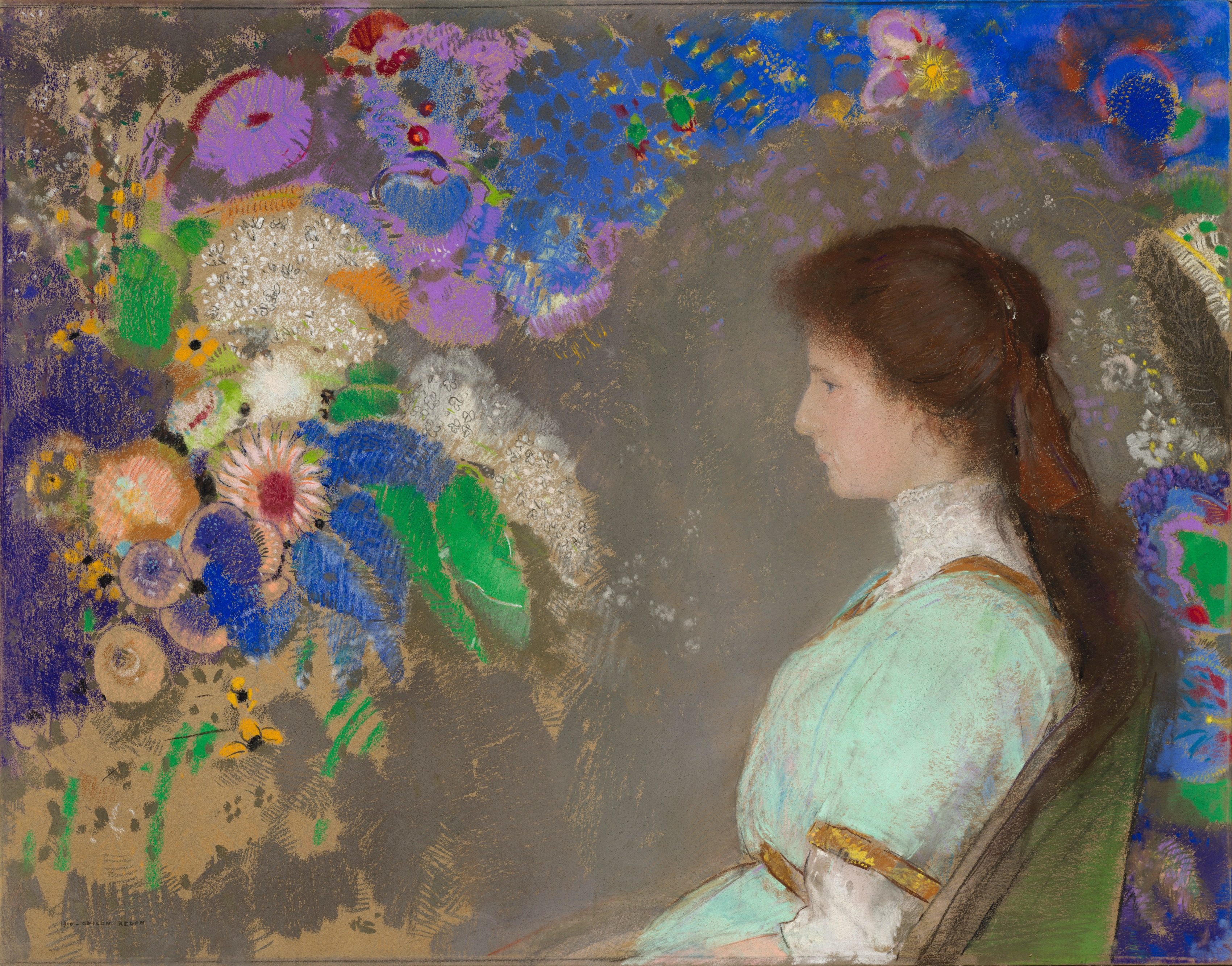
The blossoms do not present a plainly described room with an obvious floor, wall and vase. Some gather at the left; others continue above and around the sitter. Color helps them occupy a space that is less definite than the portrait itself. The museum describes the surroundings as dreamlike.
I would therefore read the two parts together: “Redon gives the sitter a recognizable appearance while surrounding her with a field of colored blossoms that feels imagined rather than like a fully described room.” The pale clothing and colored flowers are visible observations; the imagined quality is an interpretation supported by their arrangement and the museum’s account.
This does not establish what Violette was thinking, or prove that every flower carries a hidden code. We can discuss an expressive setting without inventing the sitter’s private feelings. Here color extends the portrait’s world; it does not have to replace the portrait’s descriptive features.
An interpretation needs something visible to rest on
The two works do more than supply unusual palettes. In Gauguin, strongly stated color transforms a recognizable outdoor scene. In Redon, recognizable portrait features coexist with a less definite floral setting. That difference survives even if two viewers respond to the pictures with different emotions.
When I explain a color reading, I keep the visible observation and the interpretation close together. “The water is a broad green field crossed by white wave marks” gives someone a feature to inspect. “That treatment makes the sea feel less like an observed moment” explains my response to it. A bare claim such as “green is peaceful” skips the picture.
If you want to name a color relationship more precisely, our complementary-color examples show what the term actually identifies. If you are comparing a painter’s wheel with a screen, the primary-color guide distinguishes the models. Neither label, by itself, tells you why an artist chose a color or what everyone should feel.
FAQ
Is color in art the same as hue?
Hue names a color family, such as red or green. A description of color can also include lightness and intensity. Two green passages can differ greatly because one is pale and subdued while the other is dark and strong.
Does expressive color have to look unrealistic?
No. A believable palette can still contribute to an expressive effect. Exaggerated or invented hues make the distinction easier to see, but descriptive and expressive uses can coexist, as they do in Redon’s portrait.
Does unusual color make a painting abstract?
Unusual color alone does not remove the subject. Gauguin’s bather and waves are recognizable despite their exaggerated treatment. Describe what has changed—color, shape, space or something else—before assigning a broad label.
Can a color have a fixed meaning in a painting?
A specific work or cultural context may support a particular association. Establish that context rather than treating a hue as a universal code. The colors around it, the subject and the way it is used also affect the reading.
Sources and image notes
Tate supplies the general discussion of descriptive and less literal color. The Cleveland Museum of Art identifies the works, media and dates, and supplies the attributed interpretations. Other descriptions here are editorial readings of the digital reproductions, not pigment analysis or a claim to know the artists’ private intentions. Screen appearance can vary.
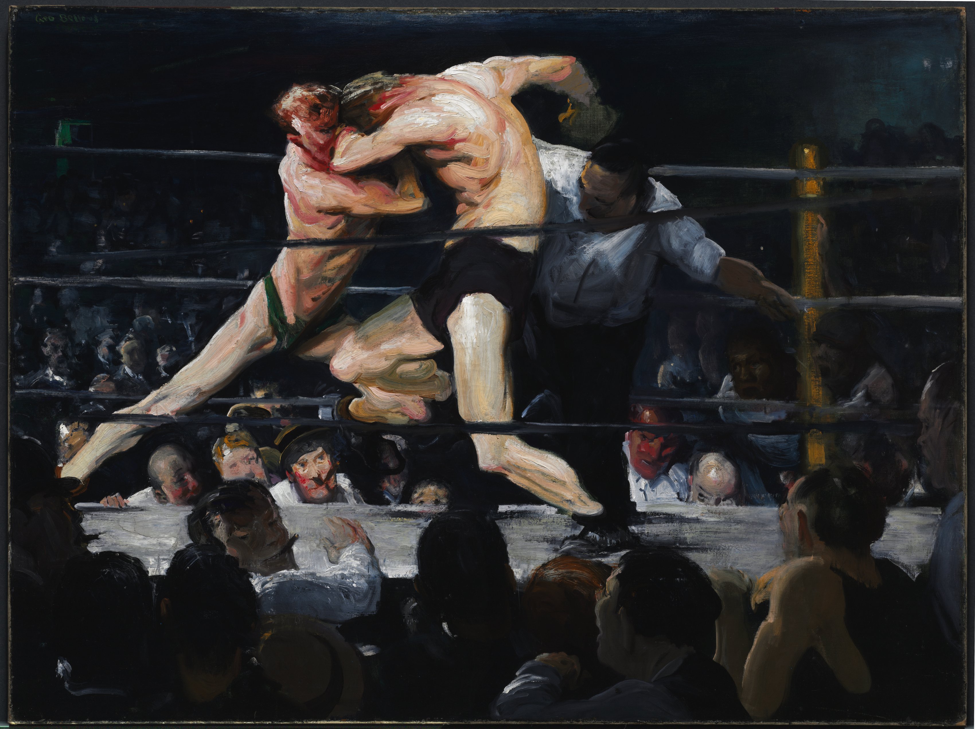
Community discussions about moving beyond color terminology and departing from literal reference colors informed the questions. They are artists’ discussions, not evidence about all viewers. Cover: George Bellows, Stag at Sharkey’s, 1909, oil on canvas. The Cleveland Museum of Art, Hinman B. Hurlbut Collection, 1922.1133. The native cover displays a cropped detail. All three Cleveland Museum images are CC0.