How to Choose a Frame for a Painting: Compare the Surround
The frame’s color, width and profile change how a painting meets its surroundings. Compare the appearance, then confirm the physical package before ordering.
Which object are you framing?
A painting on stretched canvas, a painting on a rigid panel, and a watercolor on paper need different support and protection. A reproduction of an oil painting on paper is still a paper object. The subject or the original painting’s medium does not specify what is arriving.
For a stable stretched canvas, establish its actual width, height, depth, and the edges you want visible; our canvas-framing guide covers that structural route. A panel needs a frame and attachment method appropriate to the actual board. For a paper work, discuss suitable mounting, backing, and separation from glazing; our window-mat and float-mount guide addresses that presentation choice.
The Canadian Conservation Institute recommends examining the painting, support, and frame for stability. It also recognizes an original frame’s historical significance. If paint is lifting, the support is unstable, or the existing frame may be part of the work’s history, ask a qualified framer or conservator before replacing it. Leaving a deliberately unframed work unframed can be a valid display choice; it still needs appropriate support and handling.
Look at the edges of the painting first
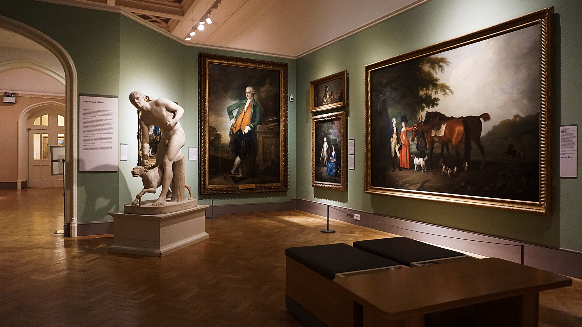
Childe Hassam’s The New York Window gives us contrasting edges to inspect. The upper and left areas contain luminous window colors. The lower edge is much darker, while the red curtain creates a warm vertical area at right. One surround will not contrast equally with every edge.
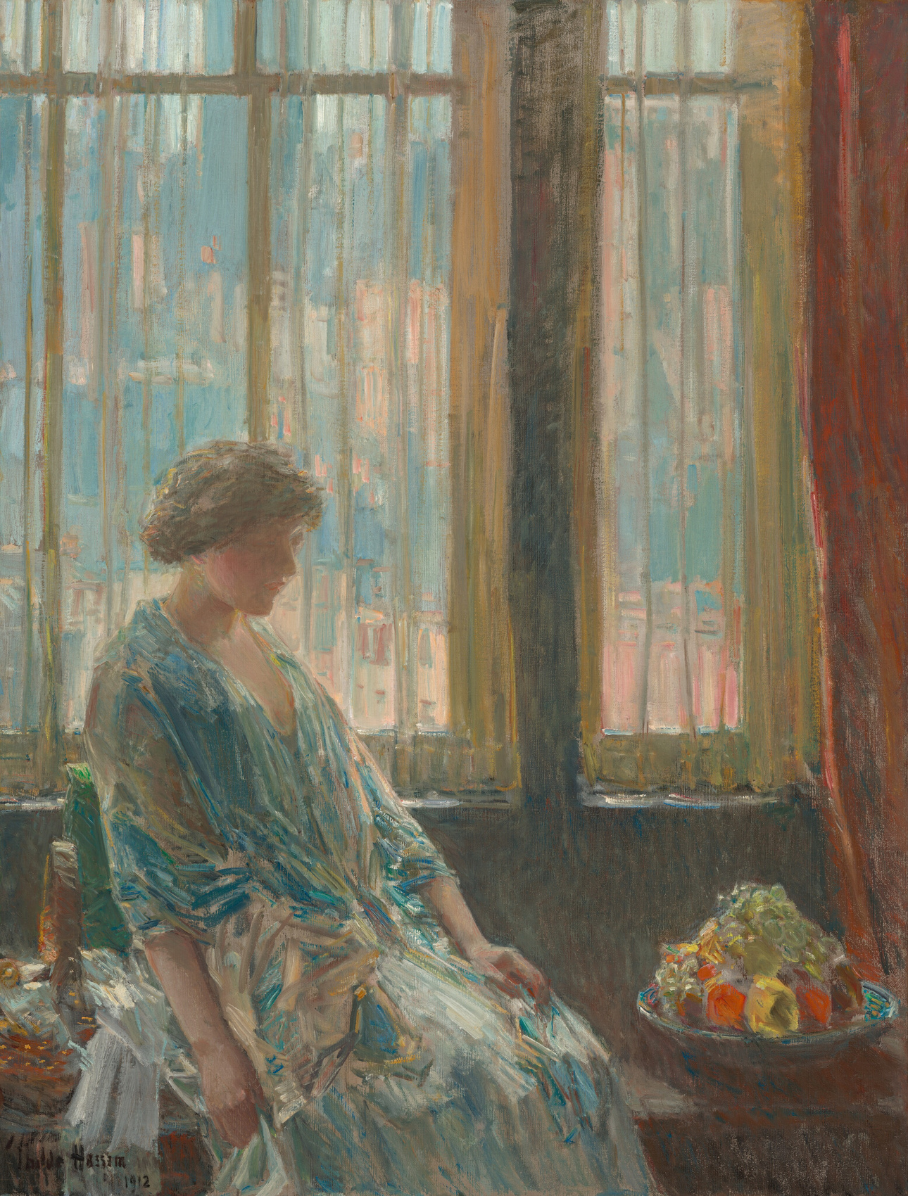
I would begin with that uneven perimeter rather than “Impressionist painting equals gold frame.” A style label can suggest a starting point, but it does not settle how a particular surround meets the particular image. If an artist chose a frame, or a historic frame is important to the object, that evidence belongs before our preferences.
The three AI framing visualizations below use this reproduction in a matched pale-wall setting. They let us inspect a narrow dark molding, pale wood and a broader gold-toned profile as plausible frame designs. The generated artwork is not a pixel-identical substitute for the original above, and the broad-frame view has a slightly smaller visible picture area. Compare the overall presentation rather than treating these views as an isolated test of color or measured width. They show no actual reframing of the museum painting.
Three surrounds, three different edge relationships
Thin dark. Look at the meeting with the pale upper window and left edge.
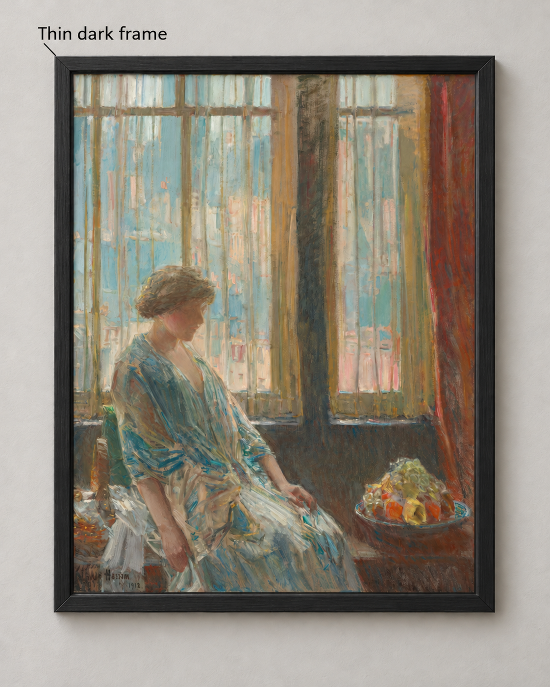
The narrow dark molding gives those lighter areas a clear boundary. Along the darker bottom, the contrast is less pronounced. Its small bevel and corner joints also let us see a frame as an object, rather than a colored outline. I like this option when the priority is a defined but restrained edge: the new perimeter remains relatively quiet.
Thin pale. Compare a similarly narrow profile in pale wood, especially where it meets the luminous window colors.
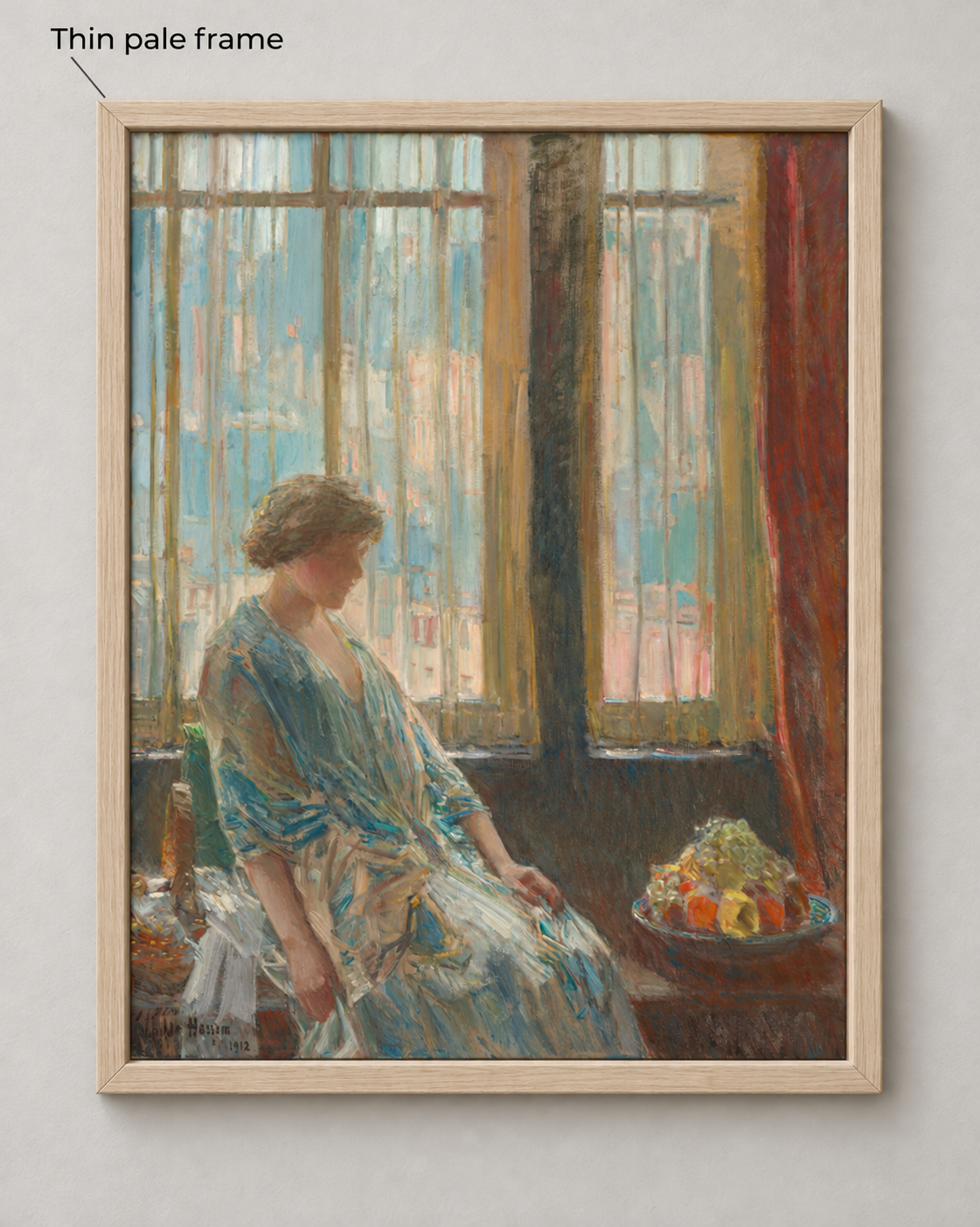
The pale wood is closer to the light window colors, making the upper transition less emphatic. Its visible grain adds a different surface character from the dark finish. It remains distinct beside the lower shadows and red curtain. I would prefer it if the wanted quality were a softer relationship around the luminous area. Color and surface finish change together here; “pale makes the whole picture disappear” would be too broad a reading.
Broad warm. Now inspect the larger warm perimeter and the stepped molding.
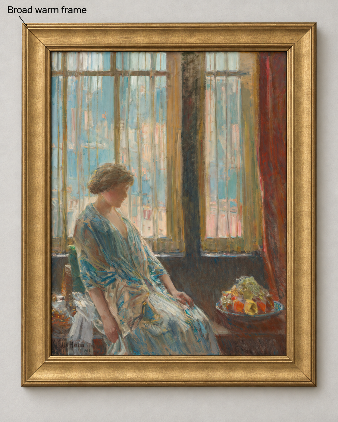
The broader gold-toned profile creates a substantial warm area outside the picture. The raised steps and illustrated highlights make the frame a more prominent decorative object. That can be appealing when the surround is deliberately part of the presentation. Width, finish and profile change together, with a small change in visible image area, so this is a comparison of complete appearances rather than proof of what gold color alone does. The rendering cannot establish a real frame’s material or finish.
My shortlist for the stated priority is the thin dark surround. I want a clear edge against the pale windows while keeping the new perimeter small. Change the priority to a softer upper transition and I would shortlist the thin pale option. Want a larger warm decorative surround, and the broad option deserves consideration. The completed choice is about these visible relationships, not a universal winner.
Turn the visual shortlist into a real frame choice
Ask a framer to place actual corner samples beside the work, keeping the visible image area consistent. An AI visualization can suggest a raised profile, grain or reflective finish; the actual sample establishes what the proposed molding looks like in your light and how much its inner lip covers. Check the pale upper edge and darker bottom separately, then look at the proposed complete presentation in the intended light. If a sample changes the relationship you liked, revise the shortlist.
A public frame-choice discussion contains conflicting preferences, including a reply that notices changing image size and cropping between previews. That is a useful caution for comparison, not evidence that one frame color is generally superior. Keep the artwork constant before interpreting the difference.
For paper work, the Library of Congress’s framing guidance calls for appropriate materials and separation from glazing. For paintings, glazing is an object-specific protection decision; canvas does not automatically mean “never use glass.” Reflection reduction and UV filtering also answer different questions. Our print and finish guide separates the paper’s matte surface from the glazing in front.
At WhispArt, we think of the finished physical work as a translation of the image, rather than the file alone. The frame and presentation belong to that object. Here, that means the screen comparison can shortlist an appearance; it cannot approve a physical assembly.
A liked frame still needs a complete quote
Consider a fictional first-art buyer with a $400 total framing ceiling. This is an illustrative budget, not a typical US price. They like a thin dark surround for a paper reproduction and receive a $390 quote naming the frame, suitable mounting, glazing, and backing. Tax and delivery are unstated; the finished outside dimensions and compatibility with the actual sheet also remain unconfirmed.
I would hold the order. The $390 line is not yet a $390 complete purchase. Ask: “Please confirm the actual sheet and visible opening, the complete outside frame size, the mounting and glazing supplied, and the total including applicable tax and delivery.” If the confirmed package is compatible, fits the intended space, and totals no more than $400, the buyer can approve it on those terms. If it exceeds the ceiling, ask for a compatible alternative or wait. Do not remove needed protection simply to preserve the preferred border.
A first-time art buyer’s discussion raises the cost of framing relative to a $250 print, and replies disagree. We would not turn those personal budgets into a rule that a frame must cost less than its artwork. The useful limit is your complete budget for the specified object, together with the protection the work actually needs.
FAQ
Should the frame match the painting or the room?
Begin with the artwork’s actual edges, medium, and any artist or historical frame evidence. Then check the complete presentation in its intended location. Repeating a furniture color can be a preference, but it does not establish a good relationship with the image or a compatible frame.
Does an old painting have to go in a gold frame?
No automatic color rule follows from age. An original or historically significant frame deserves assessment, which is different from buying a new gold-colored surround because the painting looks traditional. Compare the actual work and preserve relevant history.
Does every painting need glass or a mat?
No. Paintings on canvas or panel and works on paper have different requirements. A paper mat, a canvas floater, and protective glazing do different jobs. Choose the package for the actual medium, support, condition, and risks with a qualified framer where necessary.
What if the frame costs more than the art?
That can happen without proving the frame is wrong. Ask what the quote includes and whether those features matter for this work. Compare suitable alternatives within your total budget; the artwork’s sale price alone cannot set the frame’s necessary protection or your preferred presentation.